12 Best Art Portfolio Website Examples to Inspire
Building an art portfolio is crucial for an aspiring artist to show off your work. You need to make sure your art portfolio website is both beautiful and functional.
The better you’re able to sell yourself online and build a brand, the easier it will be to secure new projects and shows in the long run.
In this article, we’ll show you 12 great art portfolio website examples. On top of that, you will learn how to create an online art portfolio website for yourself to showcase your work.
We’ll also let you in on some tips on how to create a portfolio website that is both stylish and functional, so stay tuned until the very end.

Build, brand, and grow your business with Zyro
TRY FOR FREE
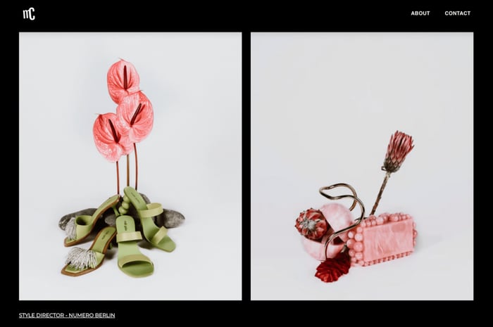
Whether you’re a visual artist or a photographer like Mills, there are plenty of things we love about this artist portfolio website.
Take the dark background of this artist website, for example. By following up-to-date web design trends, Cordelia’s professional portfolio is able to allow the artwork to pop out and capture the eye of the viewer.
At the same time, the artist is creating a unique perspective to their photography by opting for bigger images in the site design, compared to only showing a thumbnail of each artwork.
This digital art portfolio also demonstrates that you don’t need to have multiple pages to make your professional portfolio website work: sometimes, you can get by with just a main landing page, and separate pages for your contact details and a short bio.
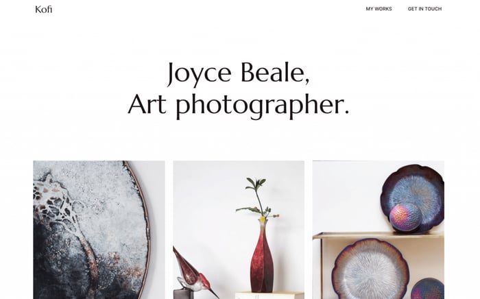
Want an online portfolio site that uses minimalist design elements?
Check out Joyce Beale’s portfolio site Kofi. As an interdisciplinary artist, photographer, and art business, Beal’s portfolio site uses a clean web design with plenty of white space to guide the visitor to what’s most important.
We especially love the clean menu and navigation this portfolio site has. Rather than cluttering the header section of the website with different links, Beal is giving visitors the chance to explore the site in a structured way.
By showing just a teaser of the actual collection and keeping the rest behind a link, the artist is able to keep visitors engaged on the website for longer.
Beal also cleverly echoes the colors in her art in her web design overall. Take a look at the call-to-action buttons on the homepage, for example: the red color mimics the red in the photos of her work displayed on the landing page.
Don’t be scared to combine your about and contact pages like Beal does on her portfolio. This way, you’ll free up space for your art, and won’t distract the visitors with unnecessary information and content. Instead, they can take your creations in and when they are ready, they can get to know you through your bio and contact page.
Shantell Martin is a British artist who creates quirky, doodle-like illustrations.
Her online portfolio has a playful homepage. The background animates around your cursor, which results in a fun, interactive effect.
Without even looking at her past projects, visitors already have a good idea of her artistry.
The design elements match Shantell’s illustrations. Using a black and white color scheme and bold typefaces, her art portfolio effectively communicates her personal style.
She includes links to several Instagram hashtags towards the end of the page, allowing visitors to be updated with her current work on social media.
Kimi Lewis is an LA-based graphic designer who uses minimal design for her online art portfolio.
Every element of Kimi’s online portfolio website puts her art front and center.
The white background allows her designs to pop and stand out, while the small and simple typeface allows for her typographic work to truly shine.
The grid gallery allows visitors to get an idea of her talents quickly. You can simply click on an image and view a project in detail.
Cayce’s portfolio is a minimalistic art portfolio website that takes advantage of white space. The use of a black and white color palette brings more attention to the portraits.
Another excellent feature is how it presents an in-depth look at her art.
You can see a closer look at her embroideries in the Details section. On the other hand, the Versos collection includes pictures of what her embroidered portraits look like from behind.
The artist also adds images of her work displayed in galleries on the Exhibitions page. This helps visitors visualize what her embroideries and paintings look like in real life.
Steven Kozar’s hyper-realist paintings easily fool you into thinking he’s a photographer.
This art portfolio website features a full-width image of the artist’s work as the homepage header. In the About the Art section, the artist includes playful headings that emphasize that his artworks are indeed paintings.
All of his past and current work is featured on the Archive page.
In addition, Steven’s online portfolio doubles as an online store. This includes features such as a shopping cart, a review system, and a handy zoom-in feature for each product.
James White is a graphic designer who specializes in bold, neon aesthetics.
With such a colorful collection, he needs a portfolio design that complements his art.
His art portfolio website features a dark background to showcase the bright colors; it’s an easy way to make his products stand out. He uses the colors found in his art for hyperlinks and emphasis.
All of James’ artwork is divided into projects and displayed in a grid gallery. This is so the homepage can showcase numerous collections at once, and users can click on an image to get more information.
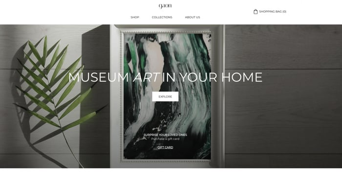
For any artists looking for a way to incorporate an online store into their portfolio site, Gaon is a great website to draw inspiration from.
Focusing on creating art that’s accessible to the world, Gaon offers art prints of various artists’ work. We love how the design of the site centers around the store, but the clear navigation gives the visitor easy access to ready-curated collections and the ‘About us’ page.
While Goan isn’t ‘an artist portfolio’ in the traditional sense, the store acts more like the online art portfolios of many different artists, instead.
If you work as part of an art collective, it’s not a bad idea to consider putting an online store or a blog onto your portfolio website.
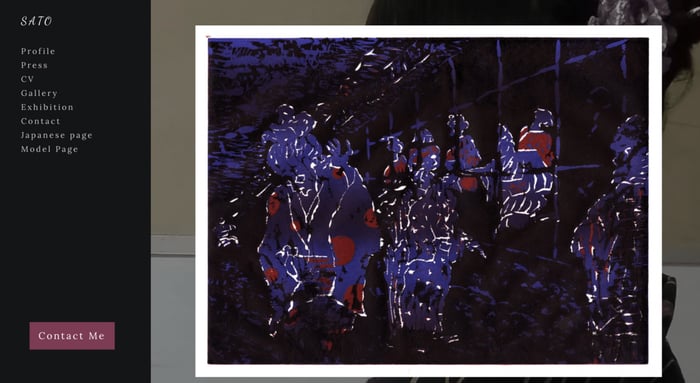
An artist portfolio can also work as a one-page website, and Sato’s work online proves that.
Thanks to the fixed side menu and helpful navigational dot to mark where you are on the page, this artist portfolio streamlines the user journey.
Sato also places more emphasis on their press testimonials, rather than just using the artist website to show off their work. This is an important aspect of web design for artists who want to build trust and credibility with potential clients.
We also love the care and attention Sato’s contact button has been given. By making the most important call-to-action buttons visibly different from the rest of the page you’re more likely to catch the visitor’s attention.
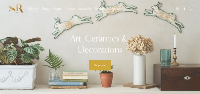
An artist portfolio site isn’t just reserved for a visual artist. Other artists from different fields can also benefit from having portfolio websites.
Sarah Rickard creates art, ceramics, and decorations, and like most successful artist websites, she too has included an eCommerce store in her artist portfolio.
Rickard is able to show off her art by extensively using product images as the background of her different page sections. This is a wonderful way to show the world the wider context of your art.
Like many art portfolio websites, Rickard uses a thought-through color palette across the site, creating a tranquil and peaceful feel overall.
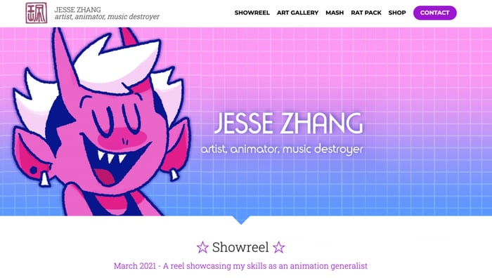
Some of the best artist portfolio websites do exactly what Jesse Zhang does.
As an artist and animator, he doesn’t just use static images to demonstrate his skills and expertise – instead, he seems to live by the ‘show, don’t tell’ principle.
Zhang grabs the attention of the visitor by placing a painting of himself as an animated character into the hero section of the homepage and embedding a video reel of his work directly below.
By using a distinct and bright color scheme, Zhang is able to distinguish himself from other art portfolio sites and build a personal brand in the long run.
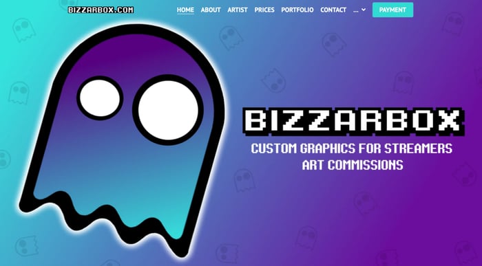
This is an art portfolio example that we love for a couple of reasons.
Firstly, the website utilizes its color palette and mascot very well. By creating different backgrounds for different page sections with consistent colors and illustrations, the site feels very cohesive. This helps to create a memorable portfolio website that sticks with the visitors.
Run by the artist Bizzar, BizzarBox also does a great job in combining eCommerce functionality with building a brand and displaying his portfolio. From having a clear call-to-action button in the main menu, and showcasing different products and services he makes a compelling case for his target audience to send in an order for some custom illustrations.
Due to the size of his portfolio, Bizzar cleverly uses a gallery view with thumbnails of his work giving a sneak peek into the art in question, enticing the users to click on the image.
Why is having an online art portfolio important?
An art portfolio website is used to show off your talent with examples of previous work. Generally, it should contain a collection of your best projects to demonstrate your skills.
There are a few reasons why a well-designed art portfolio website is important for professional artists.
First, it can enable more visibility and awareness for you and your art.
With the right keywords, a custom domain, and proper use of SEO, your online artist portfolio website can rank high on search results pages. In turn, you’ll be able to secure more projects, potential clients can find you easier, and you can grow your online presence.
Second, a portfolio site leaves room for creative design choices.
As a result, you can create a unique art portfolio that enhances your brand and sets you apart from other artist portfolio websites in the business.
Usually, the best art portfolio websites contain the following pages:
- Homepage. Welcome visitors and create a positive first impression. Let them know who you are, what your art is about, and what you’re currently working on.
- About. Elaborate on yourself, your career, and your artistic process – consider painting a picture of how your style sets you apart from other artists here. You can also consider putting in an artist statement to communicate your values in a clear and concise way.
- Portfolio. Try dividing your art by the latest projects or subject matter to make the content more cohesive. Choose a gallery form that complements your art and makes it easy to view various images at a glance.
- Exhibitions. Include a list of past and upcoming shows you’re part of. If you have any images from the exhibitions, find space for them in your web design.
- Reviews, press coverages, or testimonials. Provide links to publications or comments about you that establish your brand and build your credibility as an artist.
- Contact information. Attach a contact form, and include your professional contact details and social media handles on a dedicated webpage and also in your site footer.
Some of the most successful art portfolio sites also include an online store or a blog in their web design. Whether you want to sell prints of your painting or talk about what goes into making your art, consider following their example.
In order for you to design a portfolio site that will not just look good, but do good as well, pay attention to a few things:
- Keep your website’s menu clear and easy to follow
- Include copyright information in your footer
- Follow the latest web design trends
- Make your website mobile-responsive
- Use up-to-date security protocols on your website (like an SSL certificate)
How to create an artist portfolio website
If you want to create your own art portfolio website, you should use a website builder like Zyro.
With its drag-and-drop function and beautiful templates, you can start building your art website quickly and easily and get exactly what you see. No need to learn code or have prior technical knowledge.
Simply sign up, choose a template, and begin editing. It’s that easy – no credit card required since you can try all the features for free before publishing your website.
The drag-and-drop editor makes it easy to create web pages that reflect your vision for your portfolio. And thanks to the pixel-perfect grid, everything from text, images, buttons, and other website elements can be customized and moved around the page without risking a thing.
All Zyro plans come with reliable web hosting, a custom domain with annual plans, a free SSL certificate, and 24/7 support.
You can also use the various AI tools to touch up images, generate text from blog post titles to terms and conditions, and create custom logos.
Get more inspiration:
Create your online portfolio today
An art portfolio website is essential for any professional artist. It’s the best way to gain visibility as an artist, build a wider audience, and showcase your art to the world.
With a website builder like Zyro, creating your portfolio site becomes an easy and fast process.
If you draw inspiration from the above art portfolio websites, your portfolio site will surely impress site visitors from all walks of life. Why not start today?

Zyro – the easiest way to build a website
TRY FOR FREE
