10 Best Design Systems and How to Learn (and Steal) From Them
Design systems are all the rage and while most articles talk about what they are and best practices for creating them, at DesignerUp we’ve been framing them as a teaching tool with our product design students to help them better understand, explore and learn the philosophies, best practices and principles of UI design, UX and Product Design.
Aside from implementing design systems into your workflow, design systems are a tremendous untapped resource for learning how to create better user experiences and interfaces just by studying them! What better way to understand how to design an e-commerce user flow than from Shopify or an iOS mobile app than from Apple?! These are what we call Design Patterns and great product designers know how use these to inform the decisions they make with their own designs. No need to reinvent the UX wheel when the best companies in the world have already paved the way, tested them with actual users and published their UI/UX and product design methodologies online!
“Sometimes I think everything I draw is just a combination of all of the millions and millions of drawings I’ve seen.”
— Jean-Luc Godard
Mục lục bài viết
Quick overview:
What is a design system anyway?
In a nutshell, a design system is a collection of documents, articles, examples, code snippets, screenshots, design guidelines, components, philosophies and other digital assets for a product design company. It’s usually hosted online as a website (public or internal). Think of it as a big knowledge-base that is part UI kit, part documentation with instructions, language and coding guidelines all wrapped up together.
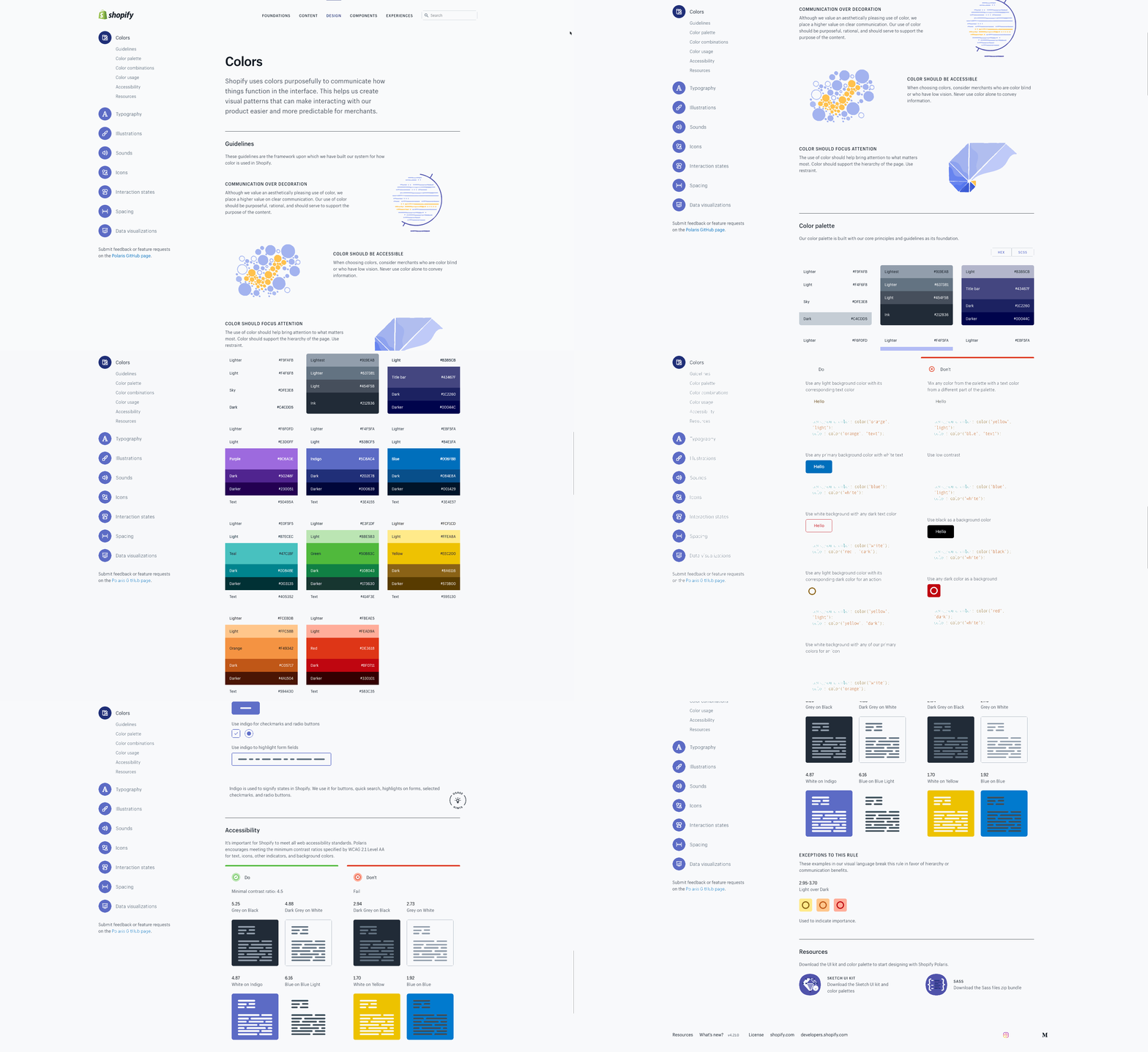 Shopify Design System
Why do companies create them?
A design system gets created in collaboration with an entire product team (programmers, engineers, designers, product managers, C-suite team etc.) Ideally, they come together as a committee to work on it; take inventory of all their current digital product assets (colors, logos, headers, footers, forms, code etc) and attempt to come to some consensus about how things ought to be designed, coded, presented and talked about.
It’s their master plan, the source of all truth and a reference to make sure that everyone who works on their product is always on the same page, consistent and in agreeance with the way things should be.
On the implementation level, when a coder needs to repeat a snippet of code on a new page, the reusable component is right there for them to copy and paste. When a designer needs to whip up a new landing page, all the pre-designed UI symbol elements are ready to drop in and can be non-destructably edited. When a marketer needs to send out a newsletter, there is no question as to the kind of tone the copy should be written in or what the header image should be. It’s all there, clearly laid out and because everyone has discussed, contributed to and agreed upon it there is no question as to what and how things need to be done.
What you can learn from them
For the purposes of this article rather than talk about how to create a design system, we are going to look at design systems from another angle and show you how you can use them and as a study guide to understanding UI/UX and product design practices and implementation.
Most design systems are setup in much the same way; a top-level navigation that shows the main categories of the system; usually something like Branding, Design, Components, Code etc. Within each of those categories, there is usually a sub-navigation or side-bar navigation that further breaks down these categories into areas like Color, Typography, Components, Forms, Guidelines etc. It’s like a master class in design!
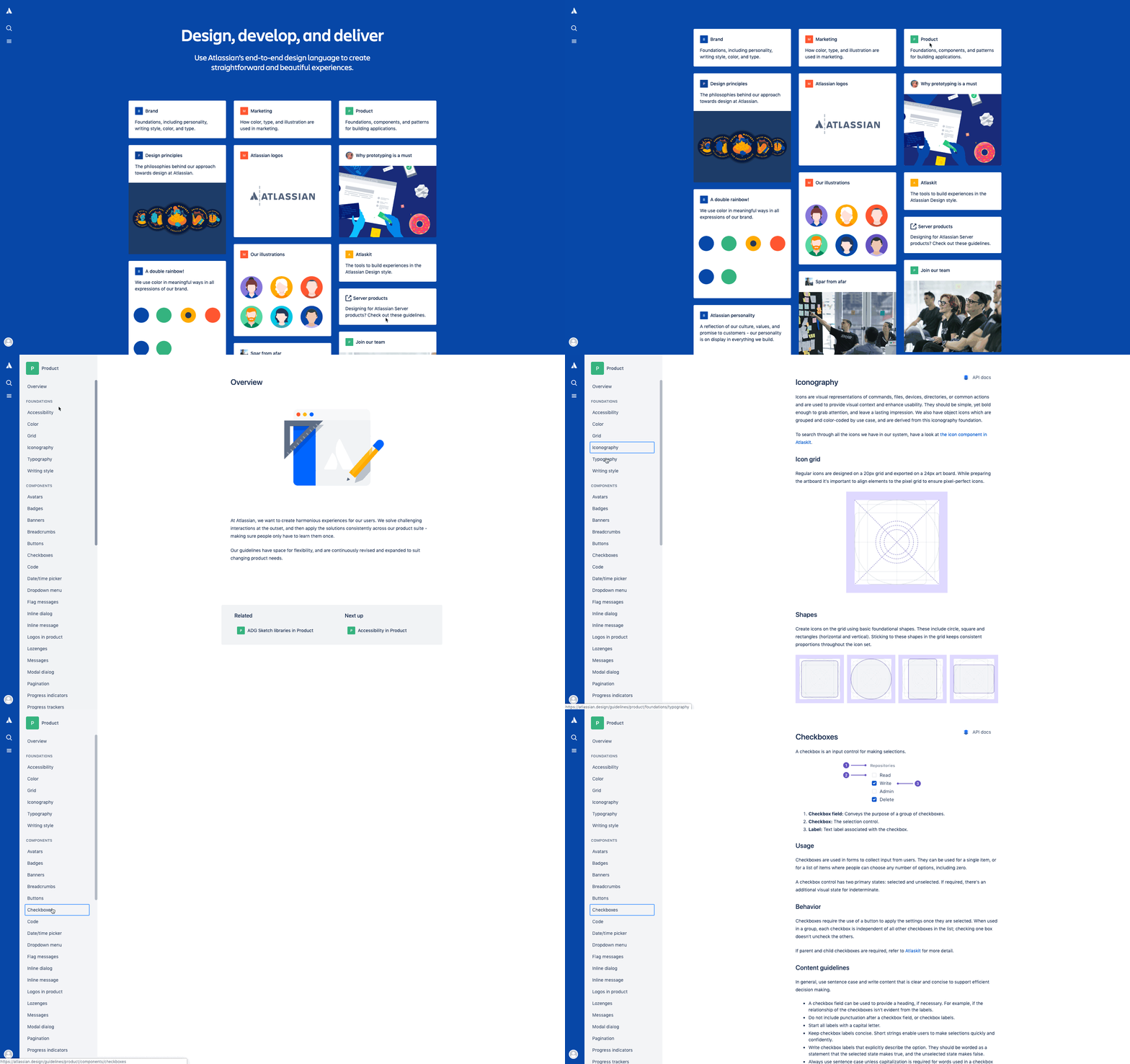 Atlassian Design System
So how can you learn from this? Say you’re designing an e-commerce site and the menu needs a dropdown for categories. Not sure what size your arrow should be on the dropdown or how far away from the text to place it or what it should look like when it’s fully expanded? Well, you can look to a shopping system pioneer like Shopify to see how they do it!
Here is our top 10 list (in no particular order) of the greatest of the greats, what their design systems include and how you can use them to learn from and inspire your own designs.
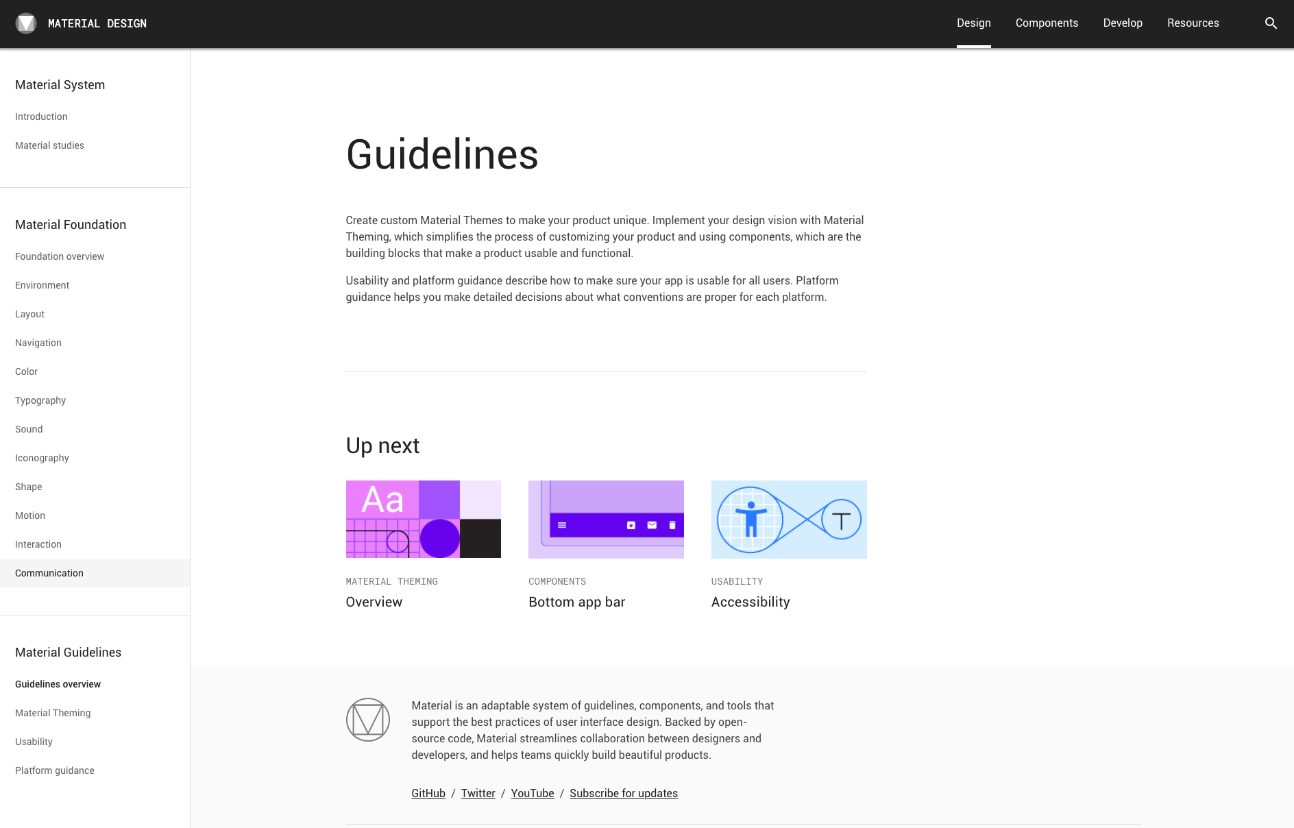 Google Material Design System
Who they are:
The Google we all know and use is a behemoth of an American technology company that specializes in Internet-related services and products; including online advertising technologies, a search engine, cloud computing, software, and hardware. It is considered one of the Big Four technology companies, alongside Amazon, Apple, and Microsoft
Their design philosophy:
In terms of design, Google’s publicly shared ‘Material Design’ system paved the way for many to follow. The absolutely insane attention to detail categorized and cataloged components in a way the design world has never so succinctly seen before. They made the mistakes so you don’t have to and gave order and meaning to the atomic design principles that all design systems are built on today. Their goals for their design system:
- Create a visual language that synthesizes the classic principles of good design with the innovation and possibility of technology and science.
- Develop a single underlying system that unifies the user experience across platforms, devices, and input methods.
- Expand Material’s visual language and provide a flexible foundation for innovation and brand expression.
Design system features:
- Layout
- Color
- Typography
- Components
- Material Theming
- Design Source Files
- Mobile Guidelines
- Starter Kits
How you can apply it to your work:
Material design system allows you to directly download design component source files for the most popular design software (like Sketch and Figma). They also include Material studies which demonstrate how components and theming can be used to create beautiful, usable apps.
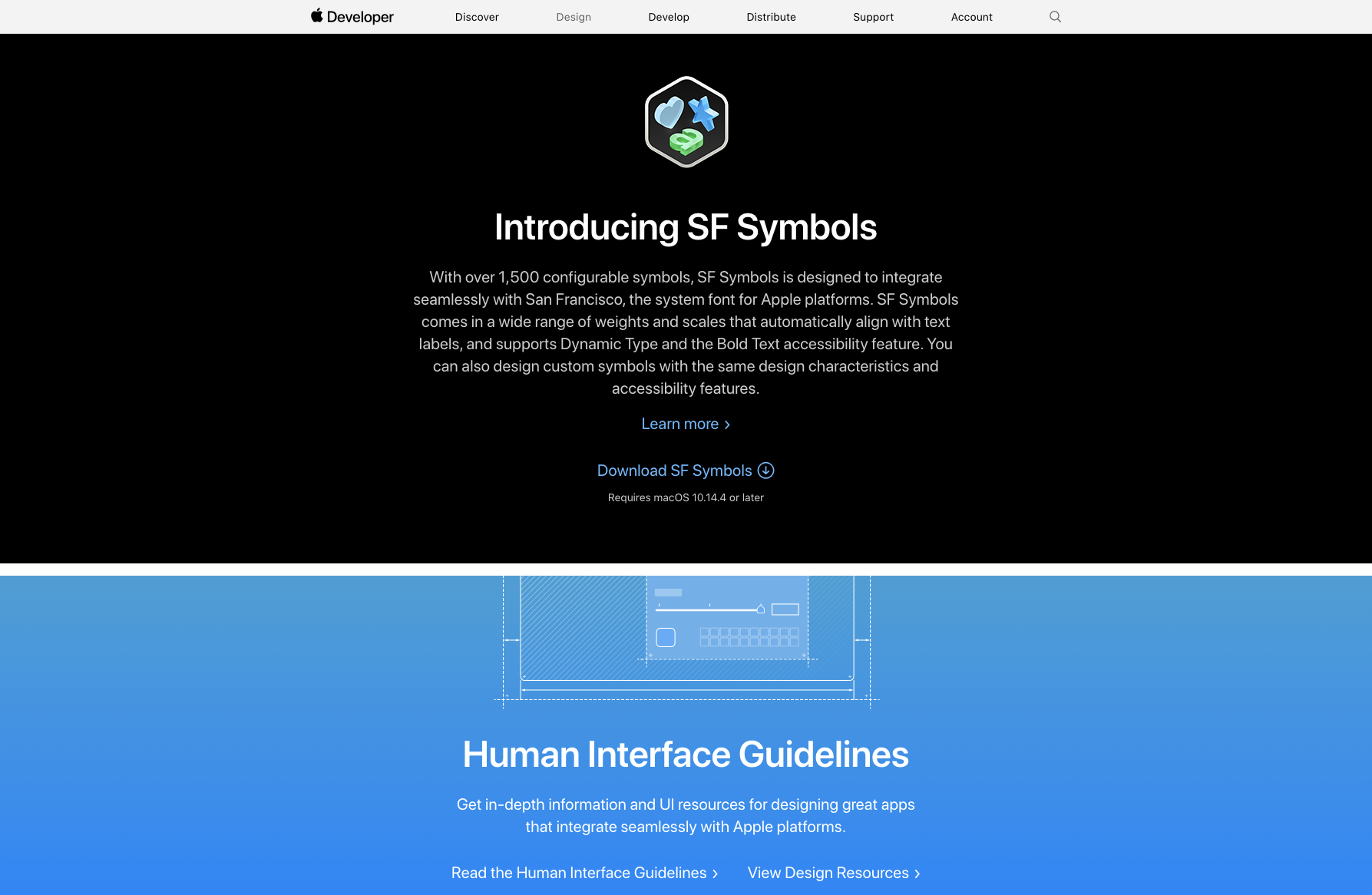 Apple Human Interface Guidelines
Who they are:
Needing no introduction, elegant and intentional design is in the very DNA of Apple. Apple’s Human Interface Guidelines is not only a design system but an incredible resource full of downloadable templates and other guidelines that you can use in your own projects.
Their design philosophy
Famously, Steve Job’s Design philosophy consists of 6 pillars:
1.Craft, Above All – Meticulous attention to detail and precision
2.Empathy – A process that emphasizes empathy with user needs and an intimate connection with the feelings of the customer
3. Focus – Eliminate all of the unimportant opportunities
4. Impute – People form an opinion about a company or product based on the signals that it conveys
5. Friendliness – recognize that high-tech devices could be friendly and approachable and appeal to novice and advanced user alike
6. Finding simplicity for the future in metaphors from the past– Design simplicity should be linked to making products easy to us
Design system features:
Apple’s external-facing design system features best practices, guidelines and resources for developers, designers and distributors for macOS, iOS, watchOS, vOS
- Themes
- Visual Index
- App Architecture
- User Interaction
- System capabilities
- Visual Design
- Icons and images
- Window and View
- Menus
- Buttons
- Fields and Labels
- Selectors
- Indicators
- Touch Bar
- Extensions
How you can apply it to your work:
You can download and directly use a variety of developer and designer resources and tools in your work (such as design files, device mockups, Swift code) as well as reference their guidelines for best practices and how-tos to bring your digital visions to life.
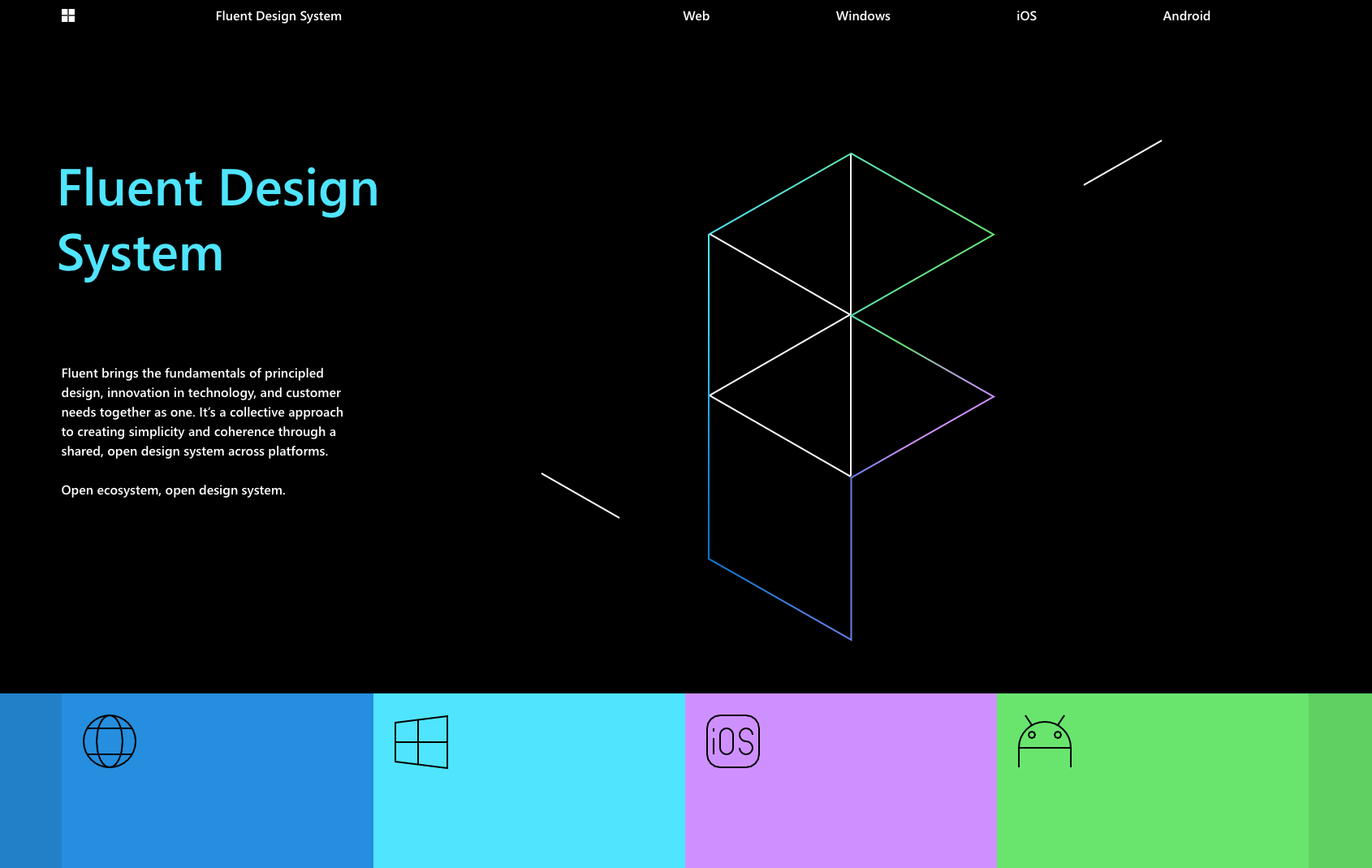 Microsoft Fluent Design System
Who they are:
From the makers of our loved and loved to be hated on Microsoft, we all know them for their ubiquitous computer operating system Windows, computer software Office and internet browser Internet Explorer.
Their design philosophy:
Microsoft’s Inclusive Design methodology is born out of digital environments. It enables and draws on the full range of human diversity. Most importantly, this means including and learning from people with a range of perspectives. They believe that exclusion happens when we solve problems using our own biases. As Microsoft designers, they seek out those exclusions, and use them as opportunities to create new ideas and inclusive designs:
- Recognize exclusion
- Solve for one, extend to many
- Learn from diversity
Design system features:
- Colors
- Elevation
- Iconography
- Layout
- Motion
- Typography
- Localization
- Theming
How you can apply it to your work:
Microsoft’s ecosystem of design tools and open-source components can help you get the same look as their products quickly and easily so you can create a consistent vision across Web, Windows, iOS and Android platforms and understand the logic and look of Microsoft products. It is also a great case study reference for how to make your own UI/UX designs as inclusive as possible.
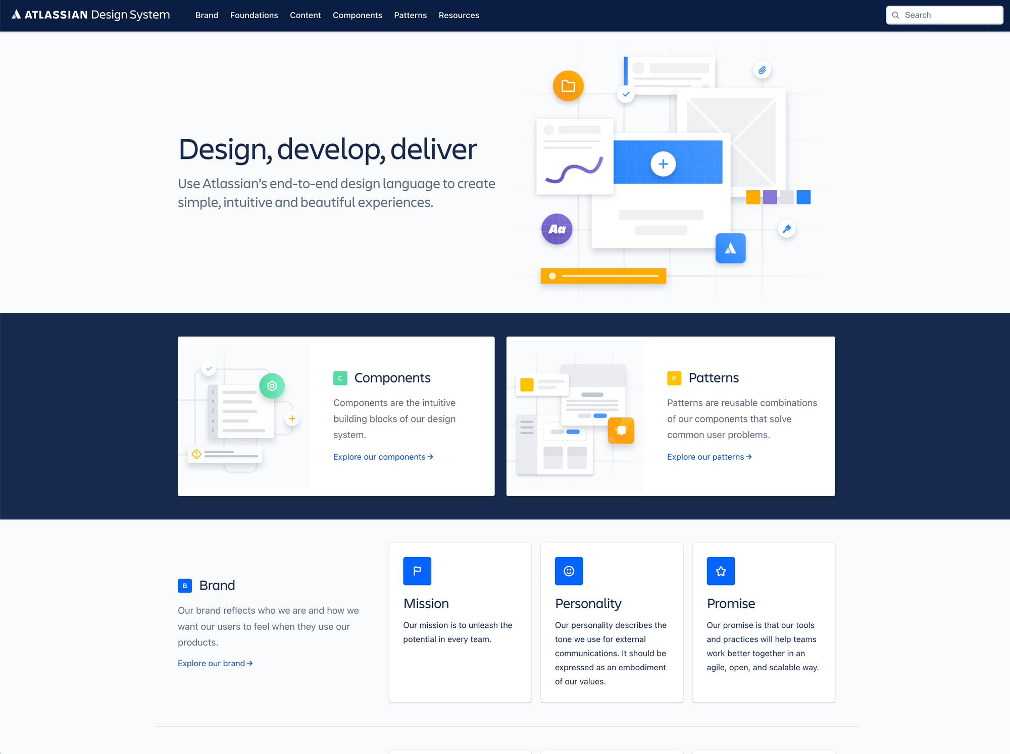 Atlassian Design System
Who they are:
One of my personal favorite design systems, Atlassian makes project management and collaboration tools like Jira and Trello that are used by thousands of teams worldwide. Their focus is on agile tools for agile teams by helping them stay on track as they plan, develop, and deliver products.
Their design philosophy
Atlassian’s design philosophy reflects and underpins how digital experiences can unleash the potential in any team. Their credo is aimed at helping people and teams be more effective.
- Build trust in every interaction
- Connect people to collaborate better
- Match purpose and feel familiar
- Drive momentum from end to end
- Guide mastery for greater value
Design system features:
- Brand guidelines
- Design Principles
- Illustration
- Product
- Personality
- Prototyping
- Marketing
How you can apply it to your work:
The style of this design system can inspire other similar collaboration and management tools that you’re working on such as team collaboration, product management tools, project management tools, team chats, help desks, knowledge-bases
5. Uber Design System
https://brand.uber.com/guide
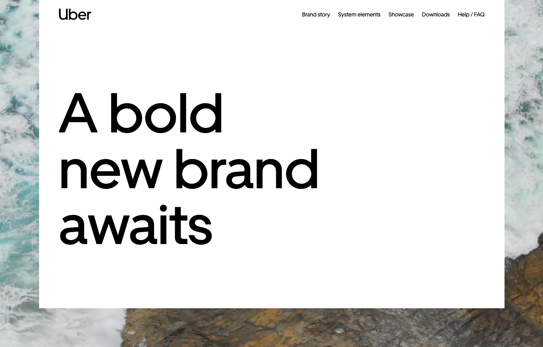 Uber Design System
Who they are:
Uber is a ride-hailing service that is part of the Gig-Economy (Serving both passengers and freelancers), offering services that include peer-to-peer ridesharing, ride service hailing, food delivery (Uber Eats), and a micromobility system with electric bikes and scooters.
Their design philosophy
From sub-brands to internal teams and products to programs, Uber is about moving people to where they want to be. In their day, in their lives, in the moment-They believe that movement ignites opportunity.
Design system features:
- Logo
- Brand Architecture
- Color
- Composition
- Iconography
- Illustration
- Motion
- Photography
- Tone of voice
- Typography
How you can apply it to your work:
If you are in the working in the area of travel or transportation, gig economy or outer space; whether it be via scooter, career pigeon or bullet train, Uber is an amazing example of how to tackle problems related to getting from point A to point regardless of where you want to go.
👉🏽 You can also download the Atlassian Design Systems for free in the Figma Community
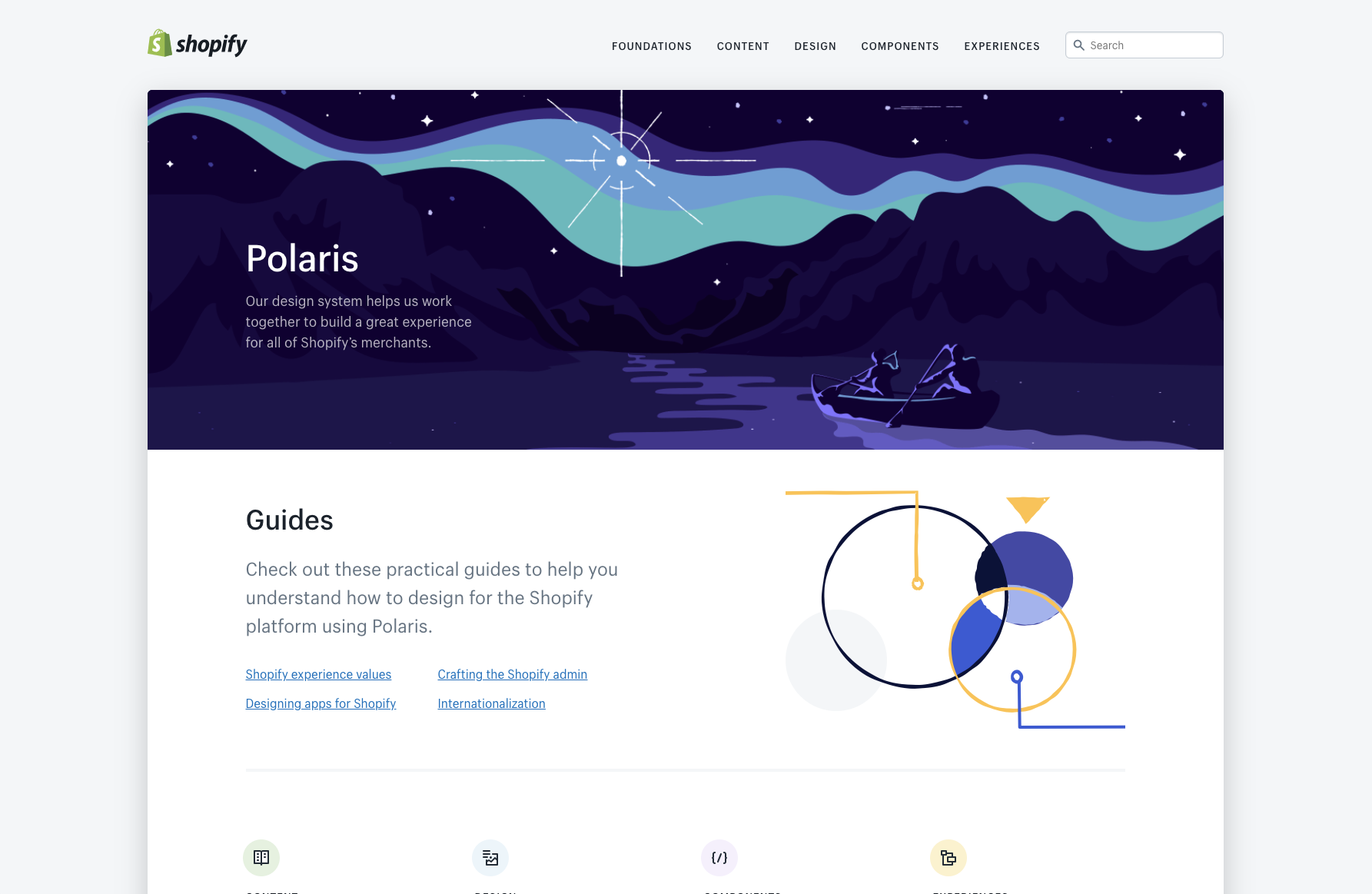 Shopify Design System
Who they are:
Shopify is an all-in-one e-commerce platform to start, run, and grow a business. It powers over 1,000,000 businesses worldwide.
Their design philosophy
Shopify believes that commerce can be made better for and more accessible to everyone. Their aim is to help people achieve independence by making it easier to start, run, and grow a business. Shopify’s shared values are at the heart of the experiences they build:
- Considerate – Above all else, we show care for the people who use our tools and products
- Empowering – We want people to feel like they can accomplish whatever they’re trying to do.
- Crafted – Shopify experiences should feel like they were created with the highest level of craftsmanship
- Efficient – Shopify experiences should help people achieve their goals quickly, accurately, and with less effort
- Trustworthy – We constantly work to recharge our users’ trust batteries.
- Familiar – We want people to feel comfortable using our products, whether it’s their first time using them or their hundredth
Design system features:
- Colors
- Accessibility
- Resources
- Typography
- Illustrations
- Sounds
- Icons
- Interaction states
- Spacing
- Data visualizations
How you can apply it to your work:
The more obvious way to utilize Shopify’s design system is as a practical guide to help you understand how to design for the Shopify platform. On another level, it provides a wealth of knowledge and inspiration for how to use language, content in design, visual elements and UI components to craft better product experiences for any e-commerce related project. This design system itself is beautifully designed…take note.
👉🏽 You can also download the Shopify Systems for free in the Figma Community

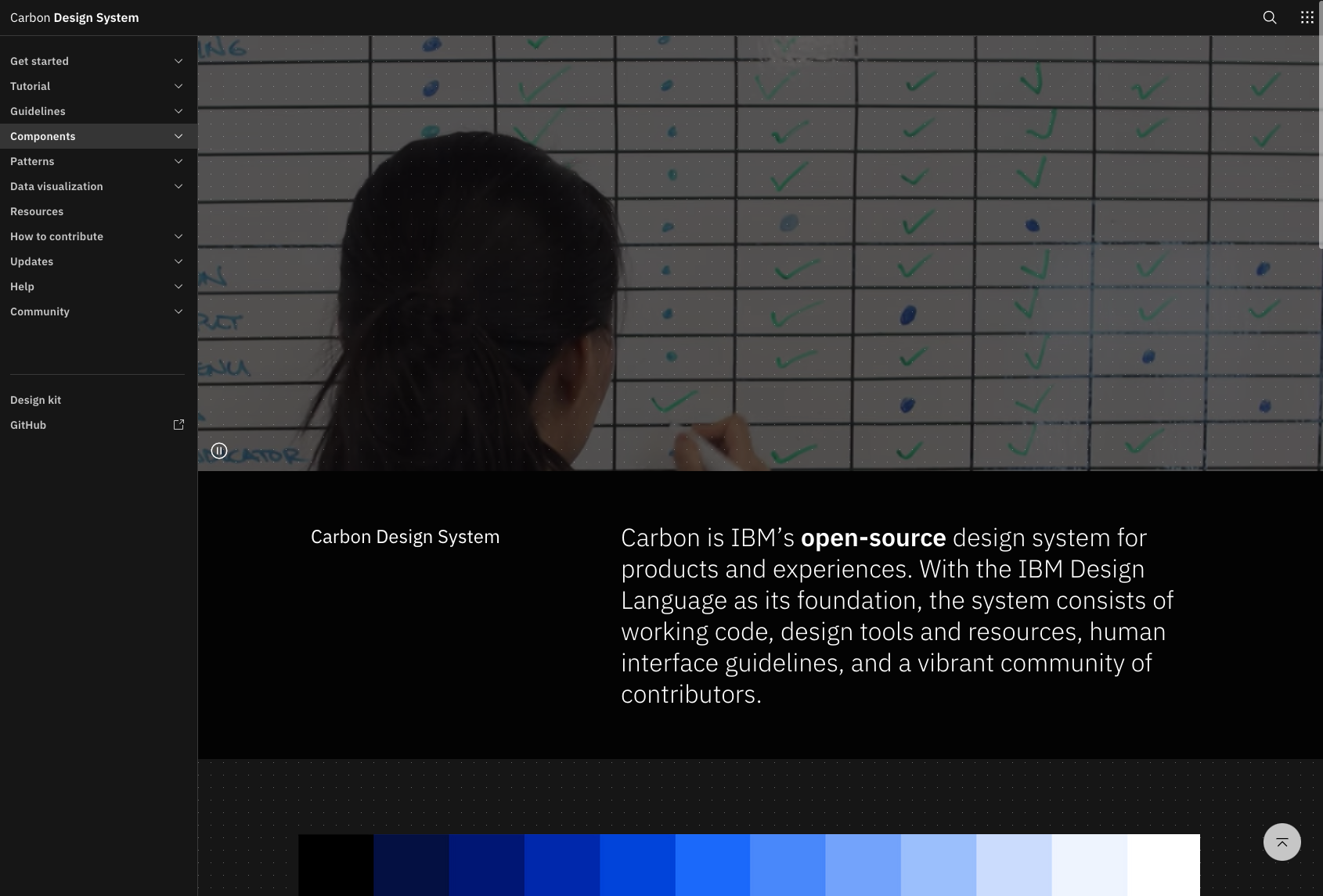 IBM Carbon Design System
Who they are:
Though IBM was once in the personal computing game with Apple and Microsoft, they have since shifted focus to large enterprise IT needs. They offer everything from business consulting to software development services to IT hosting & management, to software products to hardware (servers, mainframes, storage), and even financing.
Their design philosophy
IBMers believe in progress—that by applying intelligence, reason and science they can improve business, society and the human condition. Given their scale and scope, they believe that good design is not just a requirement, it’s a deeper responsibility to the people they serve and the relationships they build.
Design system features:
Carbon tools and resources include design files for Sketch, Axure and Adobe XD as well as resources for developers.
- Tutorials
- Guidelines
- Components
- Patterns
- Data Visualization
How you can apply it to your work:
If you are working on enterprise systems or large-scale corporate products (internally or externally) Carbon is a massive example of how to do it successfully. You can use this as a guide for how to manipulate heavy data in elegant and digestible ways and present it through compelling visualizations.
👉🏽 You can download the Carbon Design System for free in the Figma Community
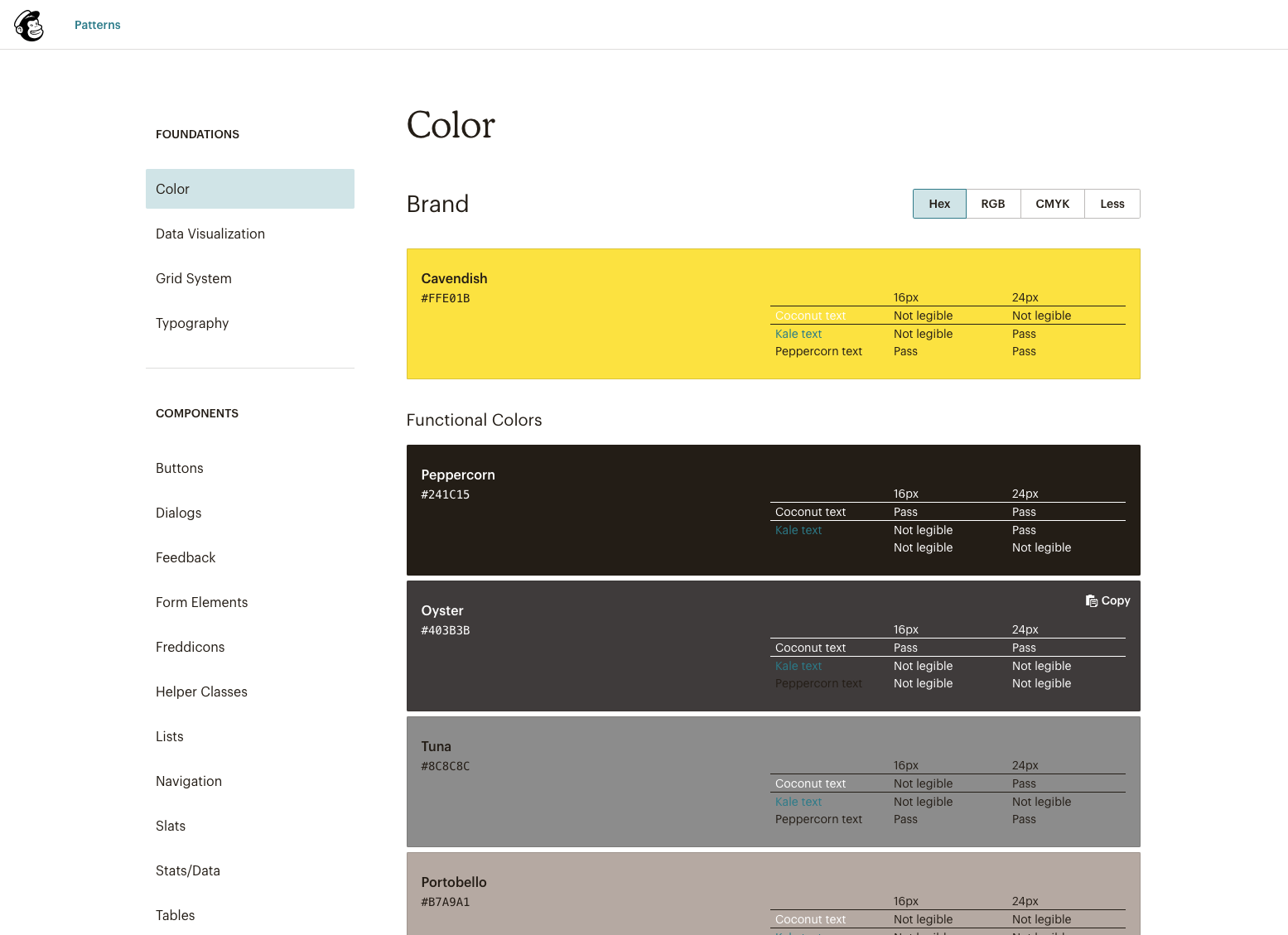 Mailchimp Design System
Who they are:
Having recently updated their branding and identity system, Mailchimp has been a long-time leader in user-friendly email marketing and has grown beyond email into an all-in-one marketing platform for small businesses.
Their design philosophy
Mailchimp empowers businesses to grow while staying true to themselves. Their brand embodies what’s important to the Mailchimp team — a devotion to craft, a love of creative expression, and an obsession with quality.
Design system features:
- Color
- Data Visualization
- Grid System
- Typography
- Components
How you can apply it to your work:
If you’re working on a project in the realm of email, marketing, business, strategy or ads, Mailchimp can provide some useful tips and examples of how to do it right while still pushing the boundaries of expression and creativity. There are many innovative design ideas to pull from and ways to make complex tasks (such as creating automated email campaigns and newsletters); normally relegated to power users, marketing gurus or tech-savvy individuals, more accessible through approachable and intuitive UX.
👉🏽 You can download the Carbon Design System for free in the Figma Community
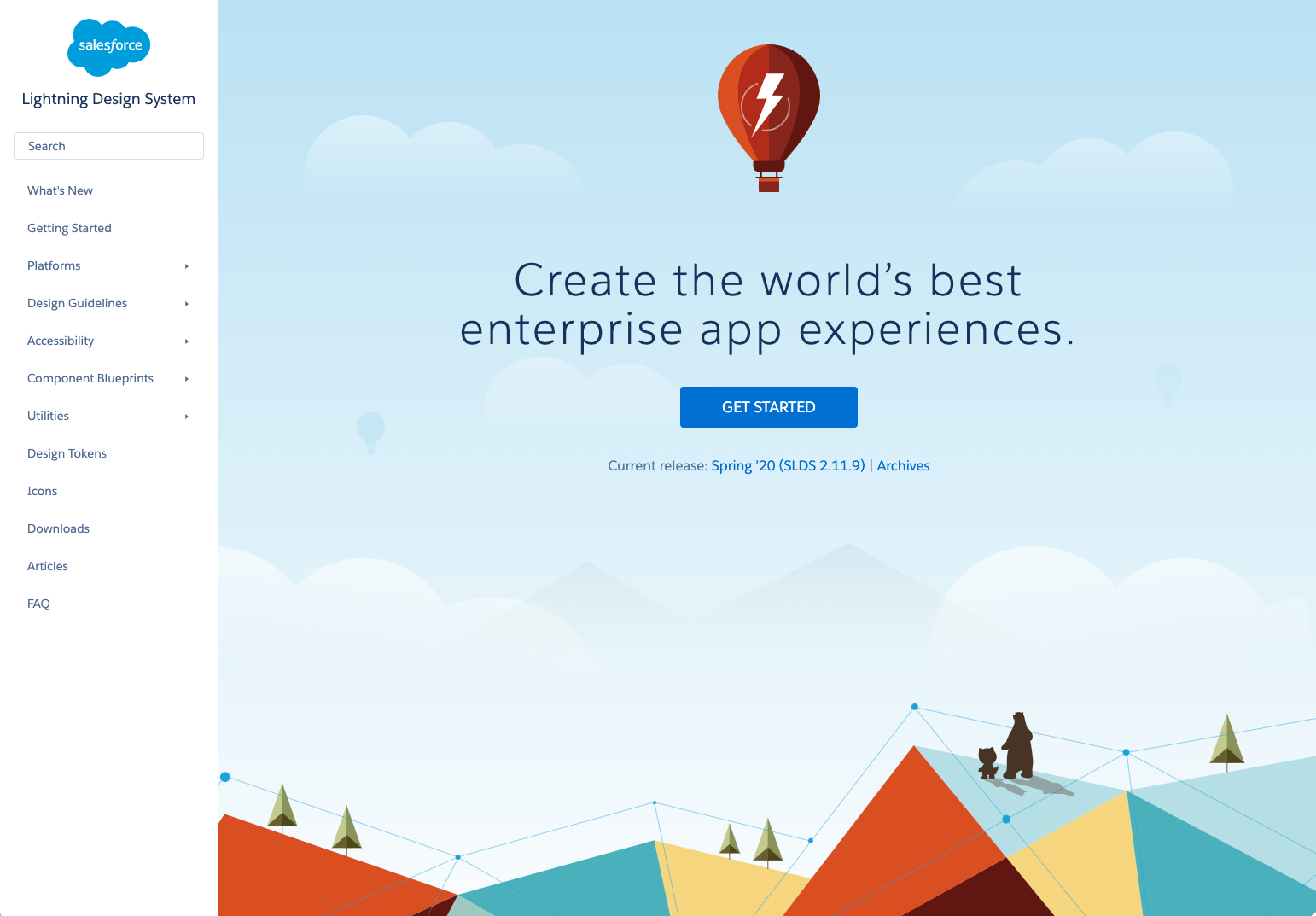 Salesforce Lightning Design System
Who they are:
Salesforce pioneered cloud-based CRM software and has helped 150,000+ companies run more effectively they deliver personalized experiences to your customers through integrated CRM that enhances marketing, sales, commerce, service, IT, and more.
Their design philosophy
Ohana is the Hawaiian word for intentional family, and is what drives their company culture. Their 4 core values which serve as the foundation for their decisions, actions, and communication are:
- Trust
- Customer Success
- Innovation
- Equality
Design system features:
- Platforms
- Design Guidelines
- Accessibility
- Components (lots of them!)
How you can apply it to your work:
If you are working on content management systems, AI, sales, commerce or analytics platforms that focus heavily on user experience, interactions, and flows you would be wise to look towards the trailblazers themselves for inspiration and guiding principles.
👉🏽 You can download the Salesforce Design System for free in the Figma Community
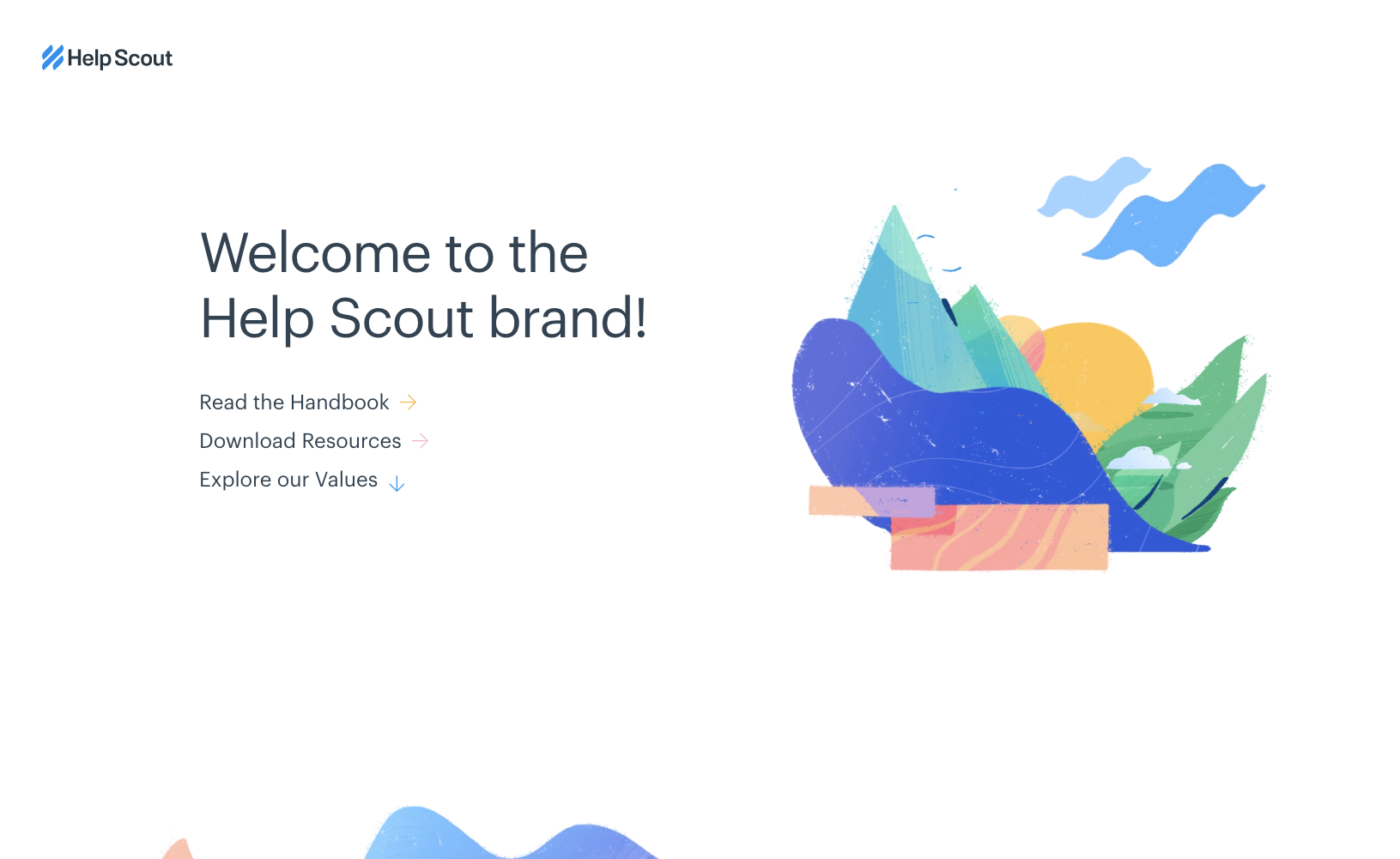
Who they are:
Help Scout is online support ticketing at its finest. Carefully crafted for a great customer experience, none of the typical help desk obstructions exist. All their efforts go into making software that gives teams the scale and efficiency of a help desk, but with a seamless customer experience.
Their design philosophy
- Brand Values
- Helpful
- Trustworthy
- Human & Organic
- Energetic
- Curious
Design system features:
One of the smaller yet beautifully designed systems, HelpScout and it’s broken down into 3 main sections:
- Visual Elements
- Content Style
- Product Design
How you can apply it to your work:
Great for your work involving help desks, ticket submission systems, knowledge bases, FAQs, wikis and support forums.
Bonus 11. US Web Design Government Design System
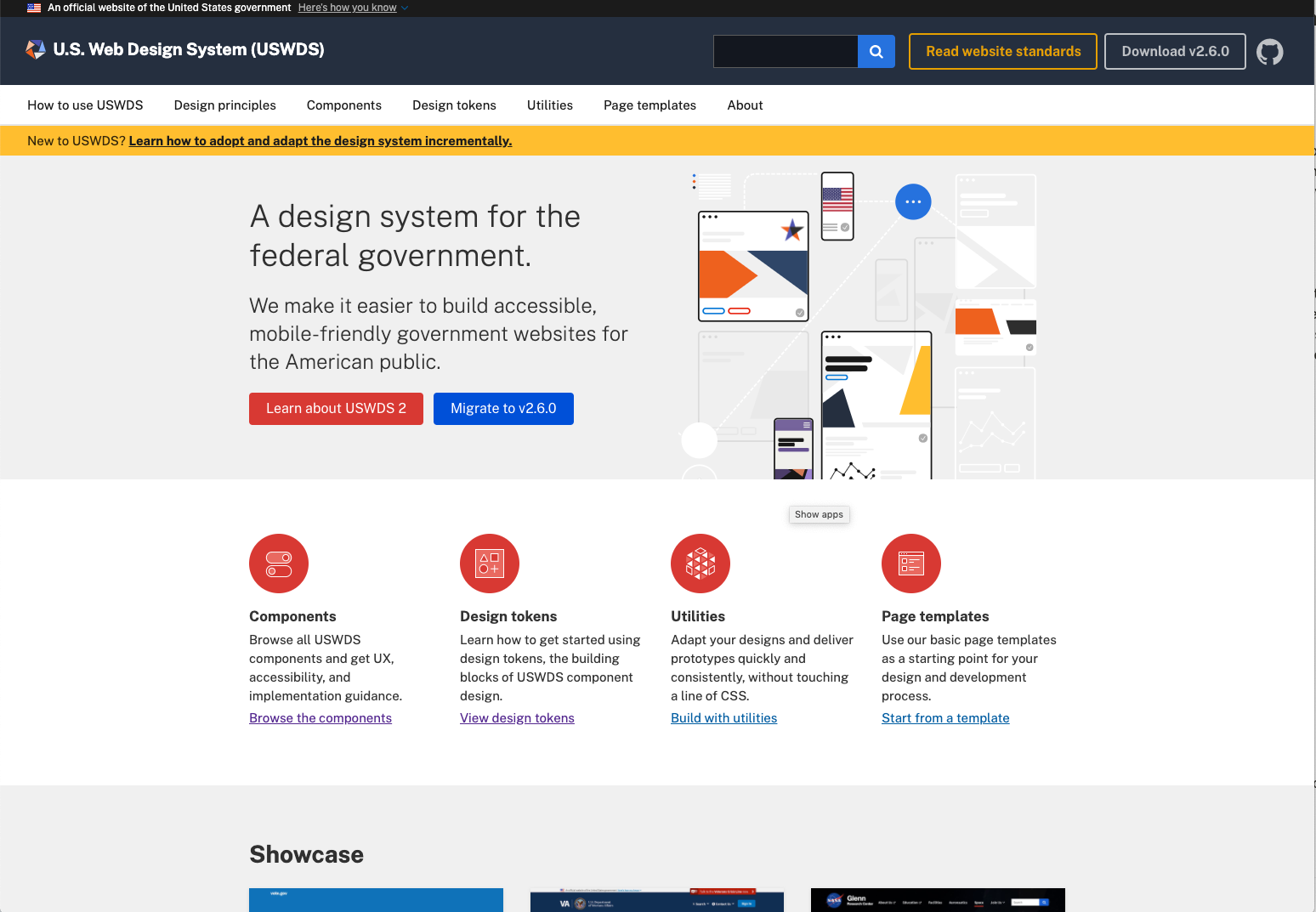 US Web Design Government Design System
Who they are:
Not the most glamorous of design systems, but believe it or not the U.S government actually has design principles and guidelines for their online touch-points! Not to be underestimated or understated, government websites (probably more than any other) touch every single one of us and while many have a long way to go in terms of improving UX, it’s nice to know that some focus is being put into the development of this sector.
Their design philosophy
They believe that real user needs should inform product decisions. Whether their audience includes members of the public or government employees, decision-makers must include real people in our design process from the beginning and test the assumptions they make and the products and services they build with real people, to keep them focused on what is most useful and important.
- Start with real users
- Earn Trust
- Embrace accessibility
- Promote continuity
- Listen
Design system features:
- Components
- Design Tokens
- Utilities
- Page Templates
How you can apply it to your work:
If you are working on a system that mostly focuses on forms, fields, inputs, tables white papers and links this is the system to refer to!
“It’s not where you take things from—it’s where you take them to.”
—Dash Shaw
So those are our choices for top design systems and what you can learn from them. Hopefully, this will have you seeing them in a new light; as learning tools and resources to help you understand UI, UX and product design better and give you inspiration when applying it to your own work.
📚 If you’re interested in learning the end-to-end process of UX/UI and product design come learn with us in our Product Design Course!
Quotes from the book Steal Like an Artist by Austin Kleon
