11 Outstanding Examples for Creating a Digital Art Portfolio
Don’t miss out on job opportunities and commissions because of a forgettable portfolio. Get started with inspiring examples, learn why they work, and follow our step-by-step guide to make your own digital art website today.
CONTENT

Mục lục bài viết
11 Digital Art Portfolio Examples with Pro Tips
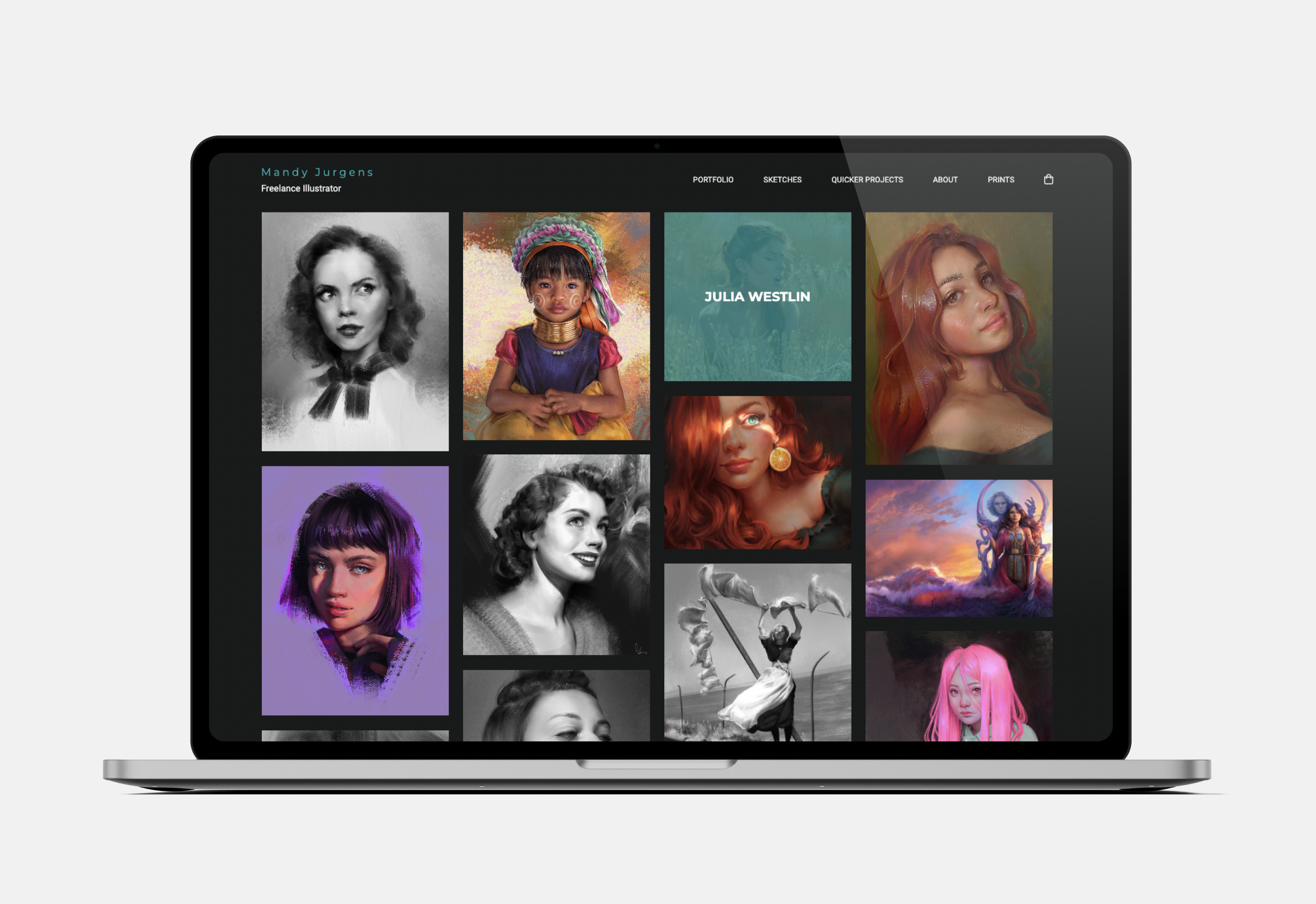
Mandy uses a classic portfolio format. Her digital paintings are displayed in a neatly ordered grid view. The black background makes her vibrant images pop. The navigation menu is easily accessible at the top, with clear categories and a print shop.
Pro tip: having an online portfolio enables you to have a web store that can be easily accessed.
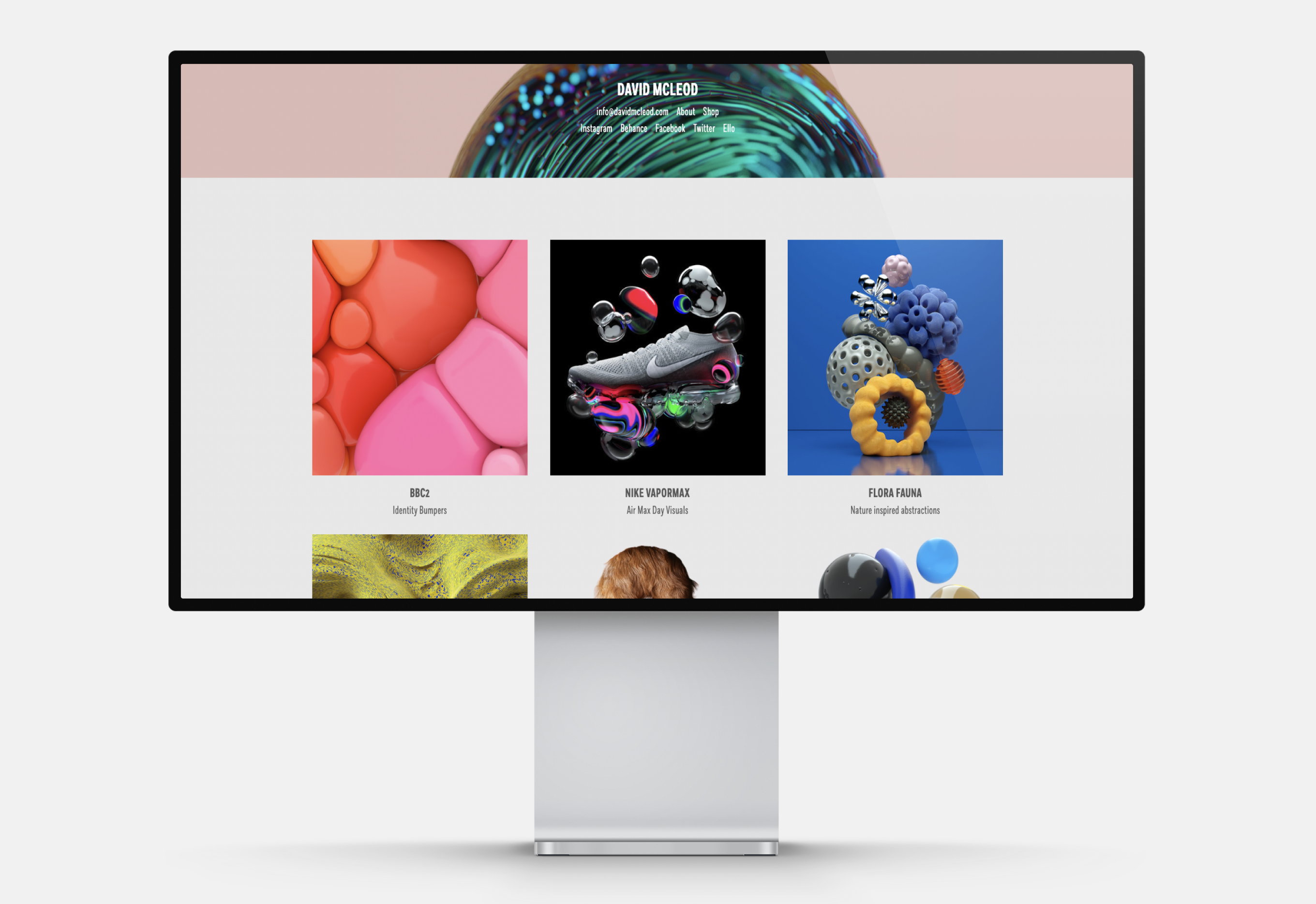
David presents his CG art using a statement header accompanied by a slideshow. His portfolio mainly showcases client projects ranging from identity updates to campaign visuals. The tiles in his portfolio are evenly spaced and have clear and concise labels.
Pro tip: allow your portfolio to breathe. Mind the spacing of your artworks so you don’t visually overwhelm the viewer.
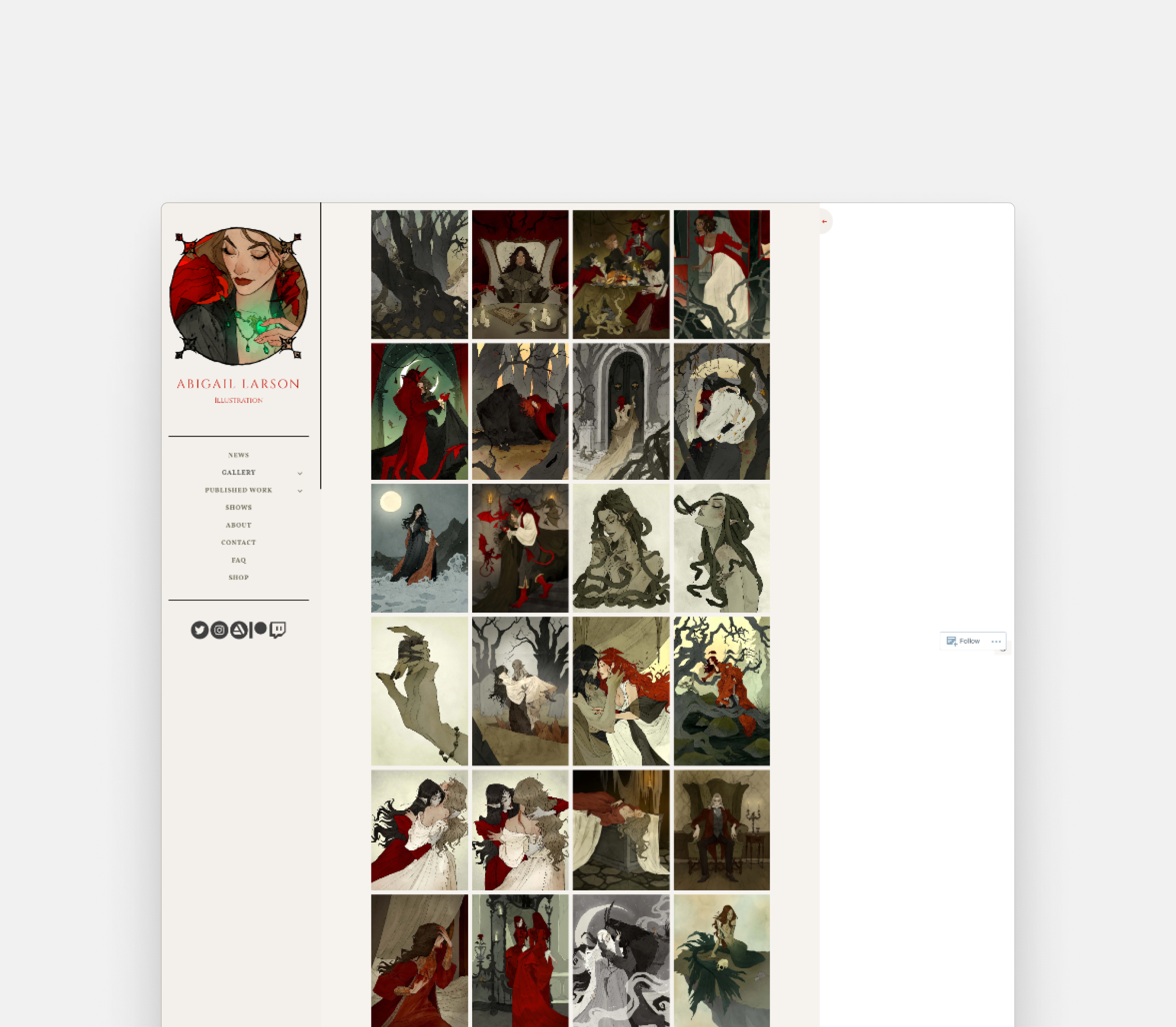
Abigail opts for a beige background to create a striking contrast with the deep, vivid hues of her digital drawings. She includes a sidebar for effortless navigation, and the font selection perfectly complements her aesthetic style.
Pro tip: Abigail’s site incorporates a digital illustrator and graphic design portfolio in one. If you also have graphic design experience, make sure to feature it.
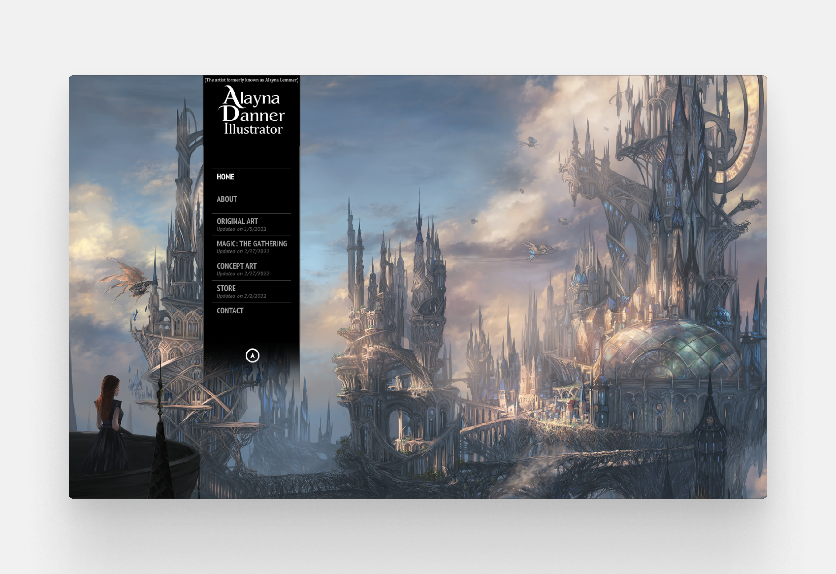
Alayna’s epic fantasy concept art deserves an impactful portfolio. The full-screen background displays a slideshow of her award-winning work, which can be accessed from the sidebar. Social media icons pop up when you interact with a menu item.
Pro tip: make your portfolio more interactive by using state animations.
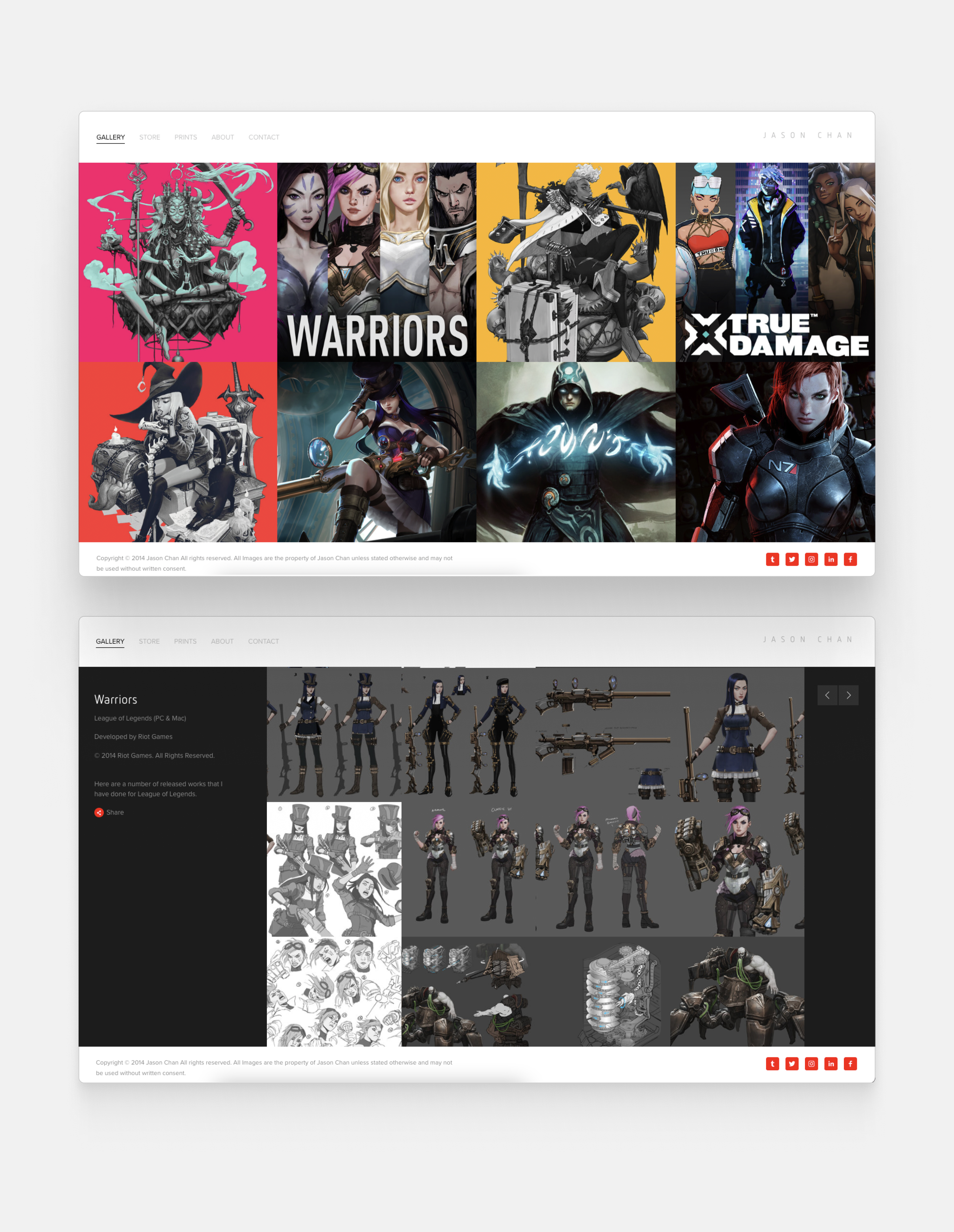
Jason is a principal visual development artist at Riot Games with a lot of projects to showcase. You can learn more about his work by interacting with the tiles. The images that pop up are linked to Pinterest, so you can save your favourite images.
Pro tip: reposting is a great concern for digital artists. Having an online portfolio establishes you as the rightful owner of your work and can offer extra protection from art theft.

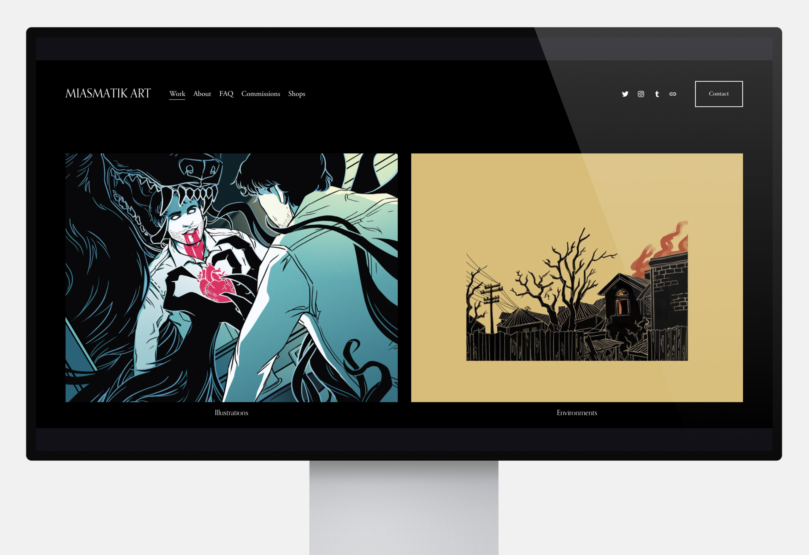
This horror-centric portfolio uses a dark background and boldly displayed, vibrant images. The about me page contains an impressive list of published fanzines and conventions MK has attended.
Pro tip: don’t be afraid to feature fanart in your portfolio. Be honest about your inspiration but make sure that the message is easy to understand for a non-fannish audience.
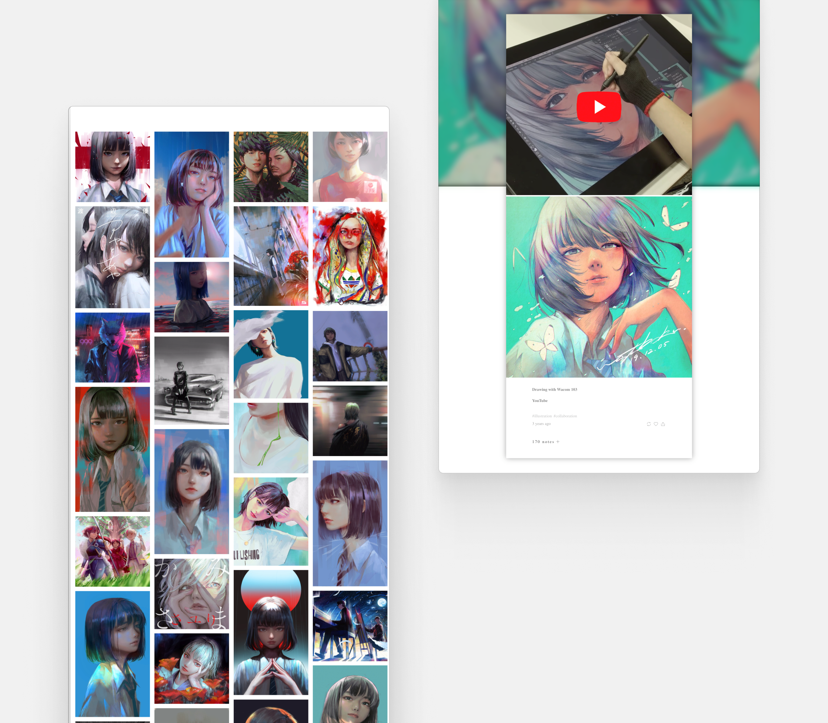
Wataboku’s portfolio uses tumblr embeds, so his art is instantly rebloggable. On top of stunning digital art, he also features progress videos to give us a glimpse into his intricate process.
Pro tip: increase your visibility with a multimedia approach. Use embeds and videos liberally.
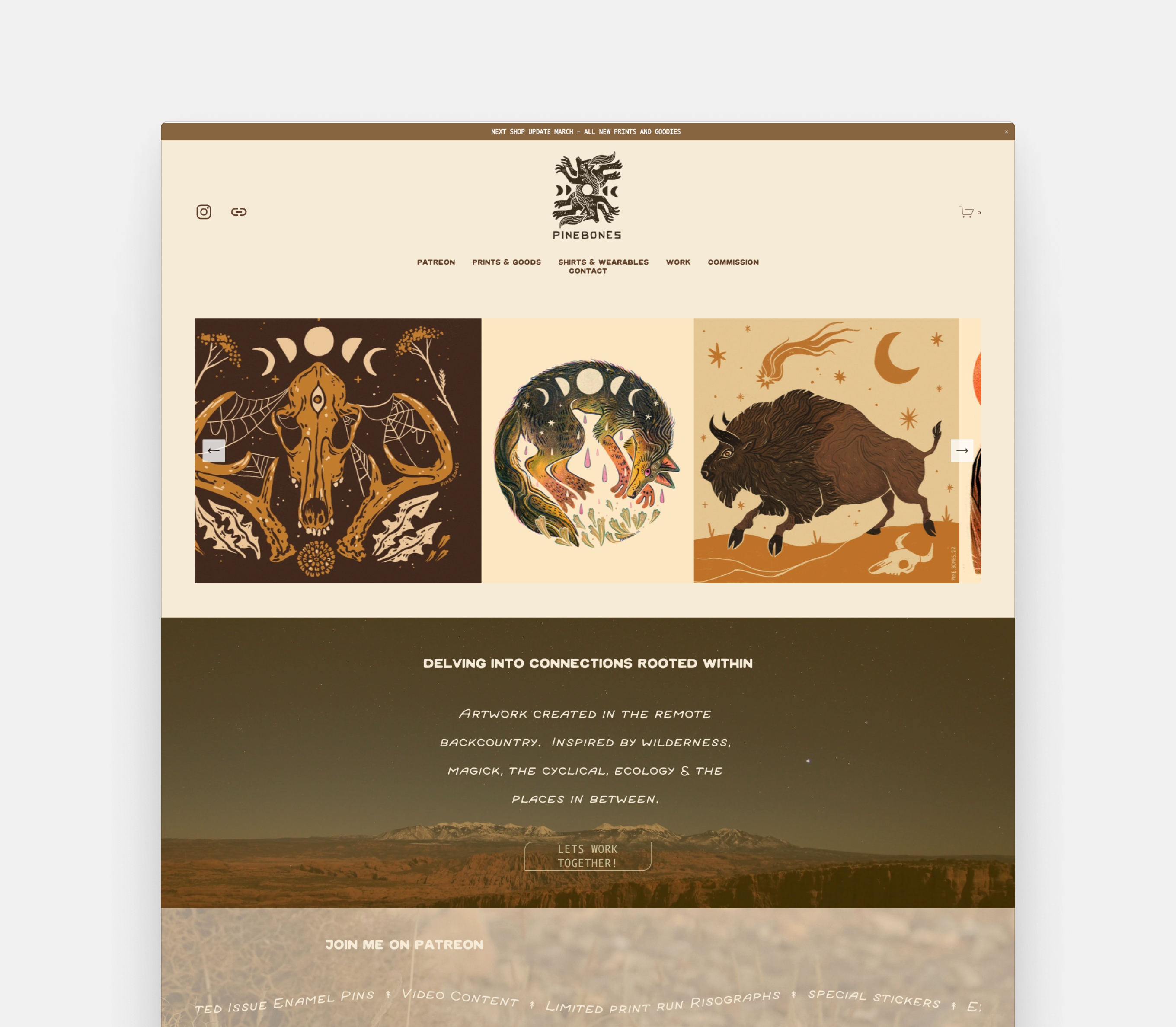
Pine Bone’s nature-inspired portfolio uses warm colors and a carousel view of their work. Magic and wilderness is present everywhere, from font-choice to backdrop photos. The main focus of the portfolio is commercial, prominently linking to the artist’s Patreon, print store, merch, and collaboration services.
Pro tip: if you also work as a freelance illustrator, check out specific tips for creating an illustrator portfolio.
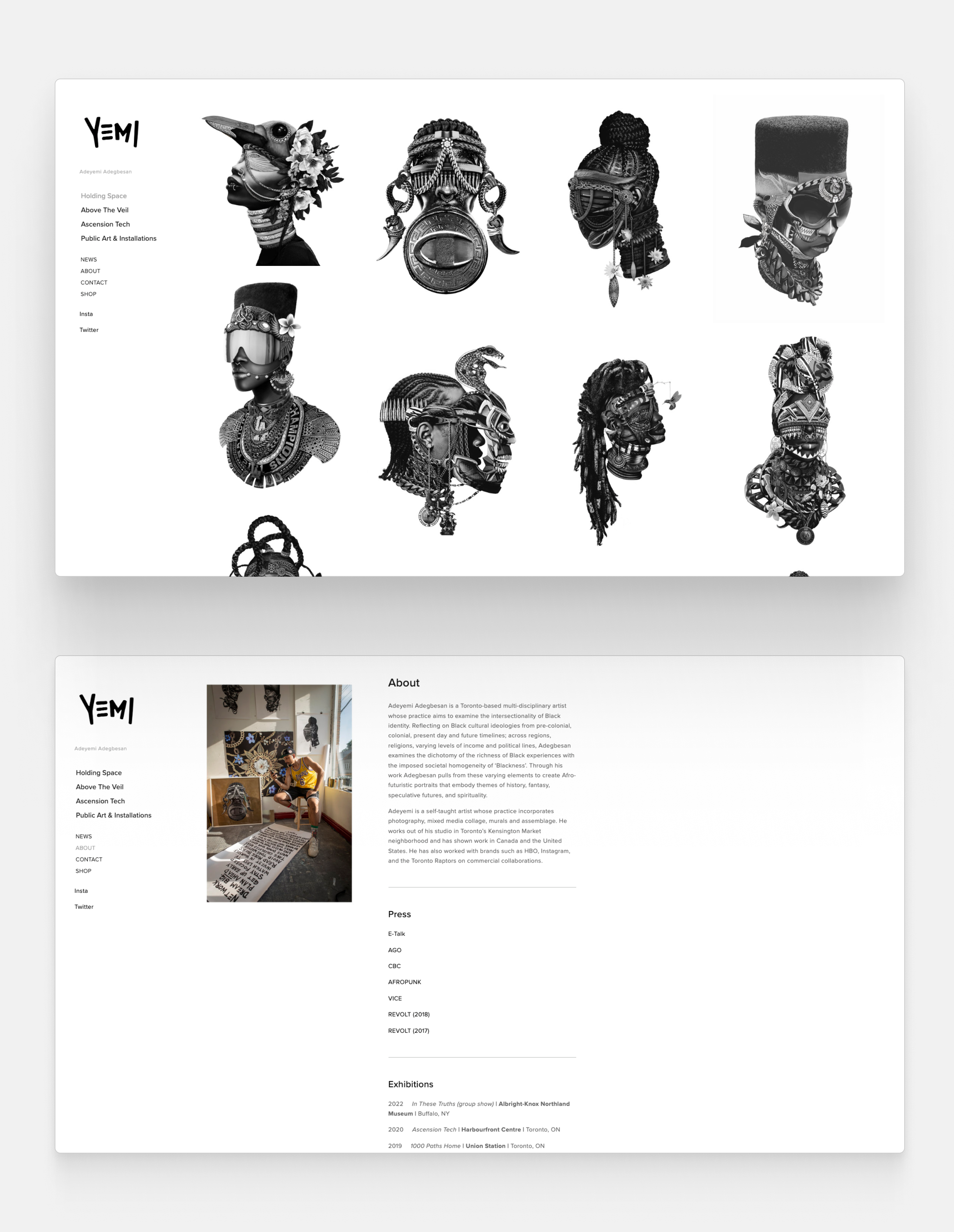
Adeyemi is a multi-disciplinary artist. His portfolio is organized around specific art projects, like the black-and-white Afrofuturistic series titled “Holding Space.” His well-written bio lists exhibitions, press appearances and commercial collaborations.
Pro tip: increase your visibility both online and offline. Stay in touch with your local art community and look for chances to exhibit your artwork to a broader audience.
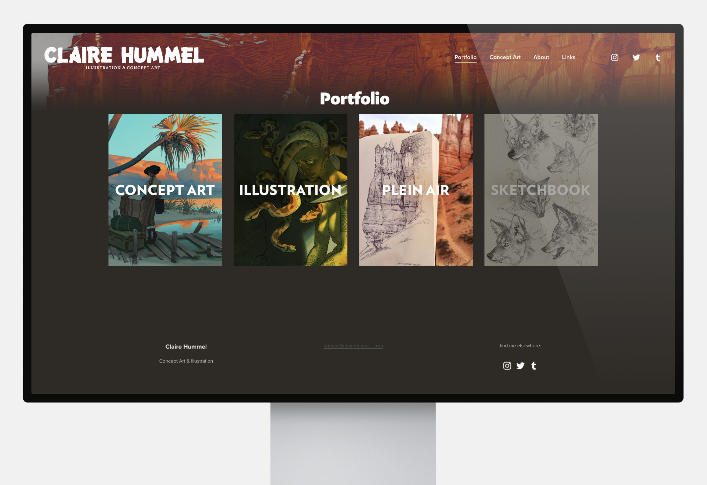
Claire is a well-known art director, concept artist and illustrator. Her portfolio features a mix of digital and traditional art. She drew her own backgrounds, which adds a special personal touch to her portfolio.
Pro tip: interested in art direction? Learn more about art director portfolios with career tips.
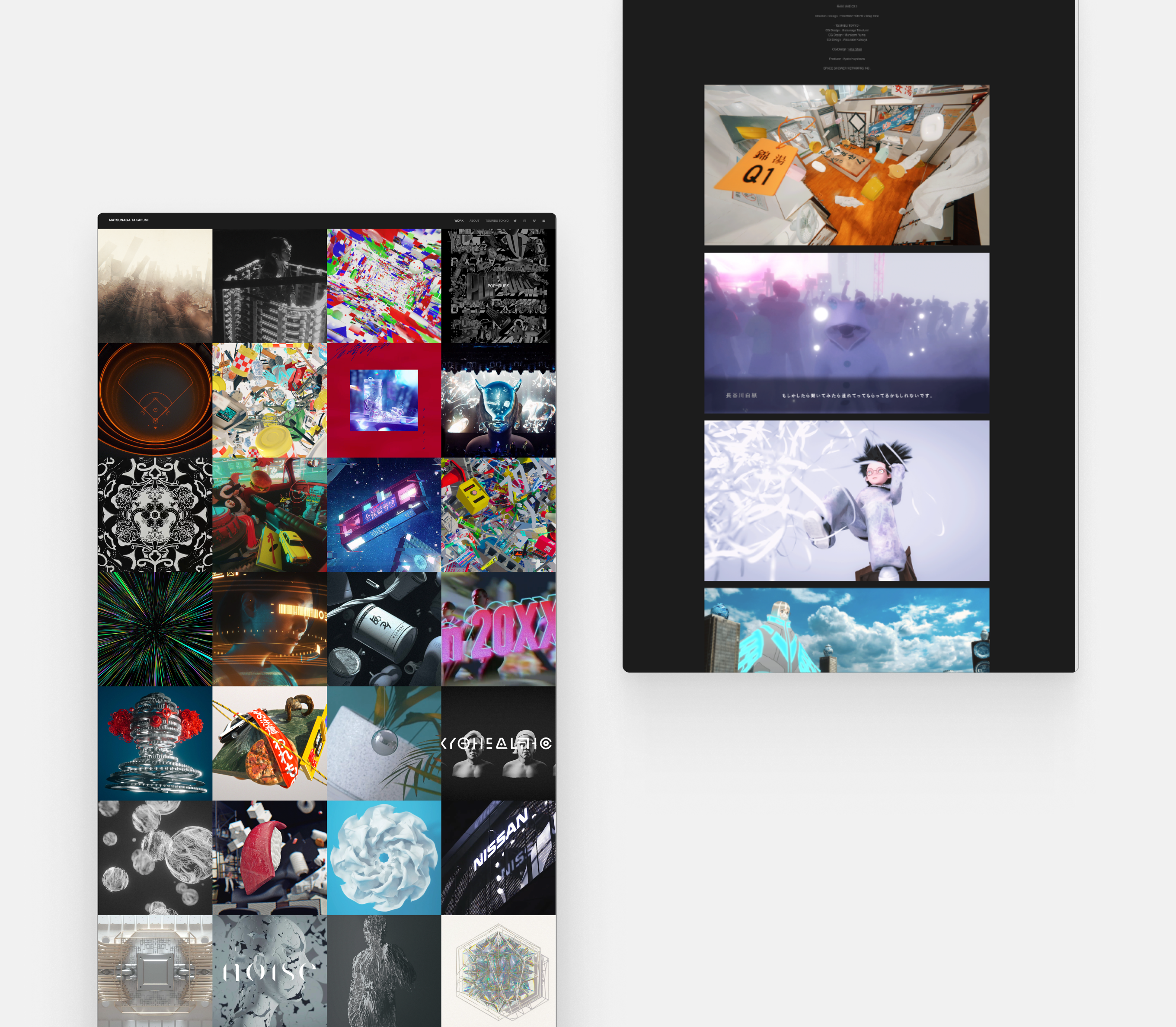
Matsaguna is a visual designer with a portfolio that includes movie clips, music videos, installations and digital art. Clicking on the tiles reveal detailed project descriptions and more images for a comprehensive look at his work.
Pro tip: your project description should include the title, date, and medium. Additionally, you can talk about the process, the techniques used, your direction and inspiration.

How to Make a Digital Art Portfolio in 8 Easy Steps
Here’s how you can establish credibility and increase your visibility with a portfolio that showcases your unique style and skills:
-
Define what type of portfolio you need
There are four main types of digital art portfolios. Think about your portfolio’s ultimate purpose and target audience, and select the one that works best for you.
1. General portfolio
A general portfolio should be a versatile collection of your work and projects with the goal to give a full overview of your skills and development as an artist. This one-size-fits-all approach is great if you’re an established artist looking to develop your personal brand. You can get creative with the layout. A grid view with labels helps you showcase a vast array of art.
Example: Mandy Jurgens
2. Career portfolio
A career portfolio is a more curated collection of your art with the specific purpose to land you a new job, a new client, or to establish your authority within the field of digital art. The layout should be sleek and professional, and a bio with contact information is essential.
Example: Claire Hummel.

3. College portfolio
A college portfolio should follow the specific requirements of the college you are applying to. Expect strict limitations on the number and type of artworks. Your artwork should include finished pieces and process work featuring various techniques.
The layout must be text-friendly, so you can describe the date and medium of each artwork included. Instead of a CV, include academic achievements, internships and extracurricular activities. Besides your portfolio, you’ll likely have to attach a cover letter for your application.
Example: Ross Draws
4. Project portfolio
A project portfolio is great for artists who want to showcase their ability to work on a specific project or collaborate with others on a shared creative vision. Include case studies of past work experience, testimonials from clients or milestone achievements.
Example: David McLeod

2. Choose a platform that works for you
1. PDF/slides
Many artists default to creating their own portfolio in their preferred design program. While it gives you unparalleled flexibility, the downside is that you’ll have to constantly update the file. Sharing it may also be difficult due to file limitations.
2. Social media
You probably already have a dedicated account for your art on Tumblr, Instagram or Twitter. It may be tempting to use it as a portfolio, but it’s a bad idea. Social media is not considered professional, unless you specifically want to work in this field. It’s hard to curate, and your statistics will determine the worth of your work. Also, you’ll need to compromise the quality of your images and they’ll show up chronologically.

3. Art platform
Art platforms, such as Pixiv, Art Station or Deviant Art are a better choice for artists, since the image quality is better and curation is easier. However, you place yourself right amidst your competition. It’s incredibly difficult to stand out from the crowd.
4. Website
Having your own website gives you total control over how your art is presented. You can have a professional portfolio at your fingertips, pull it up and edit it any time you need. It gives you e-commerce opportunities and can sell merch directly. What’s more, a website increases your visibility, credibility and professional branding. With some clever marketing, you can even make it to the top of the search result page.

5. Select and organize your best work
Selecting which artwork to include in your portfolio is like pulling teeth. Consider the following criteria:
- Cohesion. Browsing your portfolio should feel like visiting an art exhibition. Select artworks that rhyme. A color theme, motif, message or idea can give resonance to your pieces.
- Quality. If you don’t have a high-res version of your art, you need to scrap it from your portfolio.
- Versatility. Don’t reduce yourself to one theme or technique. Include a mix of old and new work, and pieces that demonstrate a range of skills and styles. If you’re out of ideas, get creative with subject matter, lighting, shading and brushes.
- Relevance. Don’t forget the purpose of your portfolio. Include pieces that your target audience wants to see.
- Quantity. Keep your portfolio focused and manageable with well-selected artworks.
- Beginner artists: include at least 5-10 pieces in your portfolio.
- Experienced artists: if you are an experienced artist with a larger body of work, aim to include 15-20 pieces in your portfolio.
- Specialized artists: If you specialize in a particular style or medium, you may want to include a smaller number of pieces that showcase your expertise in that area. For example, if you are a digital painter, you may only need to include 5-7 pieces that demonstrate your proficiency with digital painting techniques.
6. Mind the structure and organization
Portfolios must include the following three things:
- Artwork. Usually accessible from the landing page, your portfolio can showcase a variety of artworks, including personal projects, commissioned work, and collaborations. Provide information about the pieces using labeling and descriptions.
- About me page. The purpose of your about me page is to show the artist behind the art. For a professional portfolio, focus on your education, work experience and accomplishments. If you have a wider target audience, you can get personal and write about your inspiration, artistic vision, and the development of your personal style.
- Contact information. Whether you built your portfolio for your clients or your fans, they’ll know where to find you. Have a professional email address and link to social media when relevant

When it comes to organization, we invite you to put on your designer hat.
- Categorize. If you have an abundance of art to show, sort them into categories, from character design and concept art to theme (here be dragons!). Include descriptions or captions to help your audience understand the context of your work.
- Create a clear navigation menu. Your about me page and contact information should be available with a single tap.
- Consider the layout and design. A little bit of UX never hurt nobody. A dedicated portfolio builder like Folioeditor is a big help, because you can choose from professionally designed layouts and customize them to your liking.
- Make it mobile-friendly. If you go with a website builder, you don’t need to think about it too much; but whatever you design, always check how it looks on mobile.

7. Optimize your portfolio for search engines
Drizzle some marketing magic on your portfolio to make it more visible for a bigger audience.
- Use relevant keywords. Think about keywords related to your work and use them in your portfolio, including in the page titles and descriptions. Make sure the placement feels organic. Read the text out loud and revise if you sound like a robot or a broken record.
- Be accessible. Include alt tags that accurately describe the image.
- Link to your portfolio. Link to your portfolio from your social media profiles, blog, and other online platforms to increase visibility and traffic.
- Use analytics. Use tools like Google Analytics to track your website traffic and learn about your audience’s behavior and preferences.
Add new work to your portfolio whenever you create something you’re proud of. This will showcase your current and constantly evolving skills.
This also means saying goodbye to some of your old work that no longer represents you. While they hold sentimental value, only the best of the best belongs to your portfolio.
Whenever you feel unsure, ask for feedback from artists, friends, teachers or coworkers to determine which are your strongest artworks to date.
Besides your artwork, also keep your about me page up to date to showcase recent career highlights.

The easiest way to keep your portfolio up to date is to use a dedicated portfolio builder like Folioeditor. Subscribe to our newsletter for early access!
