38 of the Best Agency Websites

Mục lục bài viết
38 of the Best Agency Websites
When you’re searching for a little inspiration for your next site design, there’s nothing quite like looking at some of the best agency websites around. From marketing firms to advertising agencies to full-service design studios, these creative websites are in a class all their own.
They must not only showcase all the wonderful work an agency has done, but also grab users’ attention to help the business stand out from the crowd. (All things you’re probably hoping to do with your own site!) It’s a difficult feat, but as a designer and a creative, you’re totally capable of designing a unique site of your own.
Ready for a little inspiration? Check out some of the best of the best and browse through these awesome agency websites!
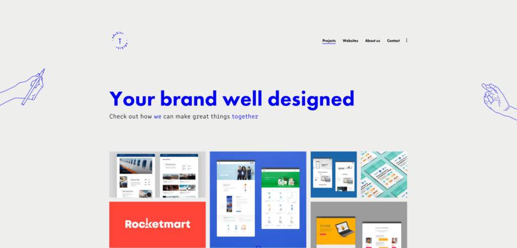
If you’re looking for a beautiful agency website with brilliant branding, you’ll love Adchitects. Their brand colors and iconography styles are present and inviting as you scroll through their work.
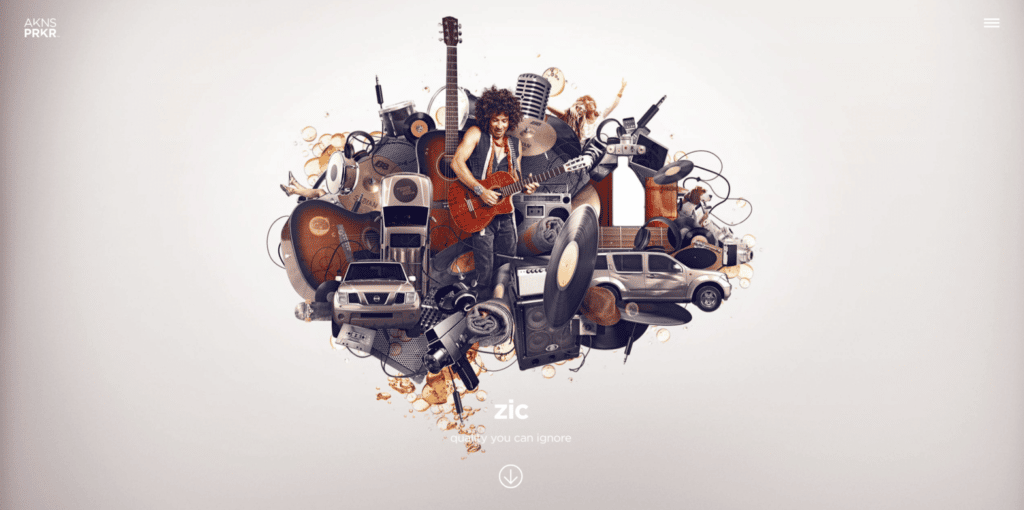
The Akins Parker agency draws you in with their unconventional scrolling and movement as you navigate through their site. Both their written and designed content keep your attention and will have you clicking around for more.
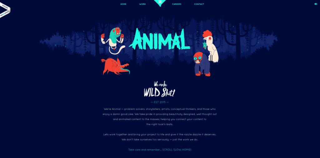
The whimsical animations and responsive design of this agency website are certainly entertaining. ANIMAL’s fun brand shines through in the interactive elements and animations spread throughout every page.
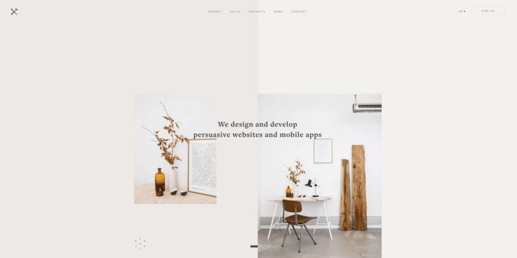
Belle Epoque is a digital agency from Paris that specializes in design, development, and SEO. Their homepage features a unique modular design that really catches the eye right when you hit the page.
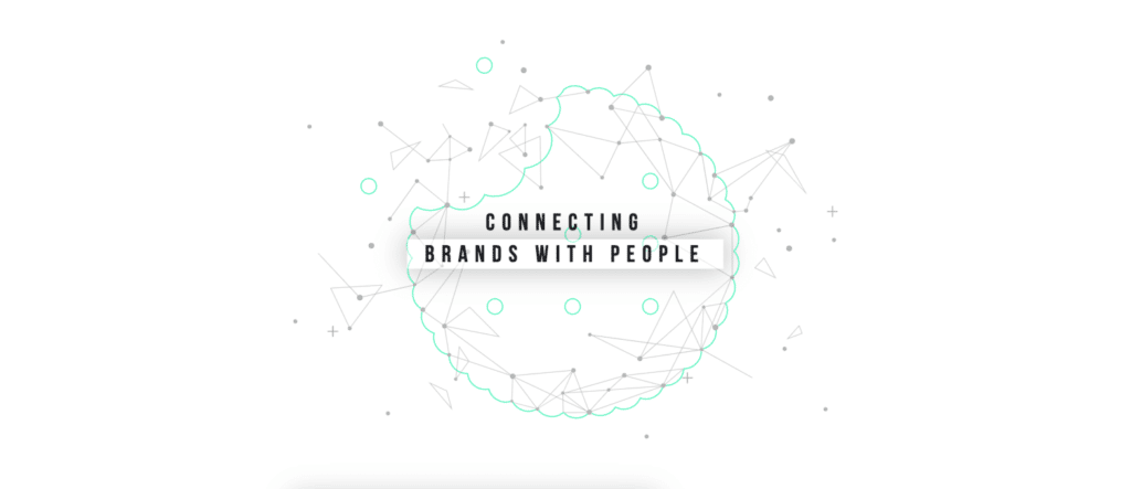
Bite Size Entertainment is a new kind of agency focusing on connecting brands and people. Not only does their website feature an awesome homepage graphic, but it reacts to your mouse for a delightful experience.
Sometimes the best way to show your work is to make it a game. Buzzworthy’s site reveals a beautifully simple and modern design, until you hover over each of their project names in a hide-and-seek fashion.
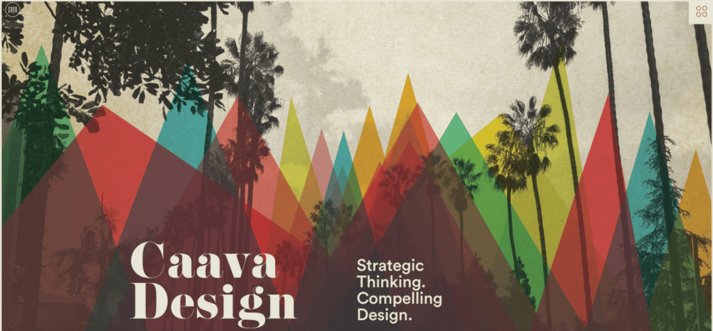
This agency from San Diego, California is all about brand development, interactive solutions, and package design. Their brightly-designed website does a fantastic job at showcasing their variety of projects.
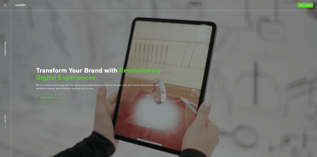
Cemtrex Labs has perhaps one of the cleanest designs on our list, but don’t let it fool you. Their mockups (and fun header animation) make the site informative, inspirational, and impactful.
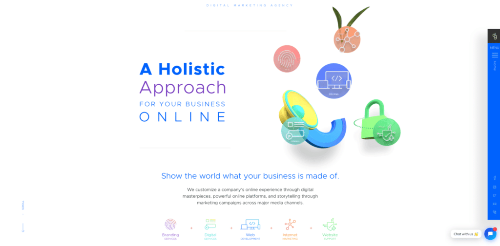
DG Studio sets the tone for their entire site as soon as you land on it. The fun, interactive animation icons in the header tell you two things: one—they are very skilled in design and two—they enjoy and love the work they do.
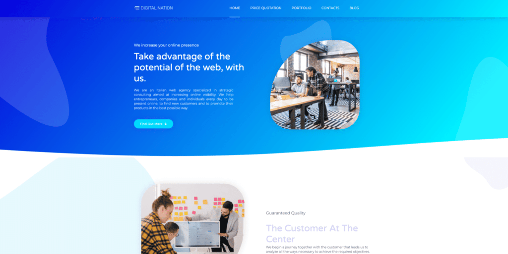
Digital Nation is one awesome website design agency with a mesmerizing homepage animation. With only five items in the menu, their site keeps things super simple and easy for potential clients to navigate.
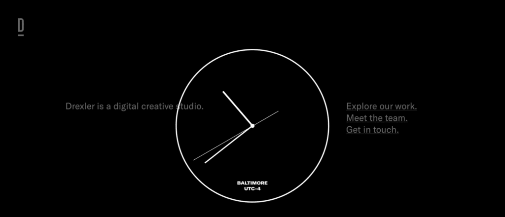
When you click around this agency website, it’s obvious that Drexler had a lot of fun building it. From elements reacting to a mouse hover to a unique way of scrolling and displaying work, this agency truly let their creativity shine on their site.
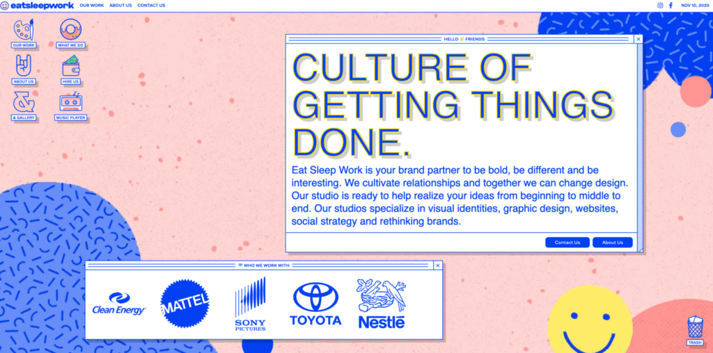
To describe Eat Sleep Work’s site in one word: out of this world. From the crazy cool menu to showcasing the big brands they work with using their own brand components, it’s so well done from the homepage to their contact page.
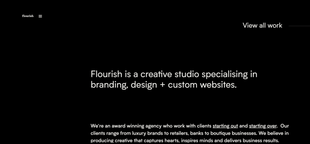
This digital agency is made up of creative thinkers that build strong business. Their homepage launches into a rotating display of some of their work, but it also features an impressive, lesser-used element: a chat box, allowing potential clients to immediately interact with the brand!
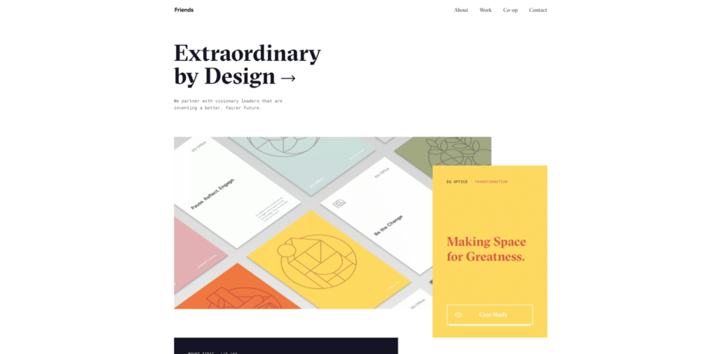
Friends is a design company that collaborates with extraordinary changemakers and organizations of all sizes. Their site may be simple, but it definitely leaves a lasting impression on visitors.
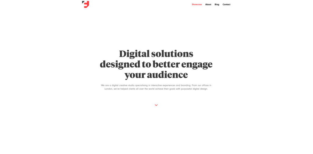
Function & Form is a small creative consultancy that specializes in digital media. They have an awesome website that truly showcases all their different skills, including bold design, 3D elements, and unique scrolling experiences.
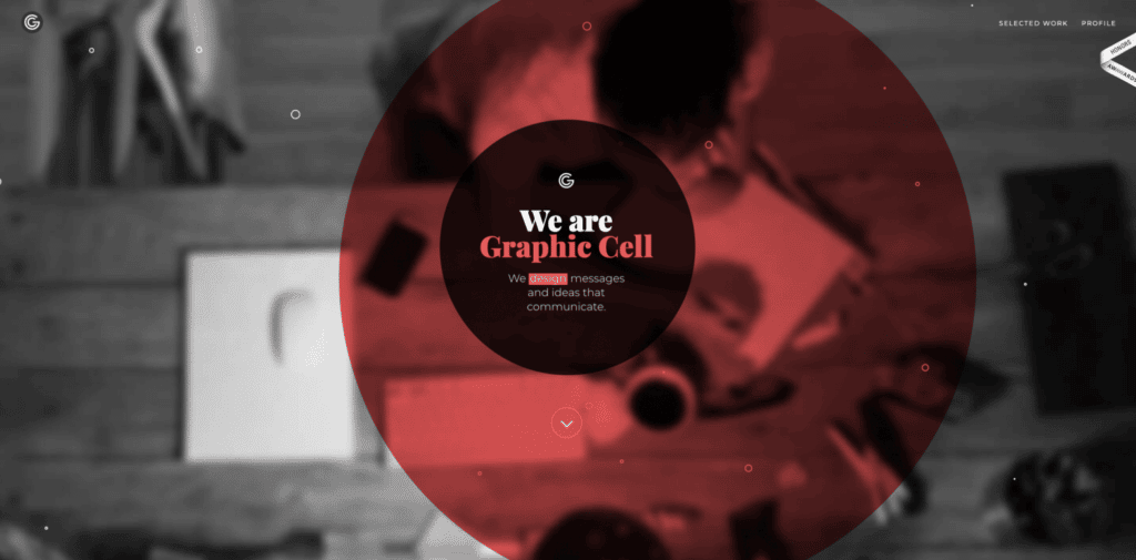
Graphic Cell is a team of content creators who are passionate about strategic design. Their website is a truly cohesive experience with delightful microinteractions (like the floating red ball!) sprinkled throughout.
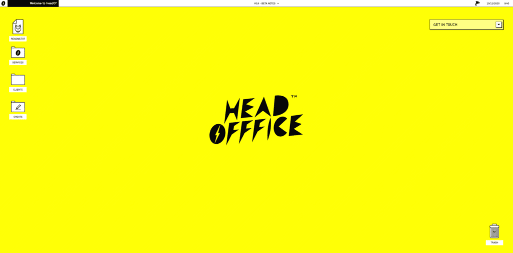
HeadOfffice’s website will take you back a few years in the most enjoyable way. They’re a small but mighty team of designers, developers, and writers with a truly amazing agency website. Be sure to click and drag elements around to fully experience it!
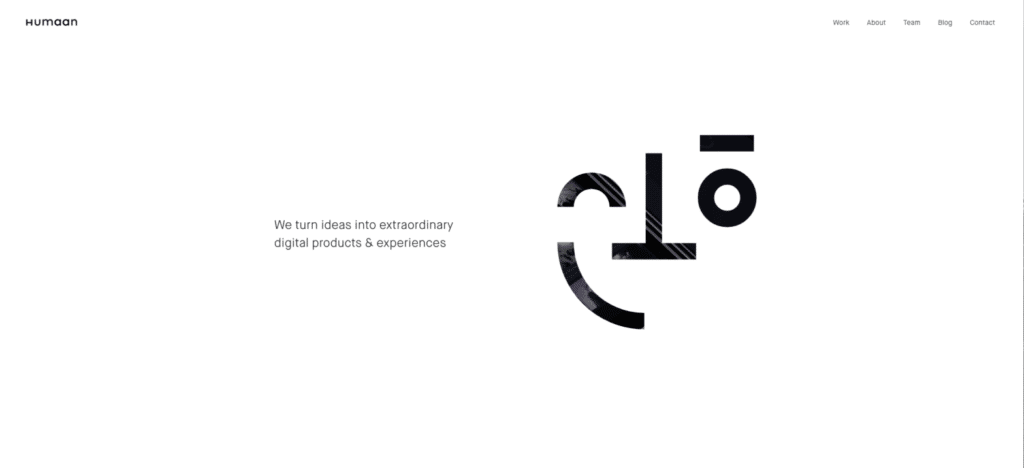
Humaan is a digital agency for human solutions that connects products with real people. With some stellar scrolling animations, their site is a joy to look through.
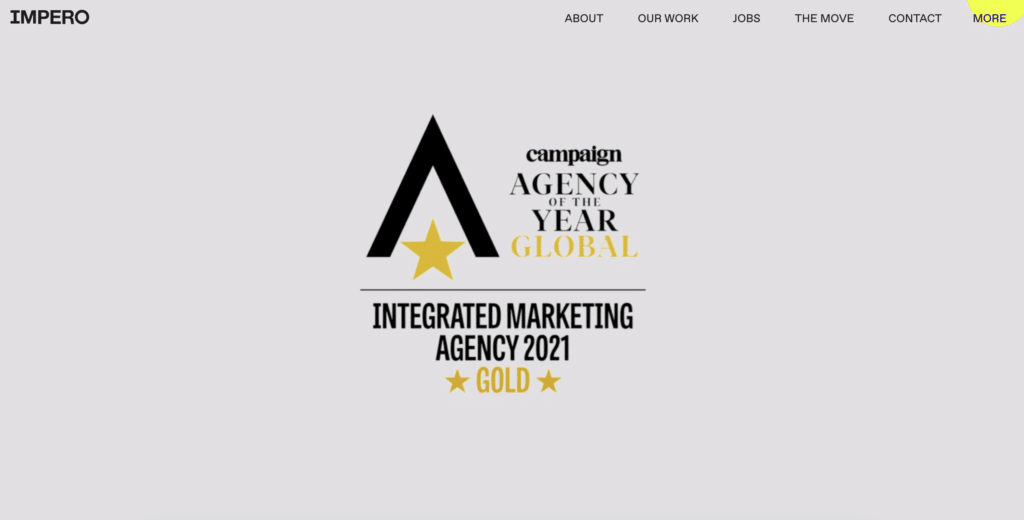
Impero is a social, digital, and creative agency from London whose sole purpose is to revamp tired brands and restore them to their former glory. Their site features strong photography and subtle animations that really give it a powerful impact.
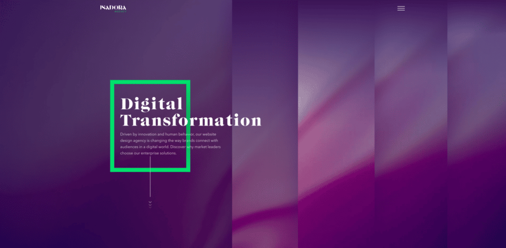
This web design agency from California has a few awards and specialties under its belt. Isadora Agency designed a super clean, informational website that’s filled with beautifully designed color and movement. From the moment you land on their page to when you leave, you’ll be extremely impressed.
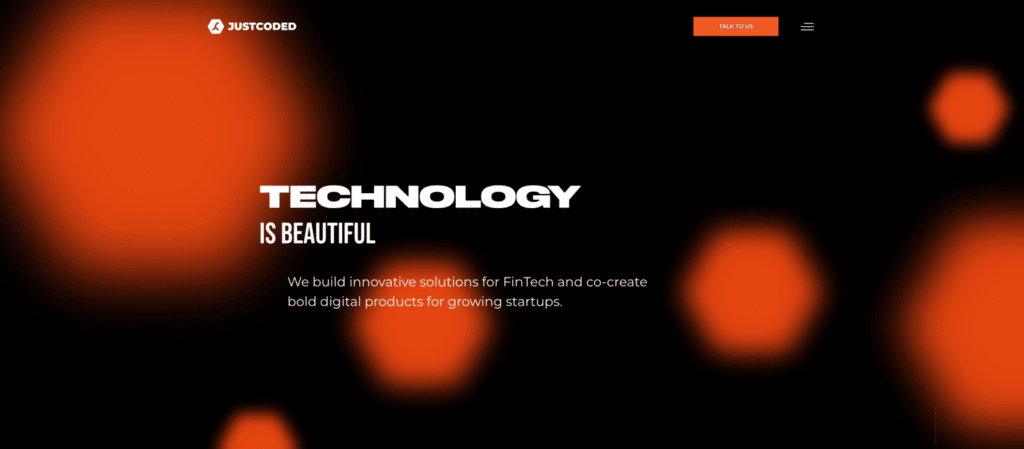
JustCoded is an agency made up of 40+ developers with different specialties in the development industry. Their site is simple, and the interactive elements get right to the point of showing off their strength in web development.
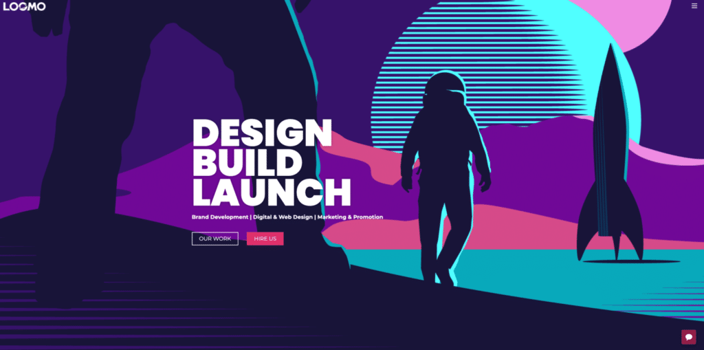
This website is sure to give you an out-of-this-world experience. It’s hard not to love Loomo, with its bright branding and adorable VP of Barketing (yes, you read that right)! You’re guaranteed to find a few whimsical surprises as you explore.
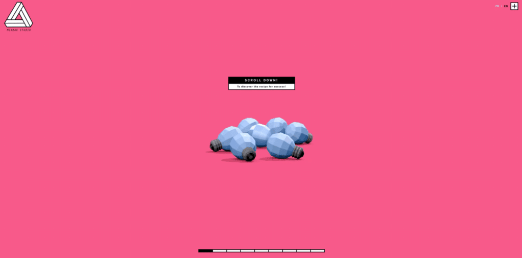
The MIKMAKSTUDIO site is an awesome blend of 2D and 3D elements. They’re a digital communication agency in Paris, and their site does a wonderful job of telling a story through graphics and content.
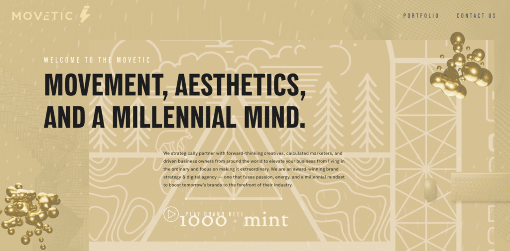
This “millennial-minded” design agency has no shortage of inspiration. Movetic’s energy and drive is apparent through their video-heavy, monochromatic design.
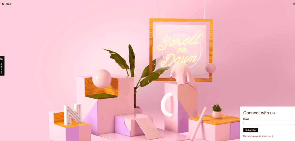
Niika is an agency based in Australia with a bright and colorful website that’s both bold and subtle. Be sure to scroll all the way to the end to catch their brilliant call to action!
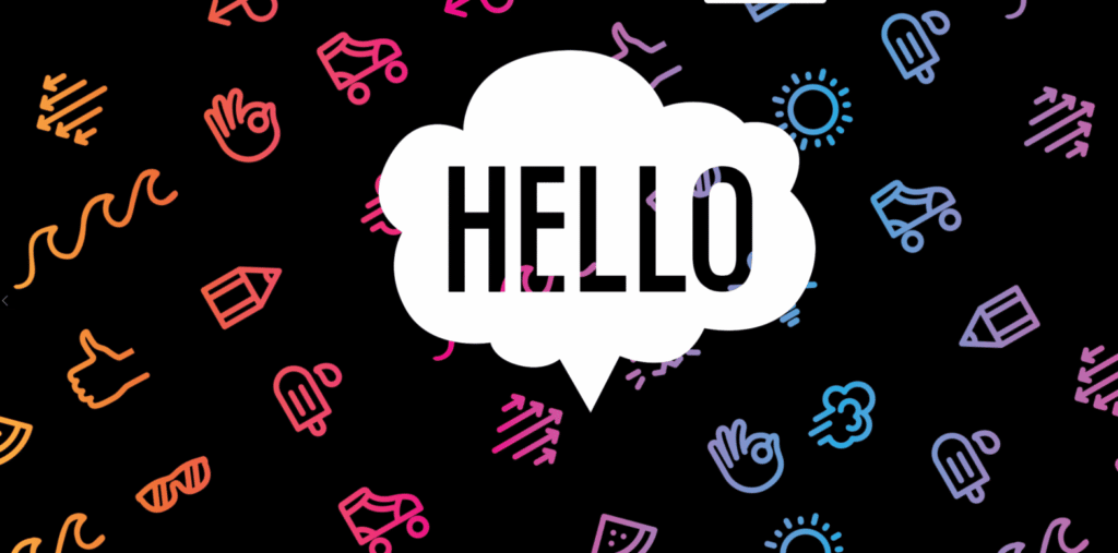
OrangeYouGlad is a graphic design studio with the most delightful homepage. It scrolls through several illustrations and patterns, welcoming you to their site with some super inspiring works of art.
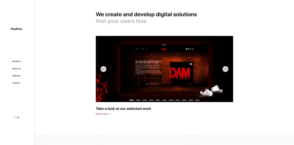
The PixelPink site is a great example of a minimal design that’s still super whimsical. They’re a design studio from Berlin that specializes in interaction design, visual design, and branding.
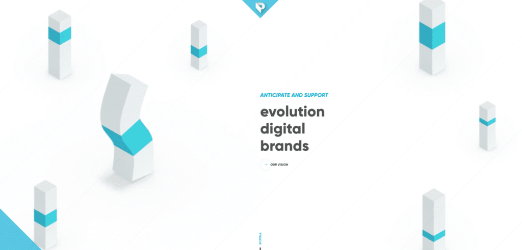
While there aren’t any real puppets here, this French agency brings their simple, meaningful design to life as you scroll through the sections of their website. You might even see some sweet dance moves!
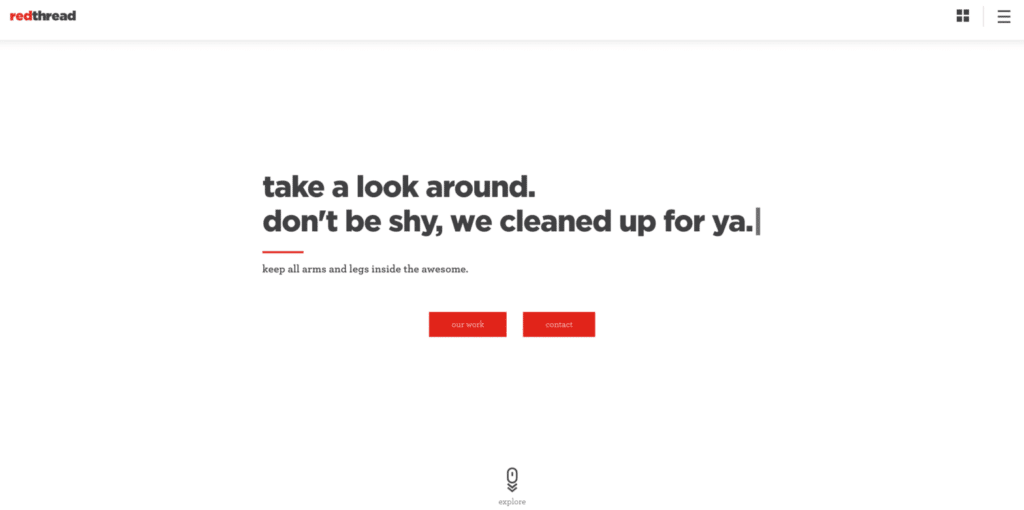
Red Thread’s site isn’t afraid to start “woo-ing” you as soon as you land on their homepage. They have messages that cycle through and switch after a few seconds, enticing you to explore more and stay awhile.
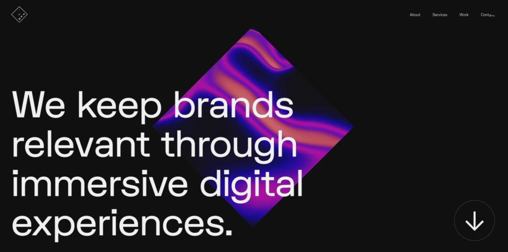
It can be hard to make an original portfolio, but Reflektor has set the bar high with both its design and video reel. You’re sure to crush on the charming content of this interactive agency website!
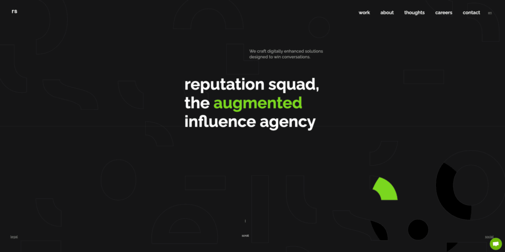
The Reputation Squad website inspires in more than just design, but also in their message and content. This marketing and design agency certainly knows how to craft a brilliant message!
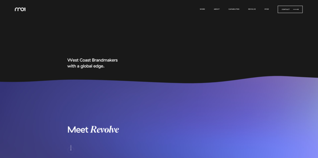
RN01 is a West Coast agency that specializes in branding and digital design and you can tell from their site that they know their stuff. As you scroll, you’ll see visual elements shift, move, and even wave in a satisfying way.
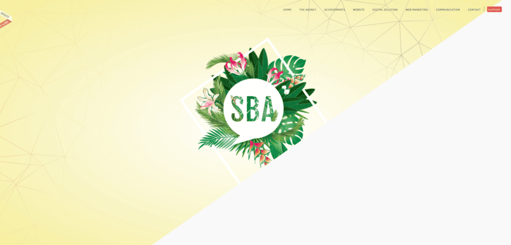
SBA will have you clicking around their agency website for a while with how many new interactive elements and beautiful designs there are throughout their pages. Looking for a different way to show off your team? Check out how SBA did it on the site!
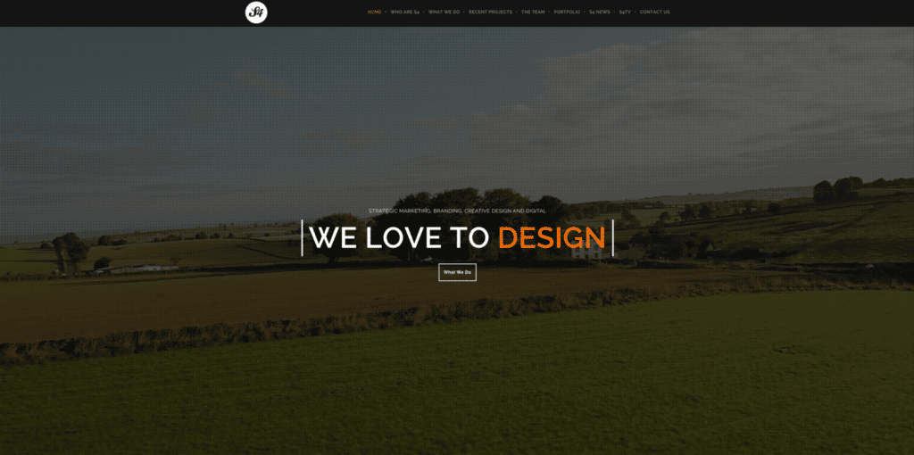
This site features high-quality video reels right in the header of the homepage, an interactive portfolio display, and just a few more interesting content nuggets as you dive deeper into their site. Their tagline is they love to design and their site does an excellent job of showcasing that.
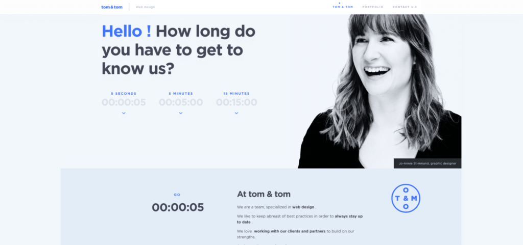
Tom & Tom, a web design agency based in Canada, took monochromatic design to a whole new level with their site. The first thing you see on the page are options to book time with their agency and the farther you scroll, the more you can learn about the agency, their work, etc.
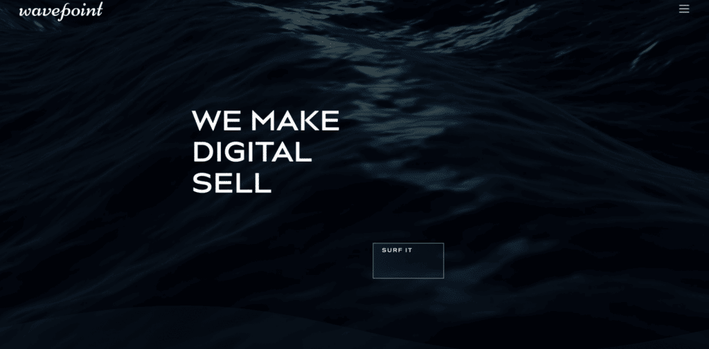
When browsing Wavepoint’s website, you’ll catch a lot more than some gnarly waves—maybe even some inspiration! This agency truly embraced their brand with the elements on their site and the content and puns on the page.
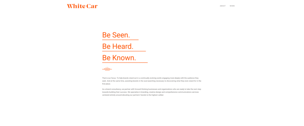
White Car is such a simple name for an agency, but there’s absolutely nothing plain about this agency’s site. While they took more of a minimalist approach, the layout for the design, the placement of content, and the vibrant orange against the classic white speaks volumes.
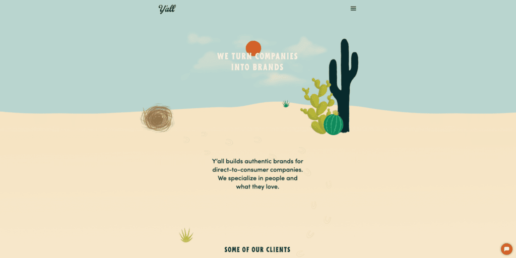
While their name screams “southwest United States”, this Wisconsin-based web design agency nailed it with their site. From the fun cacti elements throughout the homepage, to the color scheme that encourages you to just keep scrolling, this site is truly one of a kind and leaves a lasting impression.
What do you think, pretty inspiring sites, right? We know there are a ton of awesome agencies with outstanding work, and many of them are part of WP Engine’s Agency Partner Program—the largest network of agency partners in WordPress.
Find out more about the ways WP Engine inspires agencies of all sizes here.
