Digital Billboard | LED Billboard | LED Craft
A person driving by a digital billboard has only 7-10 second to view and absorb the content displayed.
If your ad is effective, viewers should be able to consume it in a glance. When designing content make it simple, bold, brief and legible.
 Visual Creativity Principles
These three basic design principles will create digital billboard content that wins over your target customers.
1. Composition
This principle involves defining the layout and the hierarchy of communication. Layout is what determines the end look of an advertisement. Visual prioritization of the message is of critical importance here. In other words, this means the hierarchy of communication. You cannot expect viewers to read and understand five different messages at once. Define the items in levels and give priority to what is important.
A normal human being would first scan the LED billboard across and then look down, grabbing information in logical order. The more these sections stand out, the faster your message will be interpreted. Overlapping visual and written information will take more time for the reader to process. Hierarchy of communication will give you a more organized layout, speed up comprehension and will lead to better retention of information.
2. Typography
This is the study of how text is arranged and presented on a page. Using large, bold and easy-to-read fonts is of utmost importance here. All caps text is advisable only if your message is very short. Sticking to restricted amounts of text will increase readability and comprehension.
In an outdoor LED billboard, comprehension of the message depends not just on the style of lettering but also the color combination used and how it all works together when a viewer reads it at a distance. When designing billboard content, distance is an essential variable that has to be considered. Consequently, the size of lettering is also a necessary consideration.
For best legibility on billboards, research shows that the width of a letter’s vertical strokes should be about 20% of its height, while horizontal strokes can be a little thinner. These proportions should be considered for both upper and lower case letters.
Common mistakes in font styles:
- Overcrowding
- Too much contrast between thick and thin elements.
- Font styles with strokes that is too thin. These usually lose importance and become invisible at a distance.
- Bulky font styles become blobs from far away and cannot be read.
- Overly fancy font styles are often illegible at a distance.
 3. Color
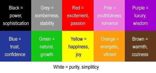
By using rich and vibrant colors you can take maximum advantages of the color capability of your digital billboard. Bright and heavily saturated colors are a better option than low contrast ones. Some colors appeal to specific emotions and hence these need to be carefully chosen. Color charts and wheels are available to guide you on which colors should be used in which situations.
In addition to appealing to emotions, color choices also affect distance factors. Reds, oranges and yellows are warm colors that are perceived as short distance for the viewer. Blues and greens on the other hand are seen as more distant. Black and white or dark colors appear to be in the foreground while lighter colors seem to be in the background. Strong contrasts of colors have closer visibility.
As for background colors, avoiding white and light colors is preferable because these may not attract the eyes. And this is not something you would want in advertising. Making use of your LED billboards color capabilities is recommended as it is more pleasing to the eye. If white or light backgrounds must however be used, it is advisable to only display that content during the day-time.
When it comes to digital billboards, a black background means the absence of color and less light energy is used to create it. White is produced by mixing all the colors and hence consumes more electricity. Dark or black backgrounds will no doubt increase contrast and strengthen legibility. As a result, your advertisement will be more attractive.
