How to review a software architecture diagram
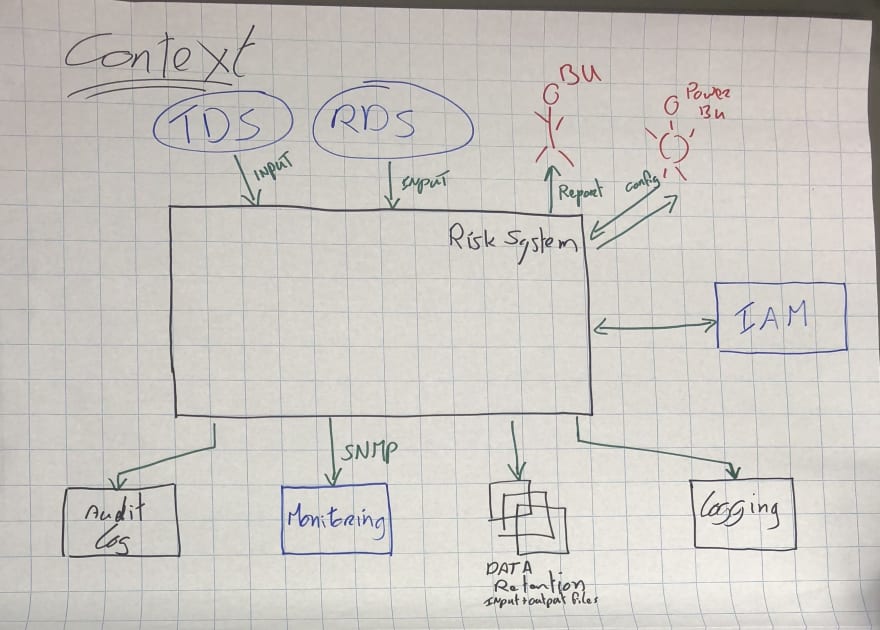
I see hundreds of software architecture diagrams every year, predominantly through my software architecture workshops. Some diagrams are better than others, but I’ve noticed that many people struggle to critique a diagram because they’re not really sure what to look for. So that’s the purpose of this blog post. Let’s start with a fairly typical example of a whiteboard diagram from one of my workshops.

On the face of it, this diagram doesn’t look too bad. It’s high-level, clean, concise, colourful, and you might even be able to work out what’s being described here. But we need to look a little closer.
Mục lục bài viết
General aspects
Let’s start by looking at the diagram as a whole. Here are a few initial things to think about:
- Does the diagram have a title?
- Do you understand what the diagram type is?
- Do you understand what the diagram scope is?
- Does the diagram have a key/legend?
I’d estimate that upwards of 90% of the initial diagrams I see created during my workshops don’t have a title! In this case, the diagram does have a title of “Context”, but it’s not explicit about what it’s showing the context of, and what the diagram scope is. My assumption is that the large box labelled “Risk System” is the scope of the diagram, but a better title would clarify this.
And regarding notation. Well, this looks like an ad hoc collection of “boxes and lines” rather than being UML or ArchiMate. And while that’s not necessarily a bad thing, a diagram key/legend would help readers to understand the notation being used. I’d recommend adding a diagram key/legend for UML and ArchiMate diagrams too, since not everybody will know these visual languages.
Elements (boxes)
Let’s move on to look at the elements in more detail. Again, here are some things to think about:
- Does every element have a name?
- Do you understand the type of every element? (i.e. the level of abstraction; e.g. software system, container, etc)
- Do you understand what every element does?
- Where applicable, do you understand the technology choices associated with every element?
- Do you understand the meaning of all acronyms and abbreviations used?
- Do you understand the meaning of all colours used?
- Do you understand the meaning of all shapes used?
- Do you understand the meaning of all icons used?
- Do you understand the meaning of all border styles used? (e.g. solid, dashed, etc)
- Do you understand the meaning of all element sizes used? (e.g. small vs large boxes)
Every element has a name here, so that’s good, but some of those names are acronyms/abbreviations. I know what “RDS” means here, but you probably don’t, so that should really be fixed. “IAM” is quite a generic term too, so perhaps it would be better to add more detail. We have a collection of shapes being used here, and I’m not sure what the difference between the rectangles and the ellipses is. It’s the same story with colour. Why are some elements blue, while some are black?
Moving away from the visual aspects, it’s not actually clear what the elements represent, in terms of the level of abstraction. Are they all the same thing (e.g. “software systems”), or are some of them (e.g. the “Audit Log”) really just an implementation detail of the “Risk System”?
Relationships (lines)
Finally, let’s look at the relationships:
- Does every line have a label describing the intent of that relationship?
- Where applicable, do you understand the technology choices associated with every relationship? (e.g. protocols for inter-process communication)
- Do you understand the meaning of all acronyms and abbreviations used?
- Do you understand the meaning of all colours used?
- Do you understand the meaning of all arrow heads used?
- Do you understand the meaning of all line styles used? (e.g. solid, dashed, etc)
Only around half of the lines are labelled, and this is very common. I imagine that “audit logs” are being sent to the “Audit Log” box, but it would be nice to know what sort of things this might include. And “input” (from “RDS” to “Risk System”) is quite generic and ambiguous, especially if you don’t know what “RDS” means.
While most of the arrows are unidirectional (one-way), there’s a bidirectional (two-way) arrow between the “Risk System” and “IAM” boxes. I’m not a fan of bidirectional arrows, because they tend to be harder to label correctly.
A better diagram
I’ve seen a number of “diagramming anti-patterns” blog posts in the past that will show you the problems associated with poor diagrams, but fail to show you the “good” example. So let’s do that.
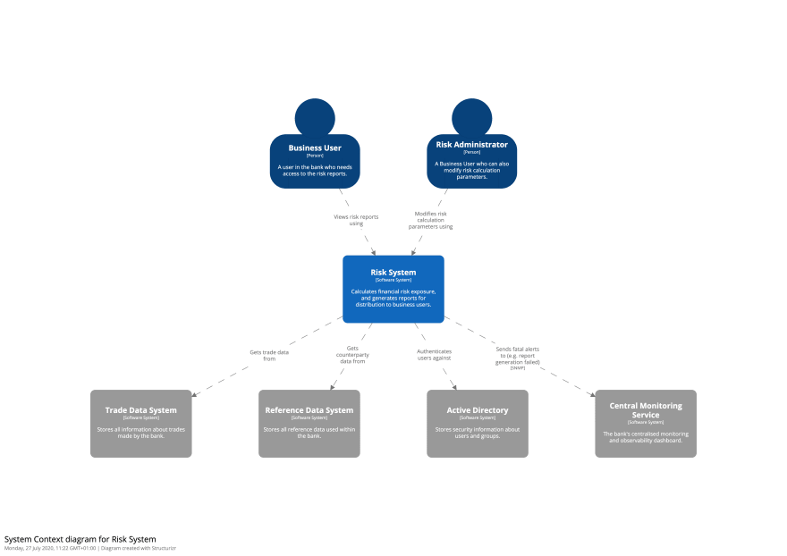
Here’s a better version of the diagram above. I’ve used a tool for this (diagram source), but you could use a whiteboard or sheet of paper.


I’ve made a few assumptions about the audit log, data retention, and logger elements being implementation details, so I’ve omitted them from this System Context diagram. Every element has a name and description, plus I’ve also included some text inside the element to explicitly state what type of thing the element represents (i.e. “Person” or “Software System”). All lines are labelled too. Finally, there’s a diagram key that shows the different shapes and colours being used.
Summary
Learning how to review a software architecture diagram is a relatively easy skill to pick up, and I’d recommend using my diagram review checklist the next time you need to do a review.
From a tooling perspective, sticky notes on a whiteboard work really well, but if you need something online, take a look at the Structurizr diagram review tool, which you can use for free. Alternatives include collaboration tools like Miro and Mural.
Creating good software architecture diagrams is a huge topic, but if you’re interested in learning more, I’d recommend starting with the C4 model.


