Samsung Galaxy S10 Review
Mục lục bài viết
Verdict
While the Samsung Galaxy S10 doesn’t excel in any one specific area, the collective package makes for an incredibly capable offering – which I’m sure was Samsung’s aim in the first place. It sports a stunning OLED screen, versatile camera and a number of enticing new features. It’s a great phone.
Pros
- Smaller than lots of other flagships, without sacrificing features
- Versatile camera that reliably takes excellent pictures
- A lovely screen that’s fantastic for video
Cons
- One UI is full of bloatware
- Battery life is middling
Key Specifications
- Review Price: £799
- 6.1-inch Dynamic AMOLED+
- Three rear cameras
- One UI
- Ultrasonic in-display fingerprint
- 8GB + 128GB / 8GB + 512GB
- MicroSD up to 512GB
- 3400mAh battery
With the rumoured Samsung Galaxy S20 and Samsung Galaxy S20 Ultra looking like they’ll see an official release soon after months of leaks, should you still be looking at the Galaxy S10?
The Galaxy S10 sits alongside the Galaxy Note 10 at the top of Samsung’s phone line. It’s the perfect mass-market device, ticking pretty much all the boxes anyone looking for a new Android phone will want.
Alongside the S10 you also have the smaller, simpler, more affordable Galaxy S10e (which boasts the same top-tier processor), the larger, longer-lasting and more camera-laden Galaxy S10 Plus, and for those who need it, the super-sized, super-speedy Samsung Galaxy S10 5G.
With all these other options, should the standard Galaxy S10 still be worth considering? In a word, yes.
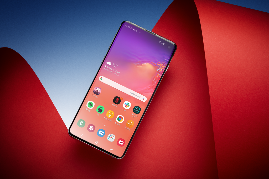
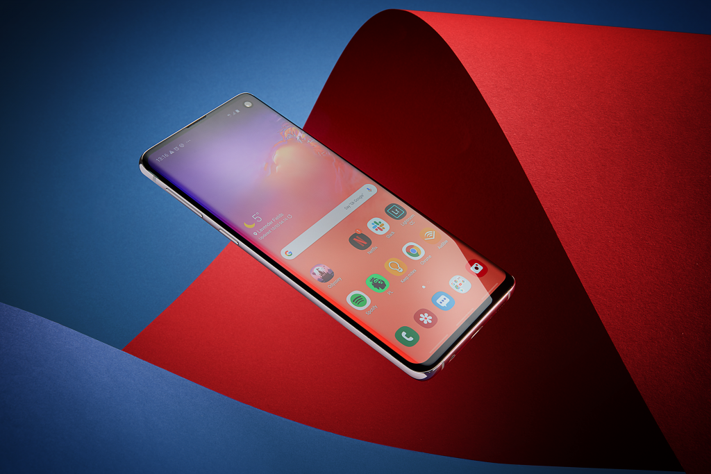
The Samsung Galaxy S10’s screen is lovely and design slick, with a minor catch
As with most top Samsung phones, the screen left me seriously impressed. The S10 sports a 6.1-inch Dynamic AMOLED display, which occupies 88.3 percent of the phone’s front. Paired with the curved cover glass, it gives the impression of a true edge-to-edge display and what’s more it packs in a ton of tech worthy of a flagship-class display.
This is an HDR10+ panel, boosting colours and dynamic range when viewing supported content from Netflix and YouTube, for example. Watch a few episodes of Star Trek: Discovery and you’ll instantly notice the deep colours and intense brightness. I wouldn’t normally use a phone screen to watch this kind of content over extended periods but the quality on display here makes it surprisingly immersive.
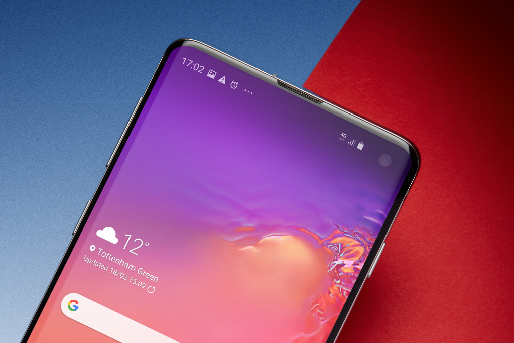
The screen is bright, too, which is essential for both outdoor viewing and, as previously mentioned, HDR content. It’s a little tricky to gauge just how bright this screen gets due to the variety of boosting modes Samsung engages but I measured a peak brightness of 350 nits (which is good for a phone) in regular use. DisplayMate claims it can match the 1250 nits suggested by Samsung in its own tests, however, we were unable to recreate such a figure in a real-world environment.
Brightness ramps up further when you’re using the phone in direct sunlight or utilising the screen enhancer mode. The latter adds a faux-HDR effect to regular content – YouTube videos, for example – which ups the brightness to give a more cinematic look. It works a treat, even if it does consume battery life at double the rate compared to when it’s turned off.
- Related: see our evolving Galaxy S20 coverage
The display has a few other quirks, too, all of which help to shape the look of the Galaxy S10. The first is the new Infinity-O display, which is Samsung’s effort to steer away from the plight of a notch. Instead of a dip in the display, as seen on the iPhone XS, the S10 moves its front camera into a circular cutout that sits towards the top-right of the panel. Unlike the notch, the screen flows around the camera, creating a more seamless finish.
I much prefer the circular cutout here rather than the longer, pill-shaped version you’ll find on the S10 Plus; it’s noticeably less intrusive when watching videos. Nevertheless, it isn’t perfect and certain apps – games especially – still assume the hole is a notch and therefore display a black bar that covers the entire top portion of the screen. Hopefully, developers will update said apps as this style of cutout becomes more popular.
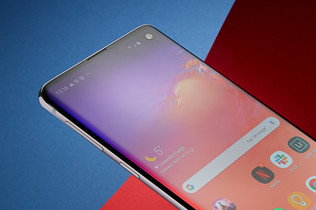
I’m less enamoured by Samsung’s continued use of curved displays. As seen in the S8 and S9, the sides of the Galaxy S10 slope away from the front, blending into the metal frame running the phone’s edge. Design-wise, it’s a trait that’s a few years old now and extensively used by other premium phones. Nevertheless, it still has that slick, instantly eye-catching finish that gets it noticed in the sea of boxy, rectangular slabs.
Despite how attractive it might look, it makes actual use of the device more difficult. I’ve experienced more accidental presses with the curved Galaxy S10 than I have done with the flat Pixel 3 (or Pixel 4 for that matter) or iPhone 1. It consistently registered accidental pressure from my palm and I’m having to alter the way I hold the phone to counter this problem. You’ll likely get used to it but having used both the S10 and S10 Plus for a few weeks, it remains an issue.
For the most part, the rest of the design also follows the same blueprint Samsung’s employed for the past few iterations of its flagship phones. You’ll find glass both front and back, a metal rim sandwiched between them, and a super-precise finish.
There isn’t much of a size difference between the Plus and the regular-sized S10 (the Plus has a 6.4-inch screen as opposed to 6.1-inches) but I do find that the smaller device feels more comfortable to hold and is easier to navigate, not requiring me to stretch my thumb too far. If you’re coming from an S9 or an iPhone then you’ll likely feel a lot more at home with the S10 compared to the Plus.
One feature missing on the Galaxy S10’s display is a high refresh rate option. The OnePlus 7 Pro, for example, can ramp things up to 90Hz creating much smooth motion and animations on-screen. Maybe this is something we’ll get with the Galaxy S11, next year.
The Galaxy S10 is feature-packed, with an in-display fingerprint sensor and reverse wireless charging
Samsung has a fondness for “features”. It loves to cram its phones with every imaginable option, if only to have plenty to shout about when it comes to advertising. It’s an approach that’s quite the opposite of Apple, which has historically rejected options such as expandable storage.
With the Galaxy S10, Samsung’s focus on features remains. If there’s a feature you’ve been hankering after, then it’s likely included in the S10: wireless charging, expandable storage, a headphone jack (you won’t see that too often in 2019), as well as inventive additions such as reverse charging and an in-display fingerprint sensor.
That in-display sensor is the standout – and while the S10 isn’t the first handset to include one, it’s comfortably the best I’ve used.
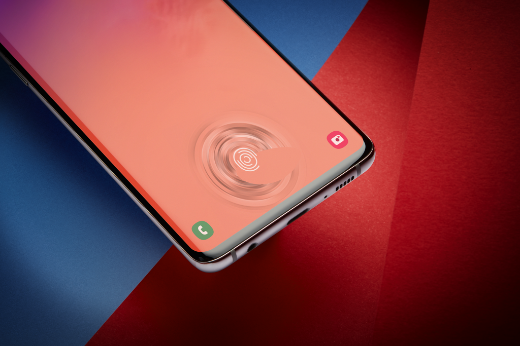
The fingerprint sensor on the Galaxy S10 doesn’t reside on the back or inside the home button. Instead, it’s found directly beneath the screen. Once set up – a process you’ll be requested to do at the start – you unlock the phone by pressing your finger against a fingerprint outline that sits towards the bottom of the screen. It does everything your traditional capacitive sensor does; it just doesn’t need to be there messing up the back of the phone.
As futuristic as it is, the in-display sensor isn’t quite as effective as the traditional unit of the S9 or iPhone. It requires a firmer press. If the fingerprint sensor on the S9 works 95% of the time, on the S10 it’s closer to 70%.
However, since release there have been some claims the fingerprint scanner isn’t secure when used with third-party screen protectors and you can unlock the phone with any finger. Samsung said it will issue a software update to hopefully fix this issue.
Another feature on the S10 that’s similar to something you’ll see on the Huawei Mate 20 Pro and Huawei P30 Pro is reverse wireless charging. Called Wireless PowerShare, this lets you turn the S10 into a Qi charger for compatible products. For example, you could charge your iPhone XS this way, or Samsung’s new Galaxy Buds.
It’s a clever addition but like the in-display fingerprint scanner, it needs a bit more work. It’s super-slow to charge, and you need to turn it on every time you want to charge a device.
The Galaxy S10’s benchmarks lead to the superb performance
Joining the packed feature list is a selection of internal components – which will vary depending on your region. I’ve been using the European model, which ships with Samsung’s own Exynos 9820 chipset and 8GB of RAM. If you’re buying the phone in the USA, your device will be powered by the Qualcomm Snapdragon 855.
Since the S10 is powered by the very latest available internals, it should be no surprise that it’s a performance beast, churning out benchmark scores at the top-end of phones we’ve reviewed. Simply put, no task on this phone feels slow or laggy. Nor are there any apps – that I’ve tested – that really push the hardware to its limits.
The same is true of games. The Galaxy S10 will smoothly run any game at the highest possible settings without running into trouble. Titles load up noticeably faster than a Samsung Galaxy S9, and only slightly slower than an iPhone XS.
This is also one of the first handsets to ship with support for Wi-Fi 6, so if you have a capable router then you’ll notice a slightly altered logo in the status bar. There’s no 5G, though, since the next-gen data speeds are restricted to an as-yet priceless Samsung Galaxy S10 5G variant.
The Galaxy S10’s camera is versatile, even if it isn’t the best overall
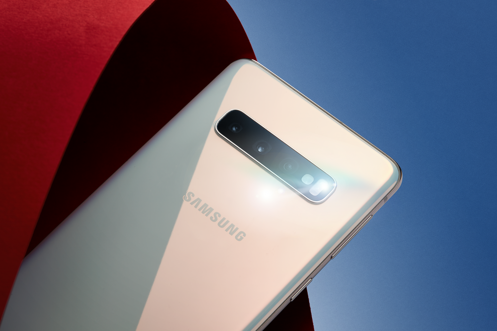
The Galaxy S10’s camera line-up is another headline feature. Three can be found on the back, with another unit on the front for selfies and face unlock. It’s a trio of cameras that will look familiar to anyone who has laid eyes on the Huawei P30 Pro
The main rear camera is an optically stabilised 12-megapixel sensor, with an aperture that can shift between f/1.5 for night shots and f/2.4 for the day. There’s an ultra-wide, 16-megapixel f/2.2 sensor, too, and a stabilised 12-megapixel telephoto sensor for zooming.
Of the three, it’s the ultra-wide sensor that’s new. In the app, you can zoom out to enter wide view and there’s somewhat of a fisheye effect on the results.
The main camera consistently judges exposure better than its predecessor, while the improved HDR mode helps give you a good dynamic range across most scenes, with fewer blown out highlights and overexposed shots.
Leadenhall Market: Samsung Galaxy S10 (left) vs Samsung Galaxy S9 (right) – move slider to compare
The latter isn’t quite on the same level as the iPhone XS’s Smart HDR mode, though, which manages to pull out much more detail from the dark areas of dimly lit scenes.


Low light performance, in general, is good if a little behind the very best – that honour goes to the Huawei P30 Pro with its RYYB Super Sensing sensor and fantastic dedicated night mode.
The main camera’s bright f/1.5 aperture (which automatically reverts to f/2.4 in brighter conditions) gives it a strong base to work from, though the S10 can still be a bit heavy-handed with noise reduction and image processing, which smudges out some fine details. This isn’t too noticeable when viewed on the S10’s screen, but photos can look more like paintings when cropped or viewed on a bigger screen.

The S10’s smarter ‘scene optimiser’ mode, which works on all three cameras, performs well in most situations. It can now recognise up to 30 different scenes, including faces and night scenes, and tweaks the colours to make them vibrant and punchy without going too far towards oversaturation.
The only downsides are the occasional mistake – for example, recognising a glass building as the sky and giving it an unnatural blue cast – and that its Super Night Shot mode doesn’t seem to be quite as powerful as the ones seen on the Google Pixel 3 or Huawei Mate 20 Pro, with no way to manually turn it on.
Still, the S10’s bokeh effects are every bit as good as its rivals, only being slightly beaten out by the P30 Pro and its dedicated ToF sensor. This added sensor gives a cleaner finish and a more accurate cut around details like glasses and hair.
Still, the S10 reliably cuts out faces and objects while applying realistic gradual blur. You can also tweak the level of fake bokeh after a shot when using the Live Focus mode, but it’s best to keep the intensity on the low side for maximum realism.

While nothing major, there do seem to be a couple of bugs in the S10’s own camera app. The focal length wheel, which lets you zoom in between each camera’s default view, sometimes opens when you try to press the shutter, preventing you from taking a shot. If you move quickly between the three cameras, the autofocus also occasionally locks up before settling down again. These will no doubt get fixed in a software update.
Video recording is handled well, especially thanks to the new super-steady stabilisation option. This uses the ultra-wide sensor to record and then crops in, smoothing out your footage and ridding it of the judder often associated with mobile video recording.
But Samsung Galaxy S10’s battery life should have been better
Samsung has crafted an excellent phone in the S10 with a gorgeous screen, high-end internals and a bevvy of great features all packed inside a well-designed body. However, it isn’t perfect.
Samsung’s One UI sits atop Android 9, and while it’s a big improvement over Samsung’s previous attempts at software, it remains ugly and bloated.
One UI’s aim is to make the software elements more accessible on larger screens. Apps that feature multiple input options towards the top – messages, for example – are pushed to the bottom, so you don’t need to dislocate your thumb trying to reach them. The majority of Samsung’s own apps have been updated to benefit from this design, and it does make navigation easier.
But the software is still full of useless additions. The virtual assistant Bixby is, and always has been, inferior to Google’s excellent Assistant – but it’s so tied into Samsung’s apps that it’s hard to get rid of. There are reams of bloatware here too, including multiple Microsoft Office apps and Samsung’s own version of many of Google’s own apps – calendar, browser and messages, for example.
For battery life the S10 isn’t as good as some rivals; even similarly sized handsets such as the Huawei P30 Pro beat the S10 for endurance. However, it’s slightly better than the Galaxy S9 and roughly comparable with the iPhone X and iPhone XS.
During my 10 days with the phone – I’ve been reviewing the European Exynos 9820 version, so US-based buyers with the Snapdragon 855 version might see different results – I haven’t always managed to get from a morning alarm to 11pm without forcing the phone into either a battery-saver mode or worrying it will die-out during something important.
If you want a more detailed look at the battery life, head to our dedicated Samsung Galaxy S10 review battery life page.
Using the bundled charger, the S10’s 3400mAh battery goes from 0-100% in around 90 minutes. You can get yourself 40% in roughly 40 minutes which is handy for a quick top-up.
There haven’t been any huge improvements to the charging tech, and there’s no high-speed method to rival the Mate 20 Pro’s Super Charge. This is a shame, but the lack of improvement isn’t quite as obvious as it is with the larger S10 Plus as that battery takes much longer to charge.
If wireless charging is more your style, expect to get a full charge in just over two hours if you’re using Samsung’s own Fast Charge capable pad.
- Just picked up an S10? Read our Samsung Galaxy S10 tips and tricks guide to get started
Why buy the Samsung Galaxy S10?
There isn’t a more complete flagship Android phone you can buy right now than the Samsung Galaxy S10 – and its two biggest competitors are, at this moment, the smaller S10e and the pricier S10 Plus.
So is there a reason to buy the S10 over those two other choices? The S10e is cheaper and ditches the curved screen, while the S10 Plus has a bigger screen and battery. Being the middle child, it does feel like the regular might get left out. But I’d say the S10 is the easiest choice. It’s the perfect mixture of size and feature-set, with a price tag that’s £200 less than the iPhone XS.
The Samsung Galaxy S10 is on sale right now.
Prices in the UK start from £799 for the 128GB model and £999 for the 512GB model. In the US, it costs $899. As such, the Samsung Galaxy S10 is £60/$180 more expensive than the Samsung Galaxy S9 when it launched in February 2019. Or you could view it as being £200/$100 cheaper than the iPhone XS.
In the UK, all major carriers – EE, Vodafone, Three and O2 – are stocking the phone, alongside Virgin Mobile and Tesco Mobile. Check out our Samsung Galaxy S10 deals for all the latest news on pricing and the best offers.
This review is of a Galaxy S10 (UK Exynos 9820 version) unit provided to us by Vodafone, and was conducted over the course of ten days – with additional days afterwards for more in-depth testing.
How we test phones
We test every mobile phone we review thoroughly. We use industry standard tests to compare features properly and we use the phone as our main device over the review period. We’ll always tell you what we find and we never, ever, accept money to review a product.
Find out more about how we test in our ethics policy.
Used as our main phone for the review period
Reviewed using respected industry benchmarks and real world testing
Always has a SIM card installed
Tested with phone calls, games and popular apps


