Top 7 Games to Test Your UI/UX Designer Skills
Are you sure the spacing on that text is even? Is that colour really complimenting the others? Does the button fit better here or there? These are questions that even experienced UI/UX designers regularly ask themselves. Questioning your designs helps you develop as a designer, but you still want to know you got the skills to pay the bills at the end of the day. While a mini-game alone can’t truly measure your skill as a designer, it might help shed light on areas to improve, give yourself a confidence boost, or even just act as a fun way to see how you stack up to your colleagues. How many can you beat?
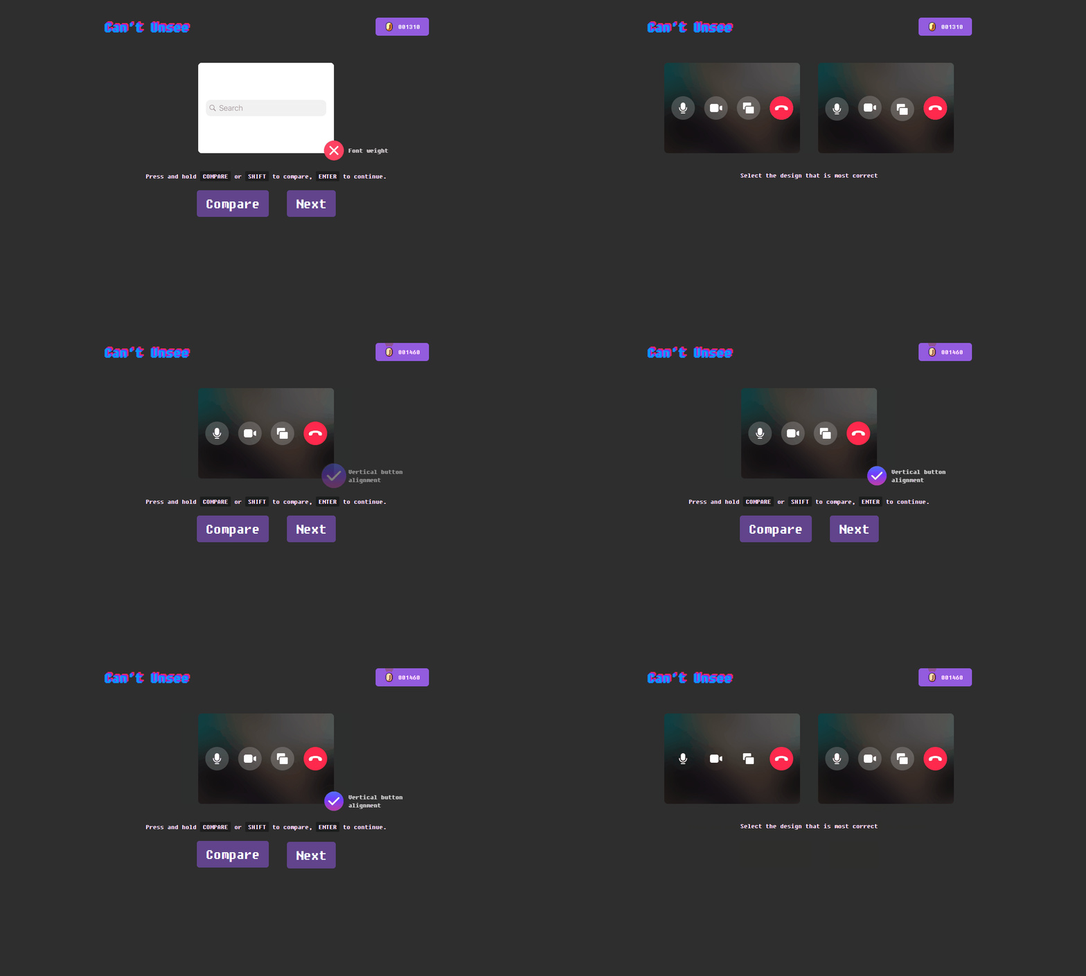
‘Can’t unsee’ is one of the more popular games on this list, with it more than likely showing up on your social feed in the past. The game tests UX knowledge by presenting two similar designs and asking the player to select which one would give a better user experience. The mechanics of this game are quite simple; all you have to do is pick one, the challenge comes with deciding which choice to make.
Starting with a tutorial, the initial decisions are pretty straightforward, but the choices become increasingly difficult after you move through the first three stages. Once a user learns if their decision was optimal, they also see the differences between the two and can compare the pair again to fully grasp the better design choice. As the name of the game implies, once you make the wrong decision and have the opportunity to compare your selection with the correct one, you truly ‘can’t unsee’ the better design decision.
Each correct answer accumulates points which, along with the time taken to complete it, impact your final rank. Your resulting rank and score can then be shared directly through Twitter and Facebook to compete with friends and co-workers.
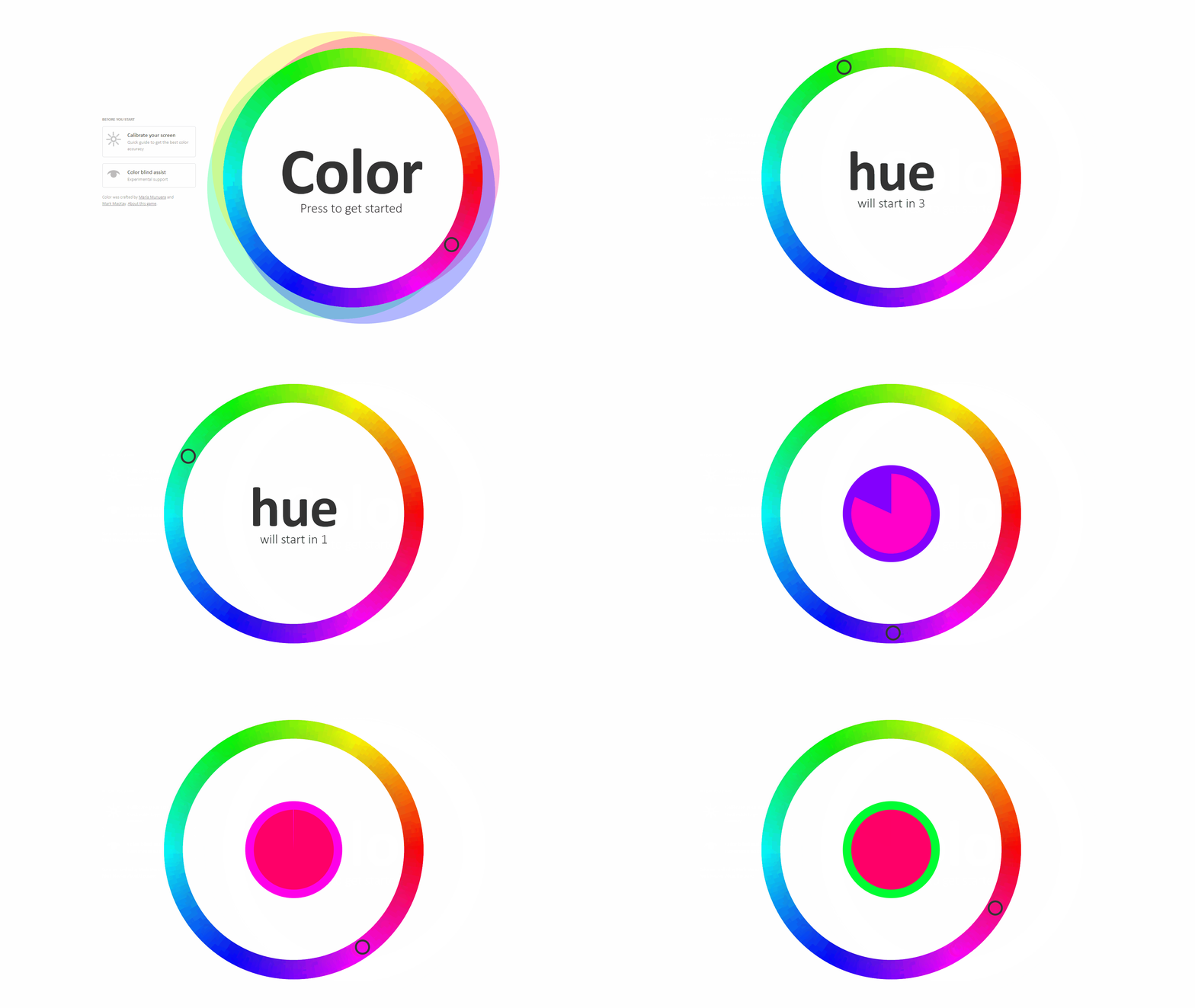
‘Color’ is a matching game made for the Method of Action site by Mark MacKay, with help from Maria Munuera, a product manager at Sketch app. The game is a great way to test your eye as well as your general colour theory. It begins with you initially trying to match a given hue to your colour wheel within an allotted time. After advancing through the first stage, your wheel encompasses the full-colour spectrum, and you are tasked with matching the saturation level of a colour.
Matching the correct colour gets progressively more challenging as the four additional stages cover complementary, analogous, triadic and tetradic colour relationships. After you complete all six levels, you are given a score out of ten that you can use to compete with your colleagues or even share on Twitter.
We’d also like to highlight two great inclusions: the game’s colour blind assist mode and its associated tools to help a user properly calibrate their monitor. These additions make it one of the more accessible games on the list and allow even more users the opportunity to play and test themselves.

In this list of games, ‘The Bezier Game’ is easily the most challenging and could almost be defined as more of a tool test than a game. The primary focus is testing a designer’s ability with the pen tool, a popular and powerful tool found in the majority of design software. At first, you are shown the basics of using the tool and given three shapes to outline. Then, after completing the initial three stages that reacquaint you with the tool, the real test begins.
Each level consists of various outlined shapes such as a car or a plane, and your task is to trace it using the pen tool. While this sounds straightforward enough, you are only given a select number of nodes to connect your outline, or you fail the level. Once you complete the level, there is an overview detailing how many nodes you used, how many you had left, and the ideal amount of nodes that could be used to complete the level.
Beginner and novice designers may struggle slightly tracing the outline within the given nodes, but the true challenge comes with keeping your used nodes to the minimum level amount. ‘The Bezier Game’ is a great mini-game to go to in your downtime if you’re trying to learn the pen tool or feel rusty and want to keep your skills sharp.

Kerning refers to the spacing between a pair of letters. In ‘Kern Type’, players can work on their eye for letter spacing within their designs. Ensuring appropriate spacing between letters is a fairly straightforward concept to understand, but much harder to master when handling it manually.
As the player, you are given a word where the spacing between the letters is clearly off. Your task is to correctly move the letters left and right in an attempt to get optimal spacing across the whole word or as close to it as you can. You can use your mouse or arrows keys to move the letters, and once you submit your changes, you’re shown how close or far you were from the perfect spacing for that font.
There is no final score in this game, only a score for each attempt. With there only being ten different words to alter, the lack of a final overall score transforms each font into its own level to overcome and perfect.
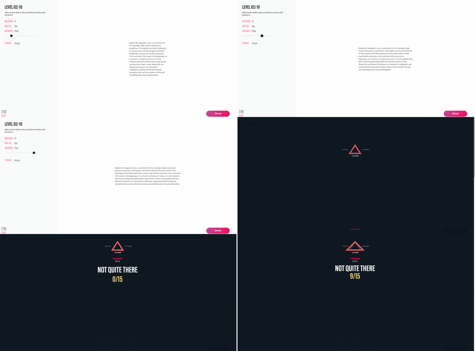
The following mini-game is perfect for those that regularly work with typography. ‘The equilateral triangle of a perfect paragraph’ is a game designed by Matej Latin that introduces the user to his concept of the same name. Matej is a product designer, author, and self-proclaimed typography geek who created the betterwebtype.com site to promote and provide various resources on online typography.
There are several articles and mini-games on the site related to web typography, of which ‘The equilateral triangle of a perfect paragraph’ is easily the most popular. Before starting the game, there is a description of Matej’s theory that introduces you to the concept and how the game relates to it. To summarize, the theory suggests that in order to make a ‘perfect paragraph’ on the web, the line height, line width, and font size should all be in harmony. The game gives you a much better visual of what that means when you start, as you begin to tweak one of the three variables to match the remaining two. Once you feel comfortable with how the paragraph looks, you submit your selection and are given a score out of ten depending on how close you were to the ‘perfect paragraph.’
After completing ten levels, you are given a score out of one hundred and a title depending on how close to a perfect score you got. Apart from this mini-game, the betterwebtype site has several alternative mini-games related to typography, as well as a ‘free mini course’ that sends you a new typography lesson every day for a week.
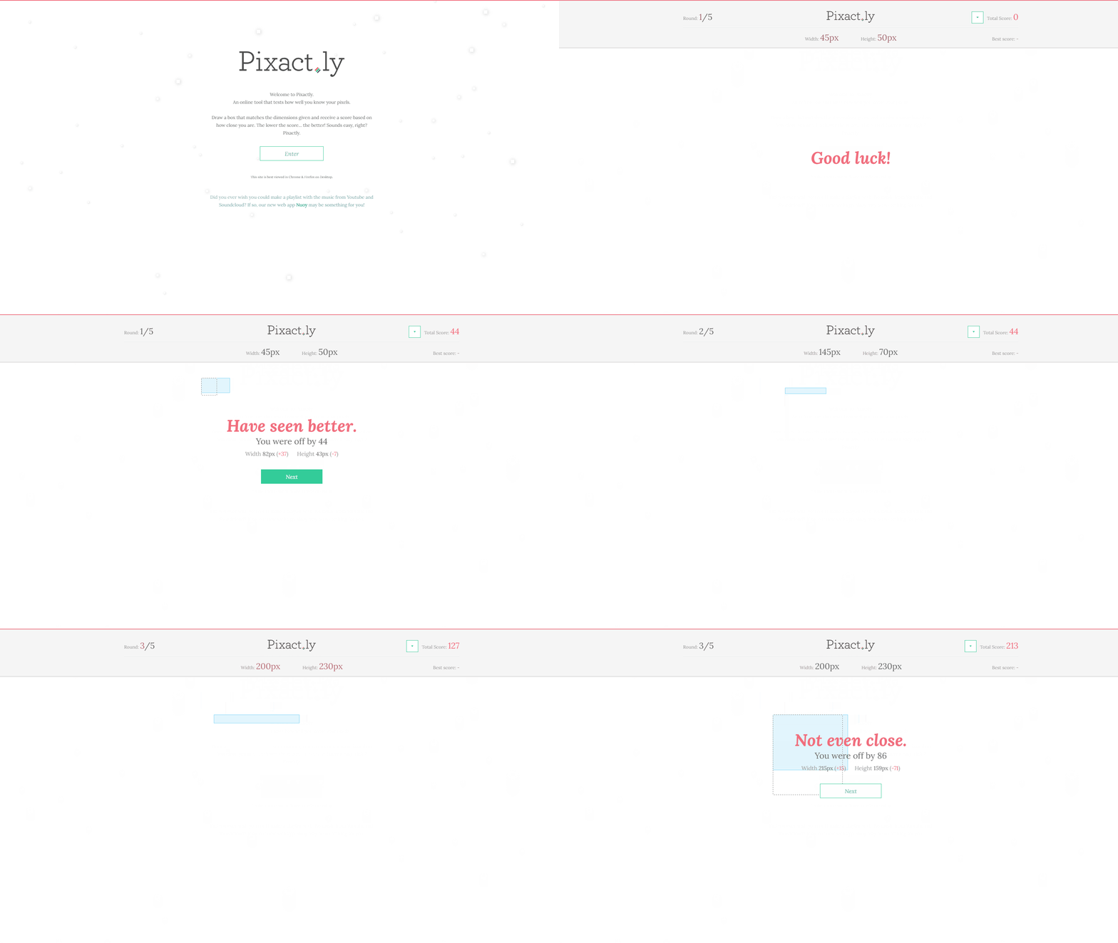
This game might be smaller than others on our list, but it still offers a challenge and test for a curious designer with less time commitment. Pixact.ly is a short game that tests how accurate you are at judging pixel space on a screen.
You are given the width and height dimensions of a box in pixels and are tasked with drawing that box as accurately as possible to the pixel. The closer you get to the targeted size of that round, the smaller amount of points you receive, with the goal of the game being to get as few points as possible. At the end of five rounds, you can share your score through socials or choose to go again.
Pixact.ly isn’t going to take up a lot of time or energy, yet it is a great way to test your eye and see how well you really know your pixels.
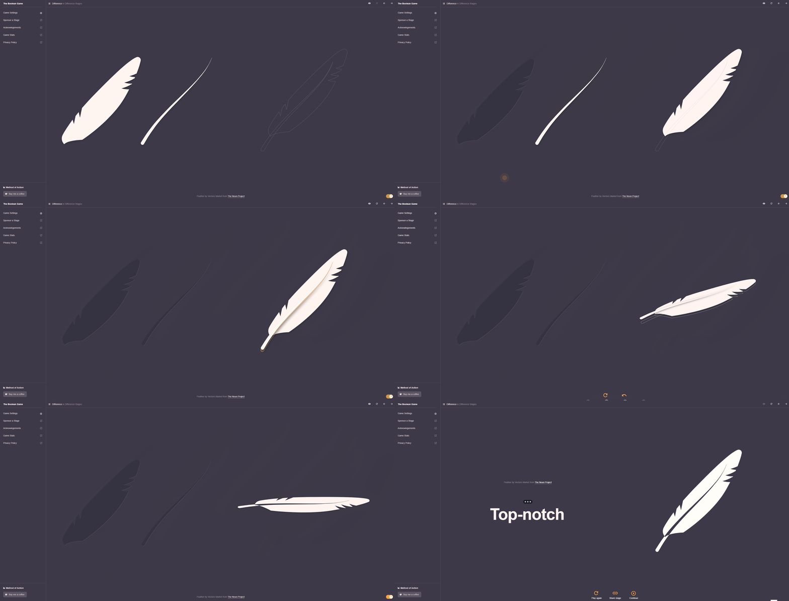 The last title to mention is another game from the Method of Action group called ‘The Boolean Game.’ Boolean operations within design software allow UI/UX designers to combine shapes in various ways, leading to countless possibilities.
The four boolean operations that a designer can use are Union, Subtract, Intersect and Difference. The first four sections of this game go through each of these operations, with multiple levels in each section, teaching or reacquainting designers with the function and ideal use of each. Once the initial tutorial stages are complete, the actual game begins as you need to use a mix of the four operations to end up with the desired shape for the level.
While levels start easy with you only needing to use one or two of the operations, by the last ‘expert’ section you will need to utilize all operations in different ways in order to pass. This game is great for those still unfamiliar with Boolean operations as the beginning is a great visual way to learn the functions, with the later stages ensuring you have a firm grasp of all their uses.
We hope the above titles can provide an easy and fun way to test your UX/UI designer skills, deliver a bit of entertainment in your downtime or add some light competition between you and your co-workers. If you feel that you’re ready for even greater challenges and are interested in becoming a UX/UI designer for video games, try reading and implementing our guide on ‘How to design a UI button for games’.
If you enjoy that process and are set on joining the industry, then definitely check out the article written by our CEO on ‘How to get a UX/UI design job in the games industry.’ Both of these articles will help prepare you and give you a better chance when applying for UX/UI designer roles. Stay tuned to our always-up-to-date Careers page for more information on joining Sprung Studios and potential job opportunities.
