Cyber Attack Maps…Accurate Or Just Eye Candy?
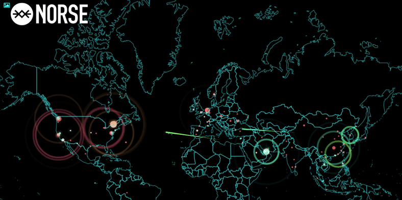
Here are the top 5 Cyber Attack Maps found in Google. They all seem to show the cyber attacks in a slightly different perspective. This is the Norse attack map as an example:
Here is a brief overview of each map:
1. Norse’s map ranks the country of attack origin, attack type, attack target country and displays a live feed of attacks. You can also filter the data down by location and by protocol.
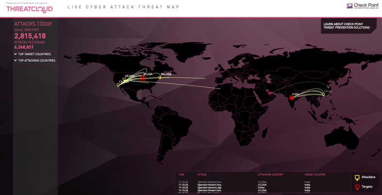
2. Check Point also shows attacking and targeted countries, along with a counter of how many attacks have happened in the current day. Over 2.8 million today according to this map! This also shows that India and Sweden are the top countries for targets and attacks respectively, however the Norse map shows USA at the top for both.
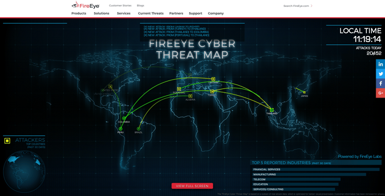
3. FireEye shows similar data as the Norse and Check Point maps, they also show the top 5 targeted industries for the past 30 days (right now those are Financial Services, Manufacturing, Telecom, Education and Services/Consulting). This map shows just 20,000 attacks for today.
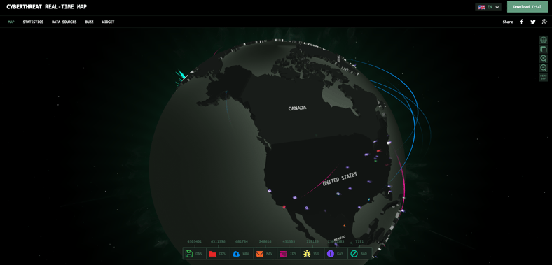
4. The Kaspersky map has a section for statistics, gives an overview of their data sources, and is highly interactive. You can customize the look of the map by filtering certain types of malicious threats, such as email malware, Web site attacks, vulnerability scans, etc.
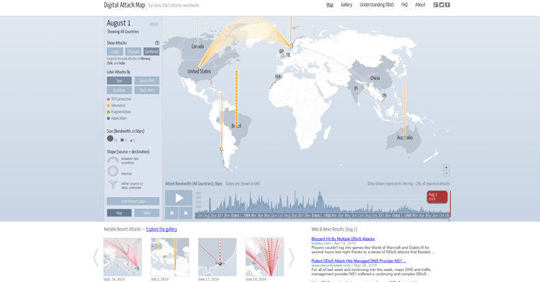
5. Digital Attack Map lets you filter by attack type and has snapshots of notable attacks as well as simplified graphs of most active countries. You can even pull up some historical data dating as far back as June 2013.
Most of these attack maps are meant to be an illustration of what really goes on, and they use strategically placed honeypots (or sometimes their own endpoints in the case of AV vendors) to get an idea of the traffic direction and the volume. You will see but a very small percentage of the real attacks as they are carefully curated to make it all “look purdy.”
Nice to show to management because it visualizes the problem and makes it very easy to understand, but do not count on any actual accuracy. You can see just by looking at the different maps that the numbers vary greatly for the same data points. However the fact remains that the average enterprise Is hit by a cyber attack every 1.5 seconds so threats are no less real.
As many as 93% of those attacks are phishing attacks carrying ransomware payloads. What’s more, is ransomware is now projected to be a $1 billion industry by the end of the year. These maps offer a glimpse into what’s really going on in the world of cybercrime.
Are you aware that many of the email addresses of your organization are exposed on the Internet and easy to find for cybercriminals? With these addresses they can launch social engineering, spear-phishing and ransomware attacks on your organization. The Email Exposure Check (EEC) is a one-time free service. Sign up for your free EEC and find out now which of your email addresses are exposed.

Don’t like to click on redirected buttons? Cut & Paste this in your browser:
https://www.knowbe4.com/email-exposure-check/
