【For Beginners】What should I be doing? Choosing the right color for skin tone ! | MediBang Paint – the free digital painting and manga creation software
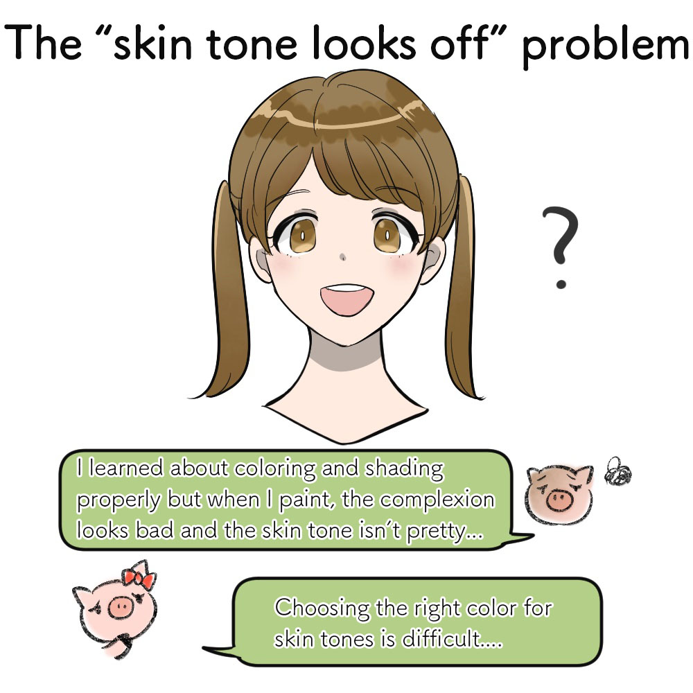
Have you ever thought your illustration looks off once it’s colored even though you studied coloring and painting shadows properly? Or maybe wondered how pretty skin tones in trending illustrations are chosen?
Skin colors are one of the important factors that influence the impression of your illustrations, in both a good and bad way.
In order to achieve a refined look, let’s learn about choosing the right skin tone color!
★ Let’s learn about the color vocabulary! ★
Before you start choosing the colors, remember these words you need!
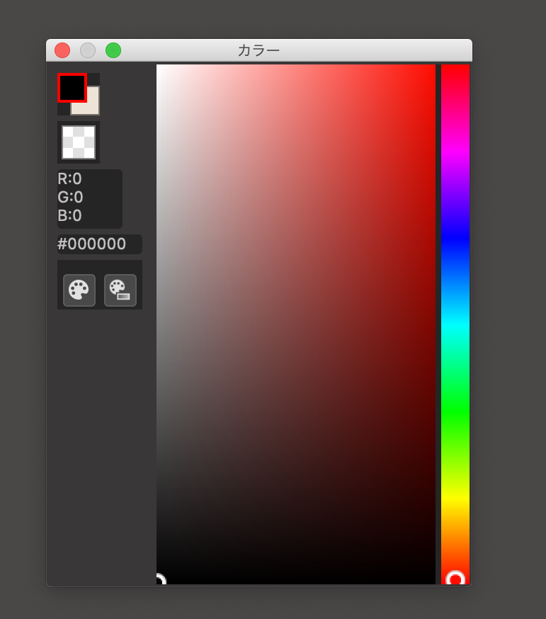
This is a screenshot from the MediBang Paint Pro (for PC) app.
You can choose any color you want from the color window.
By default, this window is set to a flat “Color Bar”.
You can leave it as it is but in order to explain clearly, I will change this window to the “Color Wheel” where all the colors would be displayed in a circle.
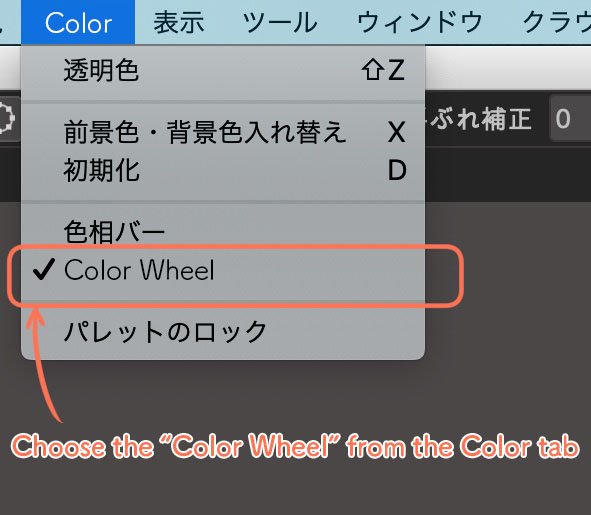
From the menu bar, go to the “Color” tab and click “Color Wheel”
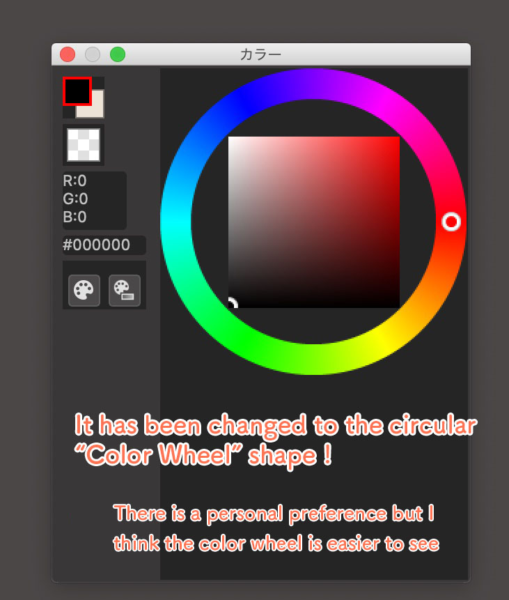
The flat color bar has now been changed to a color circle.
You can choose your favorite color, brightness and darkness by moving your cursor around this wheel.
There are three important words related to choosing colors.
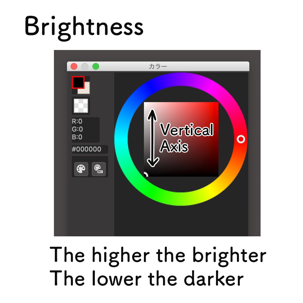
・Brightness
→ The brightness of the color.
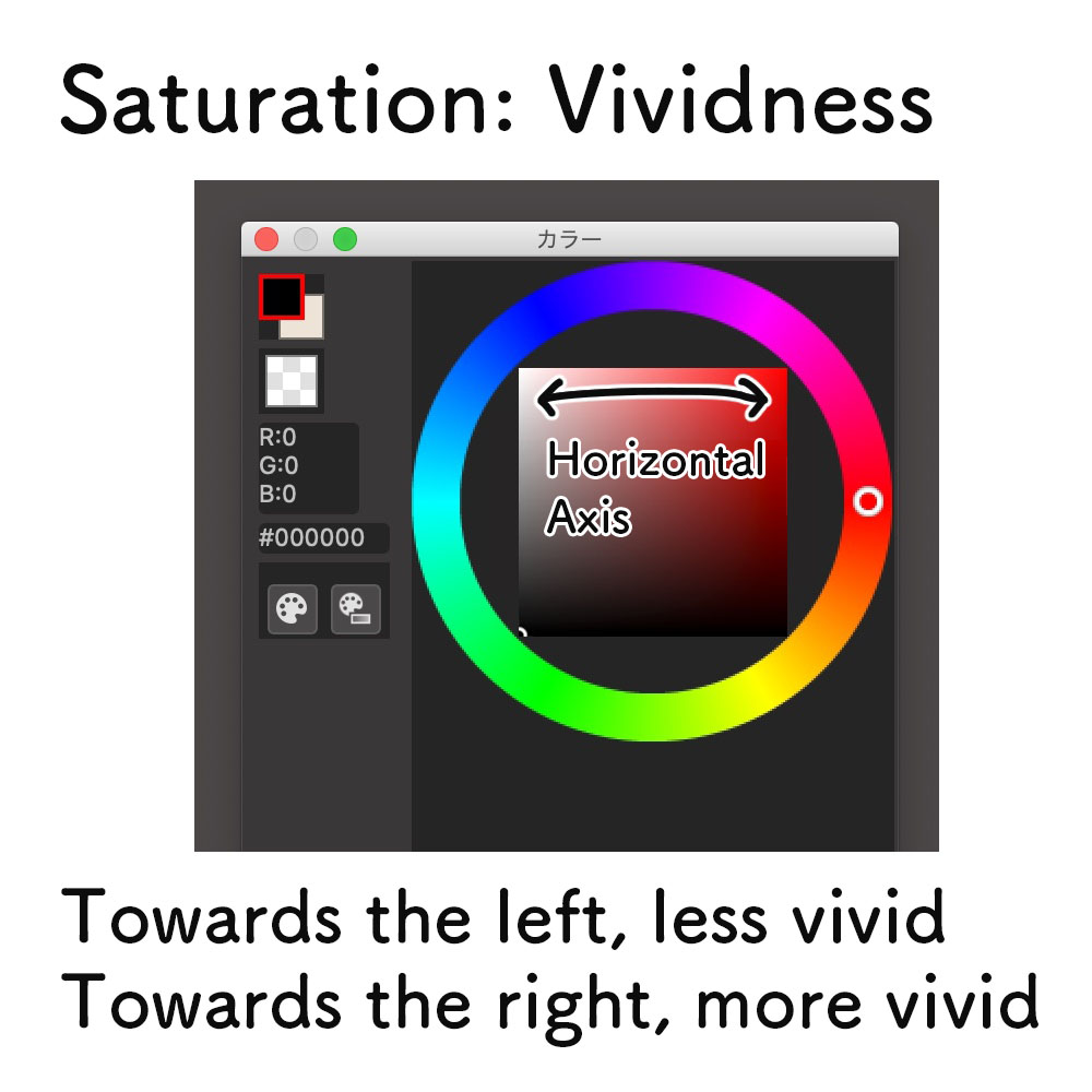
・Saturation
→ The vividness of the color.
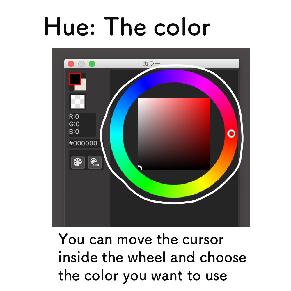
・Hue
→ The type of color (red, blue etc.)
If you know these three points, you might be able to notice more things like “This artist is adjusting the saturation here !”, when you read tutorial articles or watch making videos. This will make it much easier for you to learn about illustrations.
I will be referring to such vocabs later in this tutorial too so keep in mind the definitions.
① Choose the base color
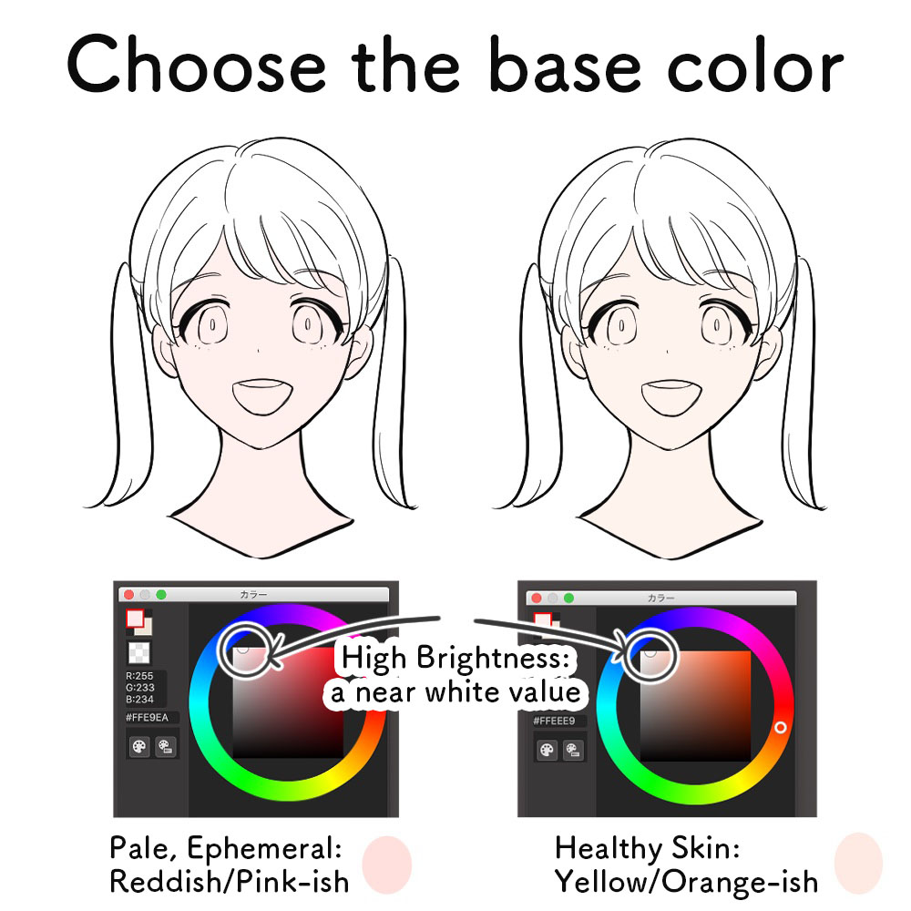
First off, you have to start by choosing the base color of the skin tone.
・For a “common Japanese character”: Yellow-ish or Orange-ish color
・For a “pale character with ephemerality or clarity”: Pink-ish color
Just like the two examples above, the base color changes depending on the impression you want to achieve.
It would be best to have a solid image of the kind of character you want to draw and the mood you want to illustrate.
Once you are set with the image, start choosing the base color from the color wheel.
Unless you are drawing a tanned character, I think it should be set to the highest brightness.
Since this is the base, the saturation should be set low to a near white color.
② Choose the shade color
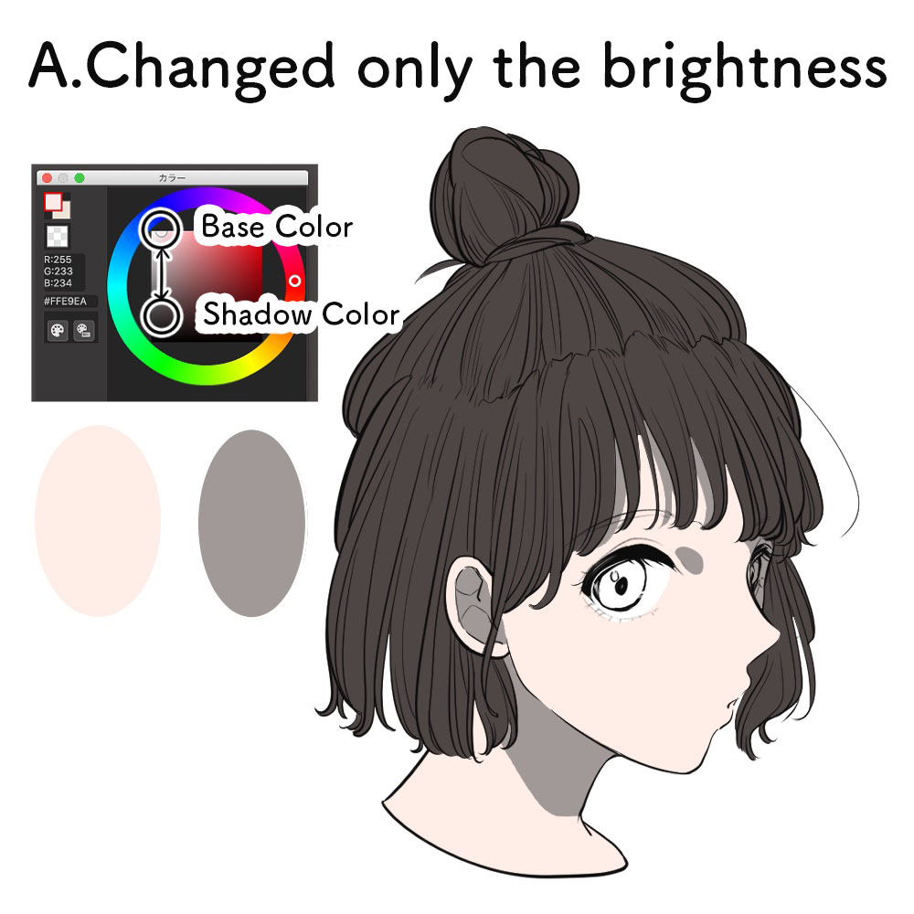
Look at the three characters from above.
It’s a single painting but with different colors for the shadow.
From the top,
-
Changed only the brightness
-
Changed only the saturation
-
Changed both the brightness, saturation and hue
In particular, A looks dark and dull.
You might have realized by now but these three characters have the SAME base color!
If you are seeing a different skin tone base, it is because of the optical illusion.
There is a trait for the color of the shade to affect the color of the skin.
A.Changing only the brightness
“The real shadow is black so it should always be shaded with black or gray right?”
That is a common misconception about shading. Many people often paint the shadows with a color in which the brightness has been dropped from the base skin tone.
It will end up making the skin too dark and dull so I do not recommend this method of painting unless you are creating such an atmosphere on purpose.
Change your understanding for the shading, do not layer the black color just because the shadows are black!
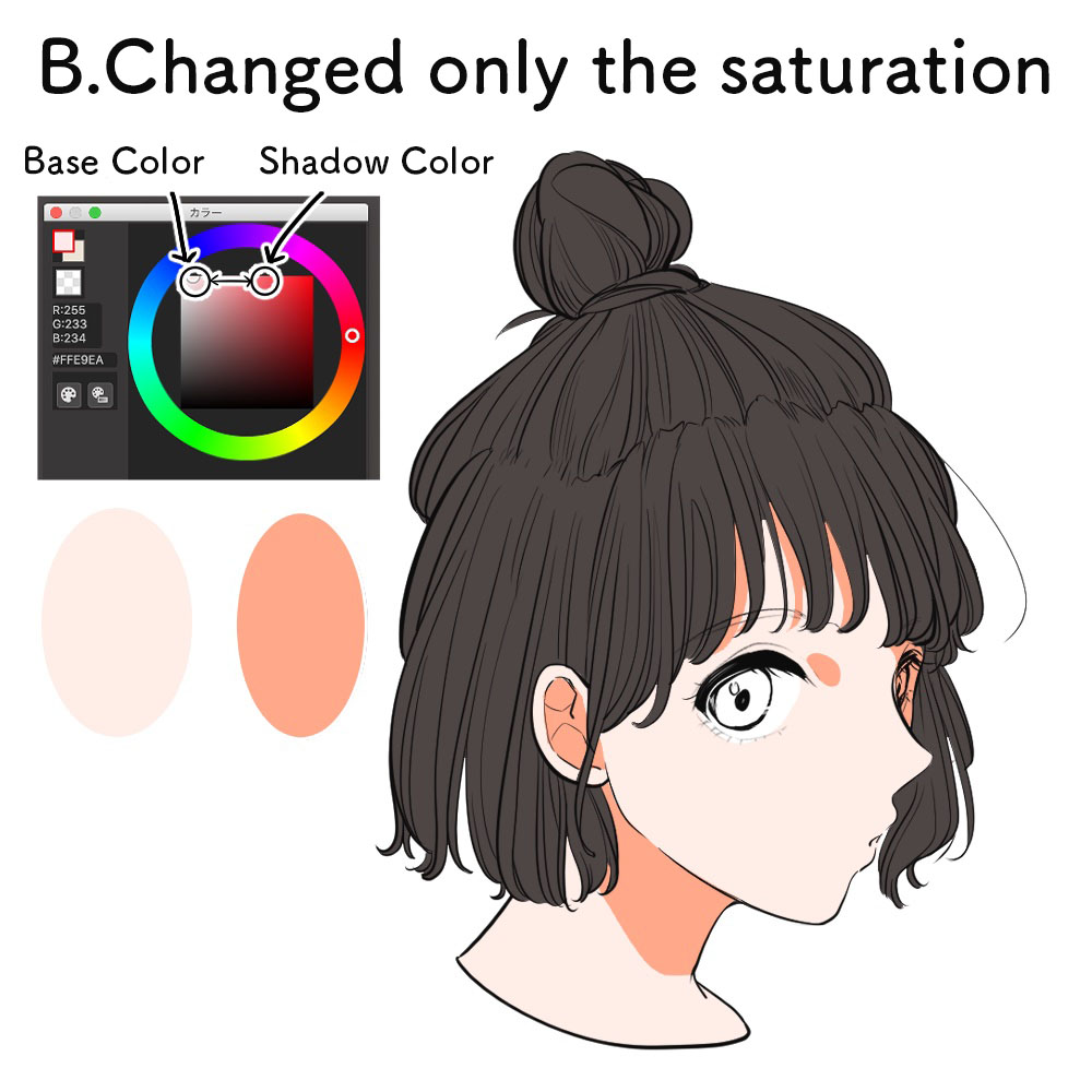
B.Changing only the saturation
I raised the saturation of the base skin tone here. It looks much brighter and cheerful than A.
You can of course try this method and leave it as it is but this illustration is painted using a single color (same hue) so it looks too simple.
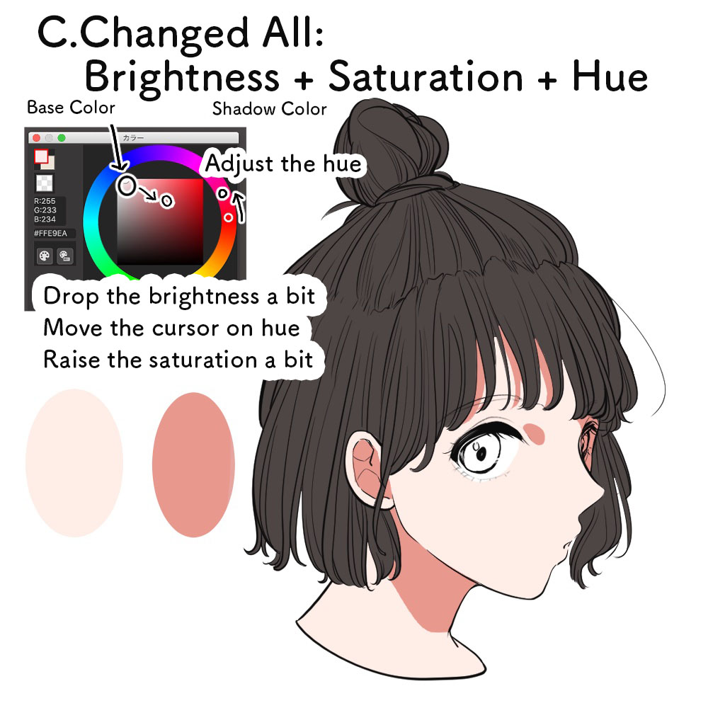
C.Changing all: brightness, saturation and hue
Let’s upgrade your illustration from B!
I only raised the saturation in B but here I will also change the hue (color type).
Let’s move the cursor on the color wheel a little towards the red color.
You can see that it added a little bit of redness to the base skin tone and the complexion looks much better.
Just like that, the key point in choosing the color of shade is by adjusting the hue and not only the brightness/darkness.
★ Let’s try various hues!
In the C example above, I brought the hue closer to a red shade but you can of course use a different color.
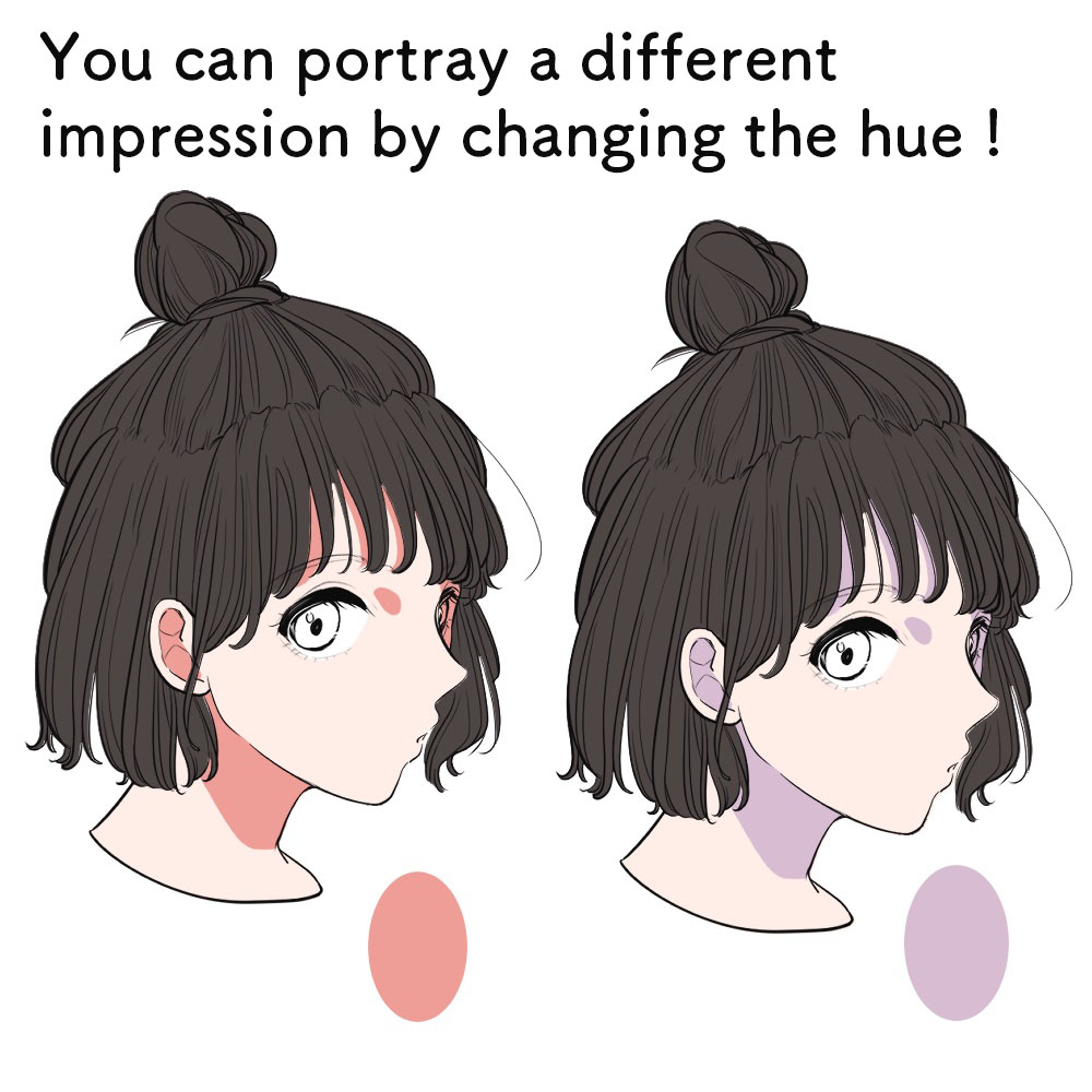
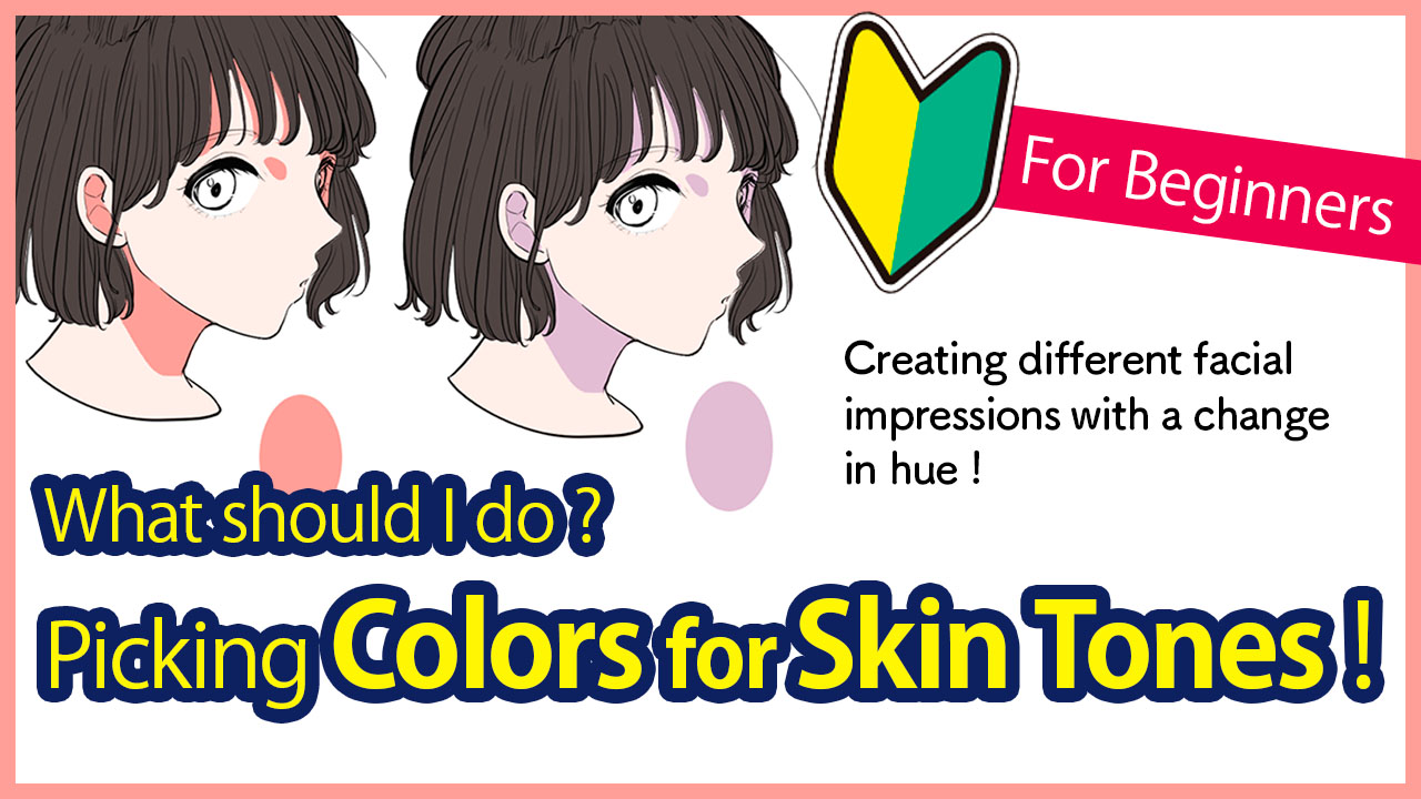
These two illustrations have the exact same base color as well as the same saturation for the shadow. I only changed the hue of the shadow.
You can see that it creates a very different impression by comparing them side by side.
Try using various hues for the shadow to see which combination fits the image you want to portray!
☆ Extra Technique ☆
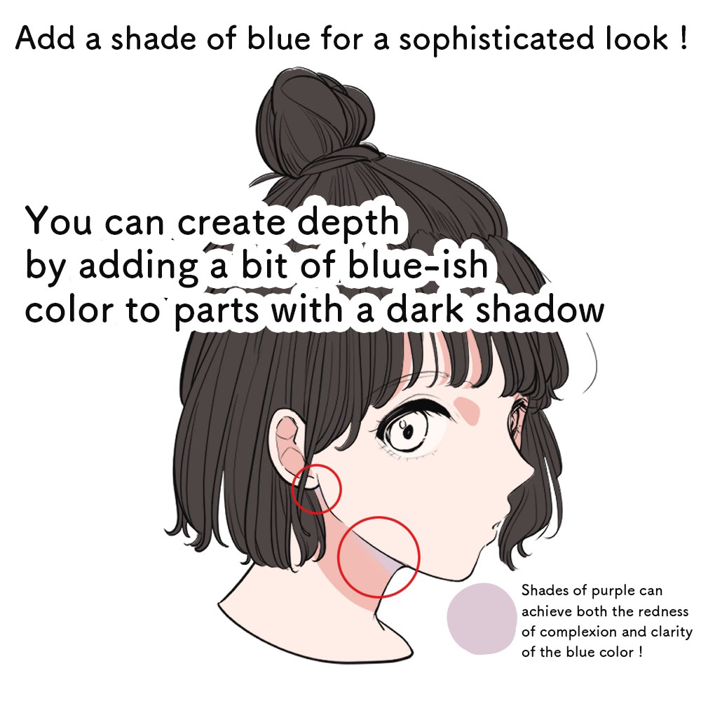
“I’ve seen my favorite artist using a blue-ish color for the shadow of the face…”
Blue is indeed often used as the color for shadows in many illustrations, not only for the skin but also for others too.
When you want to paint a white outfit for example, you can create a sophisticated look by using a blue-ish gray instead of the regular, single gray shade.
Blue as the color for shadows will allow to illustrate the feel of clarity, depth and a chilly air.
It works effectively when used for thick shadows like under the neck etc.
Although, you have to be careful with the saturation!
If used too much, the complexion will look bad and unhealthy.
The tip for using blue is to add them partially.
I tend to use a pale purple for such parts.
You can portray both the redness of the complexion and the clarity of blue so I recommend using the pale purple shade too!
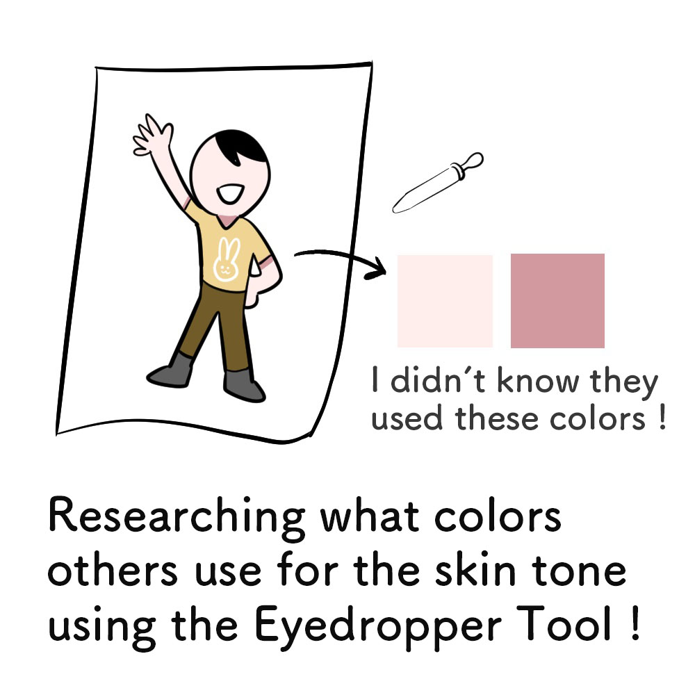
★ Learn from the gods! Use the eyedropper for reference!
Maybe some of you might feel as though this tutorial was a little too complex.
“I understand it but I don’t think I can do it myself!”
If that was your honest opinion, don’t worry there is a super trick.
Borrow your favorite illustration to study the right skin tone color.
Open your favorite illustration using your MediBang Paint app and select the skin tone using the Eyedropper Tool.
You can explore and find the different colors used for the base, the shadow etc., sometimes unexpected ones too.
Learn from the color scheme used by your favorite artists and find your preferred color, maybe you want the skin to be a little more pink-ish etc.
The color for skin tone is delicate and challenging.
I’m sure professional artists go through trial and error repetitively as well.
It is always difficult to determine the right color since it changes with the character, the style and also the trend, but I hope you can find your go-to regular set of colors.
(Text・Illustration/はらなおこ)
NAOまんが製作室
twitter:@nao_comic
\ We are accepting requests for articles on how to use /
Request