Samsung Galaxy S10e review: Still the best Galaxy S10 for most people
Mục lục bài viết
Samsung Galaxy S10e
Despite what the cheaper price tag might suggest, the Samsung Galaxy S10e is a small smartphone worthy of your attention. Just about everything from the hardware to the software is a joy to use.
This device is no longer widely available. The Samsung Galaxy S10e is now unavailable to buy from most retailers. If you are looking for an alternative device, check out our list of the
The Samsung Galaxy S10e is now unavailable to buy from most retailers. If you are looking for an alternative device, check out our list of the best Android phones you can buy and the best Samsung phones
Smartphone companies have noticed that not everyone wants to spend a grand on a phone, so they’re launching more affordable versions of their top-tier devices.
For Samsung, this year’s affordable flagship is the Galaxy S10e — it’s a direct competitor to Apple’s iPhone XR, and offers just about the same Galaxy S10 experience without the eye-watering price tag.
Read our full Samsung Galaxy S10e review to find out why you should probably buy this phone.
Design
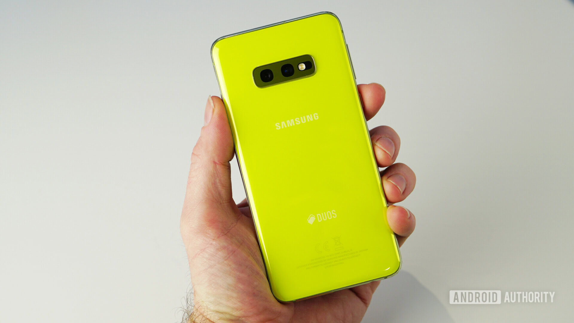
- 3.5mm headphone jack
- Side-mounted fingerprint sensor
- IP68 water resistance
- 142.2 x 69.9 x 7.9mm, 150g
All phones in the Galaxy S10 lineup share a similar design language, but the Galaxy S10e is the most different of the bunch. It’s not as flashy as the Galaxy S10 or S10 Plus, and I don’t think that’s a bad thing at all. In fact, I quite like that aspect of the S10e. Hear me out.
For starters, it doesn’t have a gigantic display — this is very much a one-handed phone. It doesn’t sport the traditional curved edges around the display either, which makes it way easier to hold than its bigger brothers.
![]()
Minimal bezels surround the display on the front, while the back edges are nicely curved to fit into your hand. The glass-and-aluminum design makes the Galaxy S10e feel quite substantial as well, without it being too heavy. It feels more like an iPhone XS than anything else. In doing so, it makes my Google Pixel 3 feel like a toy.
If you buy the Galaxy S10e, there’s no doubt you’re going to need a case. It’s so slippery. While writing this section of the review, my S10e almost slipped off the table on its own! I’m not the only one with Slippery Galaxy Syndrome either.
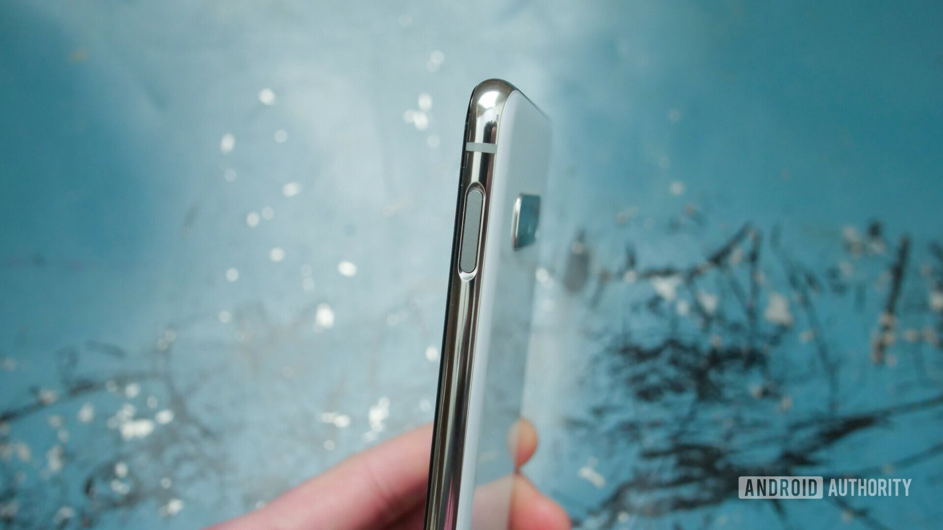
Around the left side, you’ll find a volume rocker and dedicated Bixby button (more on that later) directly below it. The right side of the S10e houses the power button/fingerprint sensor combo.
That’s right, the Galaxy S10e doesn’t have an ultrasonic fingerprint sensor embedded in its screen like the S10 and S10 Plus. As I’ve already mentioned, this is a good thing — the S10 and S10 Plus’ fingerprint sensors are slower and less accurate than traditional scanners.
I think side-mounted fingerprint sensors are underrated. They’re located in a spot where your thumb naturally rests. You can even swipe down on the S10e’s sensor to pull down the notification shade.
For as fast as the fingerprint sensor is (it’s really fast), there are some downsides:
- The fingerprint sensor is located on the right side of the phone, so left-handers will probably have trouble reaching it with their index fingers.
- It’s located a bit too high for my liking — I’ve had to adjust the way I pick up my phone so I can ensure I’m able to reach it every time.
- Because of its location, I’ve found myself taking a ton of accidental screenshots when turning the volume down. It’s very easy to hit the power and volume down button at the same time.
- Finally, you need to make sure to cover the entire sensor with your fingerprint, not just a portion of it. It’s harder to get used to than you’d think.
I wouldn’t call any of these things dealbreakers, and I think the sheer speediness and reliability of the sensor overshadows any of the other issues.
Display
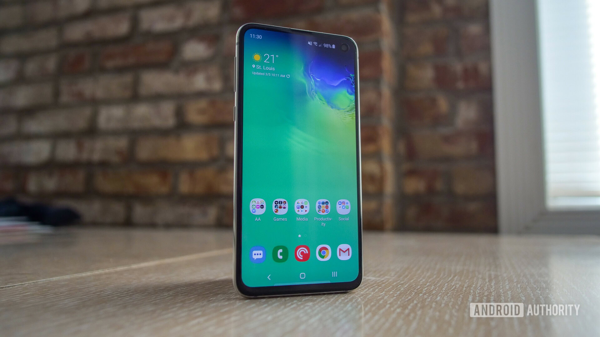
- 5.8-inch Dynamic AMOLED display
- 2,280 x 1,080 resolution, 435ppi
- 19:9 aspect ratio
Samsung makes the best displays in the smartphone business, and the Galaxy S10e’s 5.8-inch Dynamic AMOLED panel is wonderful. It gets plenty bright and dim, and I’ve had no problems with outdoor visibility. This is a Full HD+ display, so it’s not as pixel dense as the other Galaxy S10 models. But unless you absolutely have to have a Quad HD+ display on your phone, the S10e’s screen will do just fine.
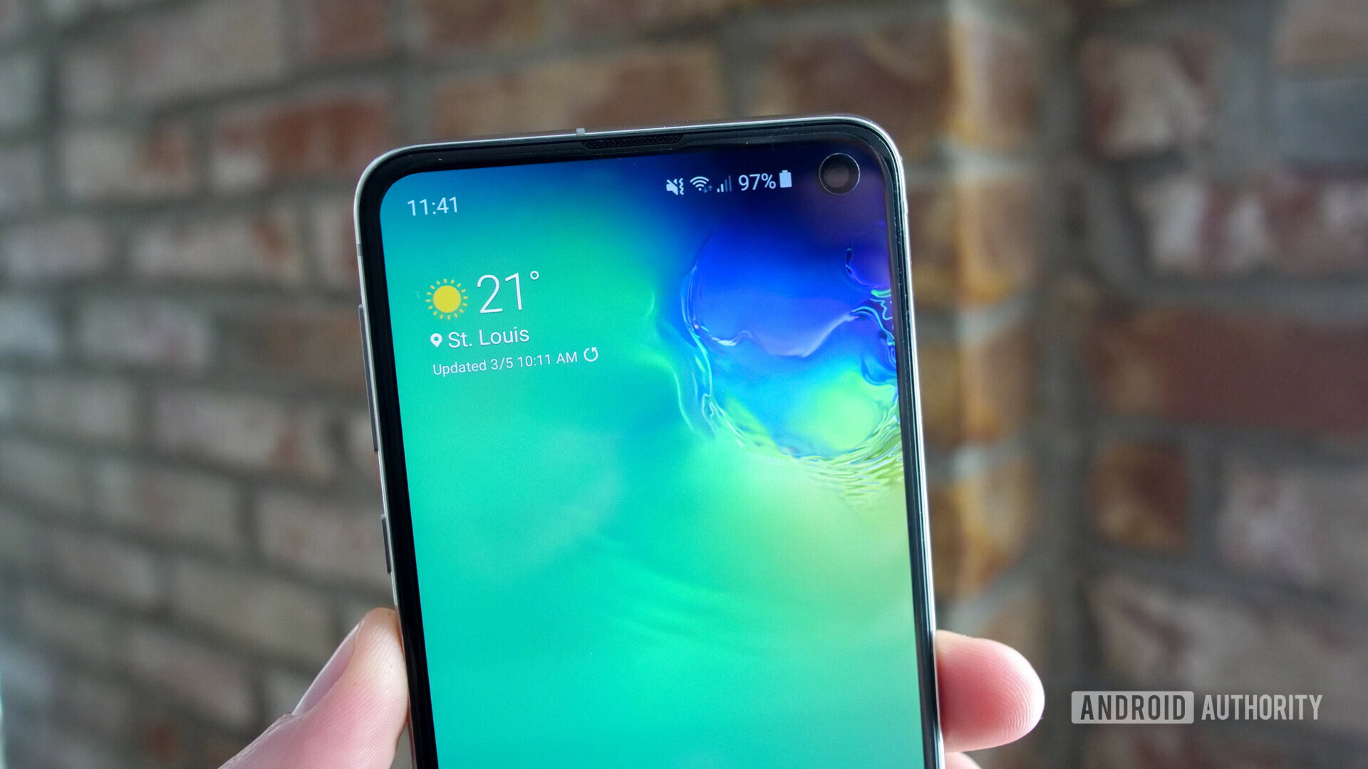
Samsung Galaxy S10 wallpapers can be downloaded here
News
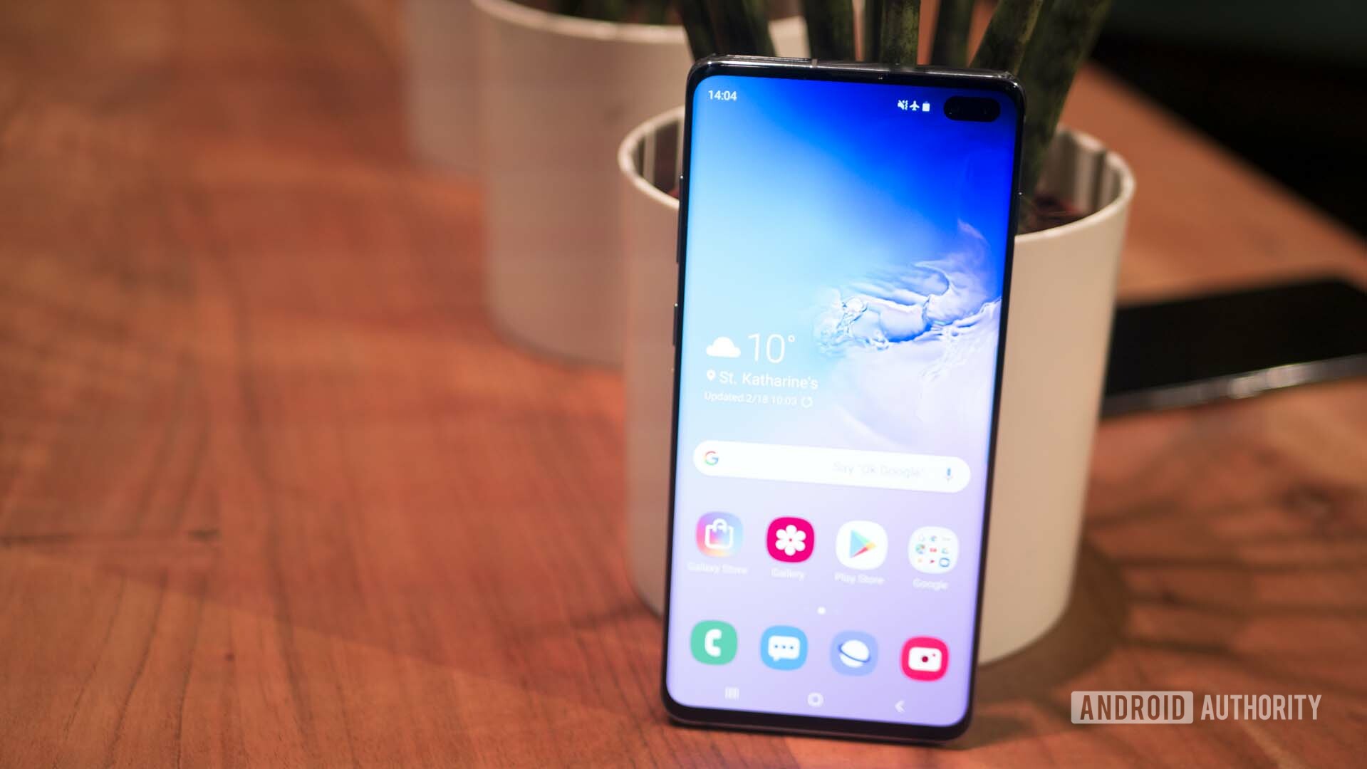
To trim down as many bezels as it could, Samsung decided to place the front-facing camera inside the display. Personally, I prefer this to a big ol’ notch in the middle. It gets out of the way most of the time, and frankly I stopped noticing it after about an hour with the device. All of Samsung’s wallpapers try to hide it as much as possible, and it’s barely noticeable if you use a black wallpaper. Plus, there’s an entire subreddit for Galaxy S10 wallpapers if you’d like to make it blend in even more.
Hardware & performance
- 8nm octa-core Exynos 9820 / 7nm octa-core Snapdragon 855
- 6/8GB of RAM
- 128/256GB of storage, expandable storage up to 512GB
- 3,100mAh battery
- Headphone jack
- Qi and PMA wireless charging with Wireless PowerShare
- IP68 water and dust resistance
The Galaxy S10 lineup is one of the first to market powered by the new Qualcomm Snapdragon 855 Mobile Platform. It’s fast. I haven’t noticed a single stutter or hint of lag throughout my time testing the device.
Global variants of the S10e are powered by Samsung’s new Exynos 9820 SoC. If you have the option to choose one over the other, go with the Snapdragon 855 model. The video below will explain why.
In case you’re a fan of benchmarks, we’ve run the Samsung Galaxy S10e through Geekbench 4, AnTuTu, and 3DMark. Performance seems to be a pretty nice step up compared to the Snapdragon 845-powered OnePlus 6T and Galaxy S9.
In Geekbench, the Galaxy S10e scored a single-core score of 3,525 and a multi-core score of 11,189. The OnePlus 6T scored 2,368 and 8,843, respectively. Our Galaxy S9 scored a single-core score of 2,144 and a multi-core score of 8,116.
The Galaxy S10e scored 357,983 in AnTuTu, while the OnePlus 6T scored 292,266, and the Galaxy S9 scored 266,559.
Finally, the S10e scored 5,639 in 3DMark, compared to the OnePlus 6T’s 4,697 score, and the Galaxy S9’s 4,672 score.
Our Galaxy S10e review unit has 6GB of RAM and 128GB of storage, but you can opt for a beefier model with 8GB of RAM and 256GB of storage. We’d suggest only buying the more expensive model if you need more storage — that 2GB of RAM difference probably won’t do much for you in real-world use. All Galaxy S10e models come with expandable storage as well, with support for up to 512GB of extra storage with a microSD card.
A few other hardware tidbits: All Galaxy S10 models come with a headphone jack, as well as an IP68 rating for dust and water resistance.
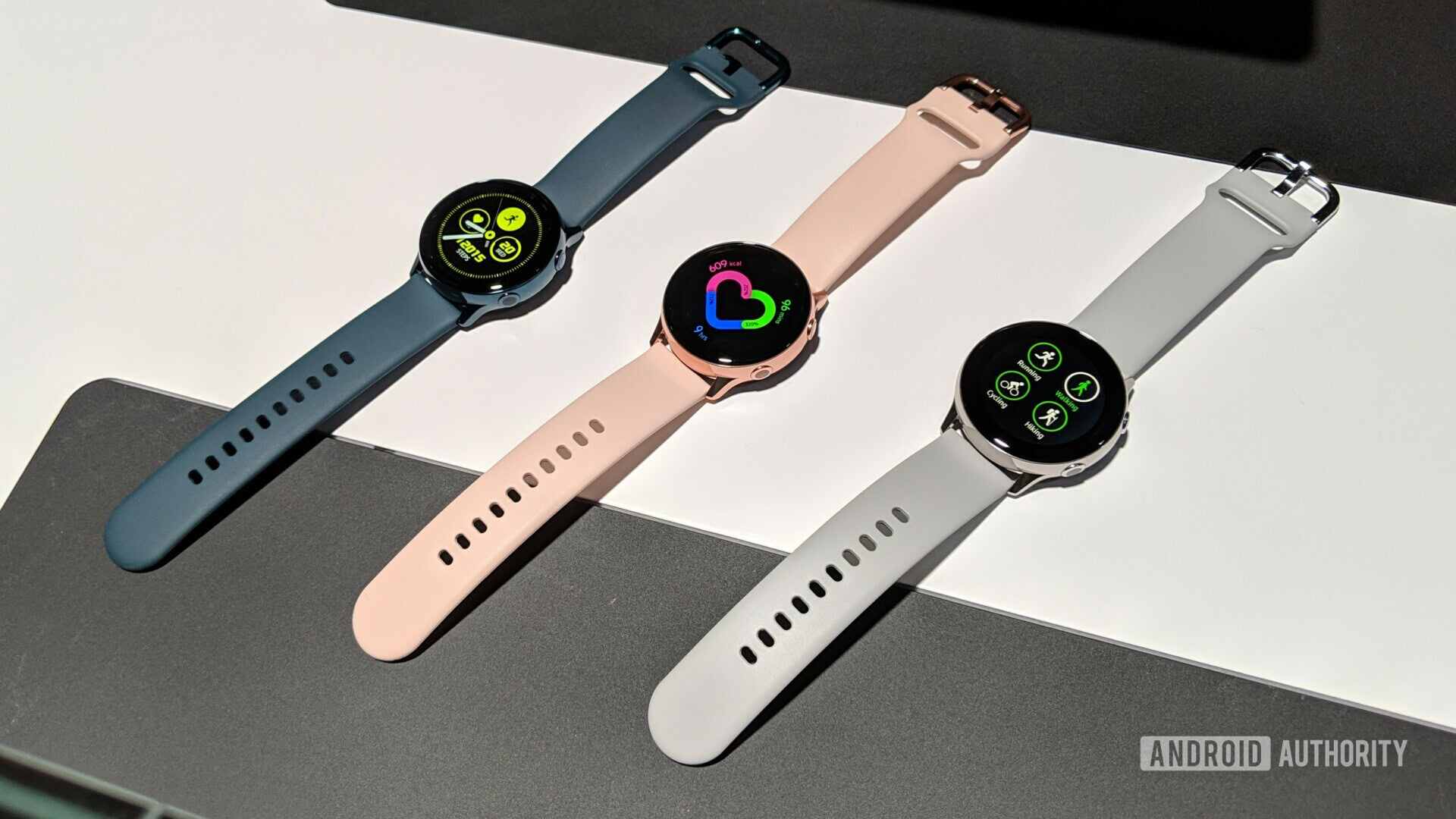
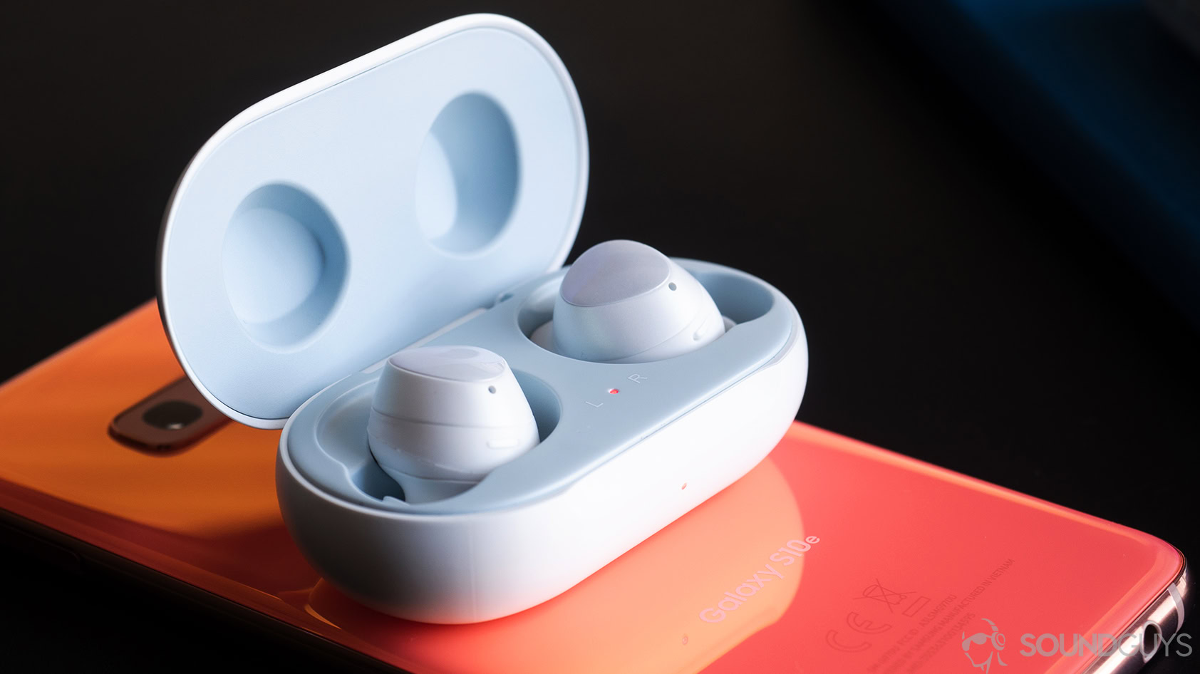
They’re also compatible with Qi and PMA wireless charging standards, as well as Samsung’s new Wireless PowerShare feature. You can charge other wireless charging-compatible devices by placing them on the back of the device. However, it’s slow, and probably shouldn’t be relied upon unless you’re charging something with a smaller battery like the Galaxy Watch Active or the Galaxy Buds.
Don’t miss
Related
Don’t miss
Related
One of the downsides to buying a smaller phone is that you have less room for a battery. The S10e comes with a 3,100mAh cell, which is decent compared to other phones of this size. Unfortunately battery life is just so-so — I’ve achieved an average of roughly four hours of screen-on time throughout my usage. Your mileage will vary, but I don’t think you should expect the phone to last an entire day unless you actively change your usage habits.
Note: The screenshot below shows just three hours of screen-on time, though I streamed podcasts for a few hours that day.
Cameras
- Rear cameras:
- 12MP wide-angle sensor, Super Speed Dual Pixel autofocus, OIS, 1.4μm pixels, 77-degree field-of-view, dual aperture ƒ/1.5 and ƒ/2.4 apertures
- 16MP ultra-wide sensor, 1.0μm pixels, 123-degree field-of-view, ƒ/2.2 aperture
- Front camera:
- 10MP sensor, Dual Pixel autofocus, 1.22μm pixels, 80-degree field-of-view, ƒ/1.9 aperture
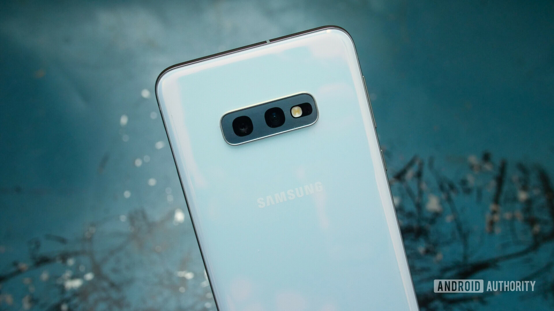
Here’s where things start to differ even more with the Galaxy S10 line. With the Galaxy S10e, you get a dual-camera setup on the rear, complete with a 12MP wide-angle sensor and a 16MP ultra-wide sensor. The S10 and S10 Plus both have an extra 12MP telephoto lens around back. Be sure to check out our Galaxy S10 Plus review for details on that.
Note: All camera samples attached below have been resized to 1080p. Feel free to check out the full-sized camera samples here.

In good-to-moderate lighting conditions, the two rear cameras can pull off some great shots. Details are prominent, there’s plenty of dynamic range, and colors are saturated. Now, colors aren’t as saturated as they have been on previous Galaxy phones, so most shots look much more natural than they used to. I like it.
The wide-angle 12MP lens should be wide enough for everyday use, but you can also utilize the ultra-wide 16MP sensor if you need to fit even more into the frame.
I’ve had mixed results with the ultra-wide lens. While it allows you to fit so much into the frame, images can become distorted if you’re too close to your subject. Just make sure you’re using the ultra-wide lens at the proper distance, otherwise your photos may come out looking a bit fake.
Google Pixel 3 Night Sight vs HUAWEI Mate 20 Pro Night Mode
Features
![]()
Things start to go downhill in low-light conditions. Where Google and Huawei have recently made big strides in low-light photography, Samsung is still lagging behind. Low-light shots are muddy and lack detail.
It’s just harder to get a good low-light shot from the S10e than it is with the Pixel 3. You can’t just point, shoot, and wait for the Night Sight software to do its thing — you may have to do some editing after the fact.

It doesn’t look like it, but my hands were perfectly still when taking this photo.
The camera interface itself is easy to use and clean. It’s not cluttered, and I like that you can swipe left or right on the interface to swap between modes.
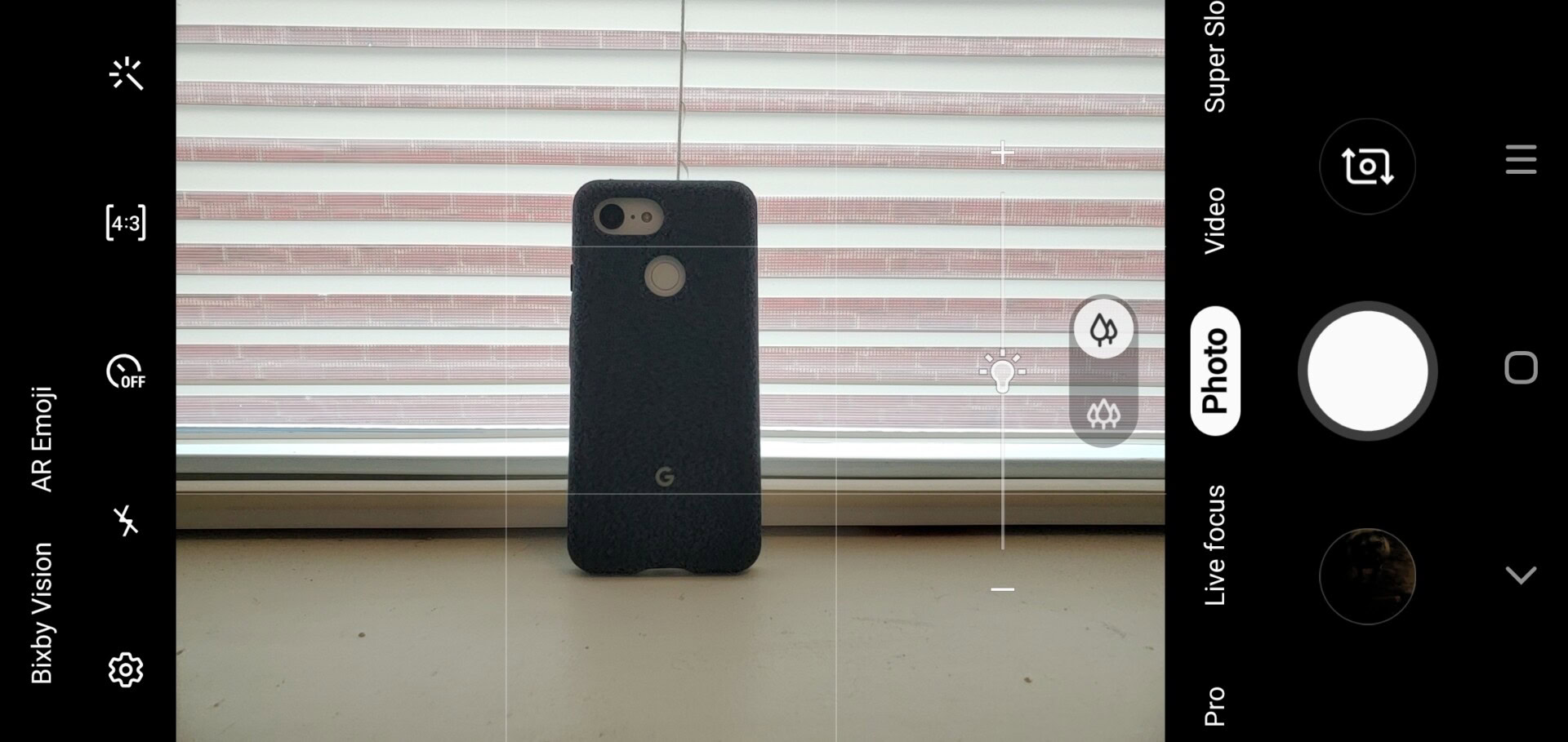
Speaking of camera modes, the new Instagram mode on the Galaxy S10e is pretty cool. Just swipe over to the Instagram tab in the camera app, snap a photo or video, and it’ll automatically import to your Instagram Story. I don’t know if this is much easier than opening Instagram and snapping a photo from the app, but hey — it’s there if you want to use it!
The Galaxy S10e has a single front-facing 10MP lens. It by no means offers Pixel 3-level width, so you’ll have to stretch your arm out a bit more if you want to fit multiple people into the frame.
I share David’s sentiments regarding the front camera. Images come out too soft for my liking, making it look like there’s some sort of beauty mode enabled (there’s not).
Check out a sample below compared to the Pixel 3.
I came away from the Galaxy S10e’s cameras a bit mixed. While I did get some really nice shots, I also got plenty of bad ones. Smartphone photography is at a different level now, and it seems Samsung hasn’t made that jump yet.
Software
- Android 9 Pie
- Samsung One UI version 1.1
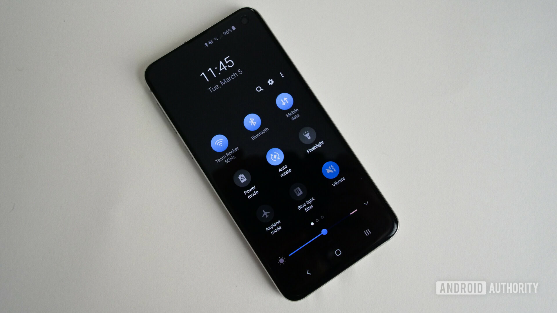
It’s been a long time coming, but Samsung’s software is finally good. The new One UI interface cleans up the divisive Samsung Experience software while making everything easier to reach with your thumbs. If you want a detailed overview of One UI, check out our review right here.
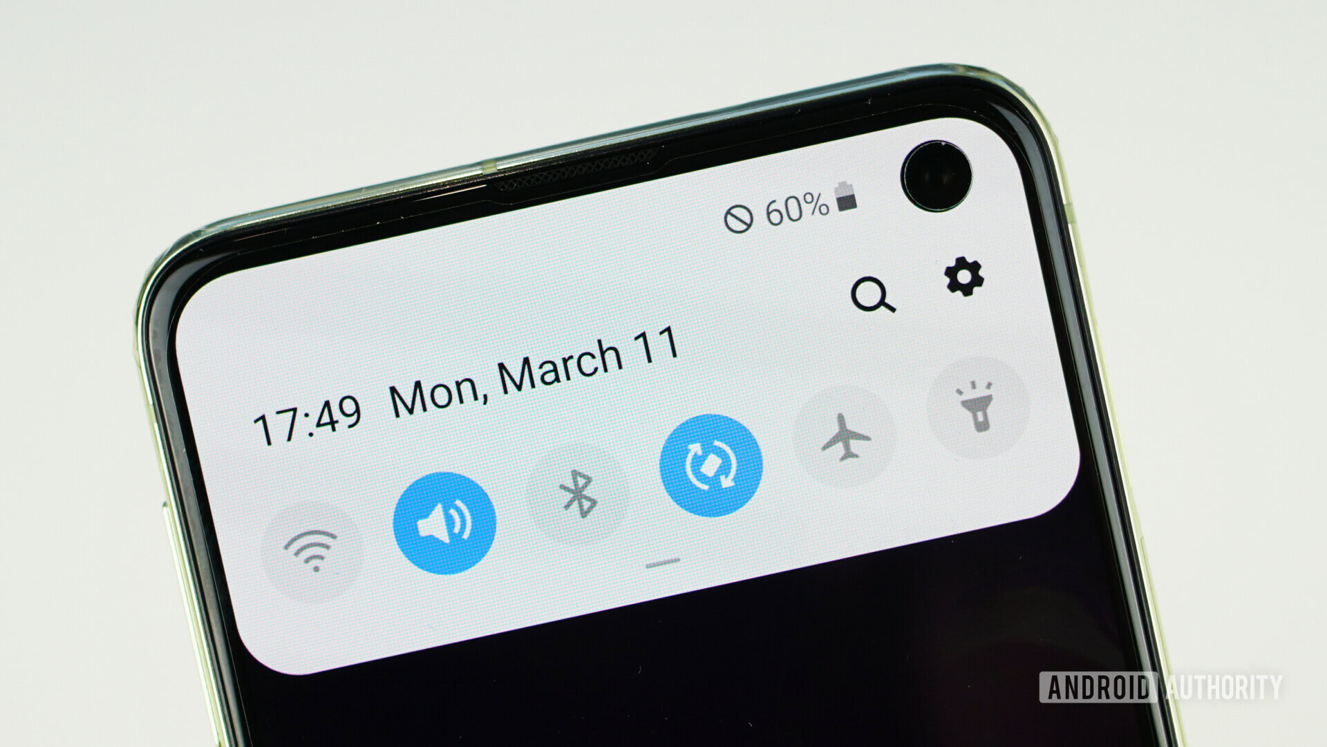
I prefer the look of One UI over most other Android skins, save for maybe vanilla Android on the Pixel. I love that there’s a system-wide dark theme that can be turned on all the time or only at night. I also enjoy the look of the settings menus and notifications, although not everyone shares my feelings on that.
A few things in the software are questionable. Bixby is still here, and it’s only slightly better than the version that launched on the Galaxy S9. It’ll still show you advertisements for games that you won’t want to play, or recommend themes for your phone that you have to pay for. It’s just not something I want on my home screen. Luckily it’s easy enough to disable if you don’t want to use it at all.
One recent addition that’s actually been useful is Bixby Routines, which is sort of like Samsung’s take on IFTTT. It lets you trigger things during certain situations, like if you’re driving or running low on battery. This is a genuinely useful feature that all phones should have.
Now is also a good time to talk about the physical Bixby button on the left side of the phone. By default, it opens Bixby whenever it’s pressed, which happens all too often on accident. Luckily, you can remap the Bixby button to any app of your choosing, as long as that app isn’t another voice assistant. There does seem to be a workaround if you want to put in a few extra minutes of your time. Personally, I remapped the Bixby button to open the Google app.
Also read
Related
Also read
Related
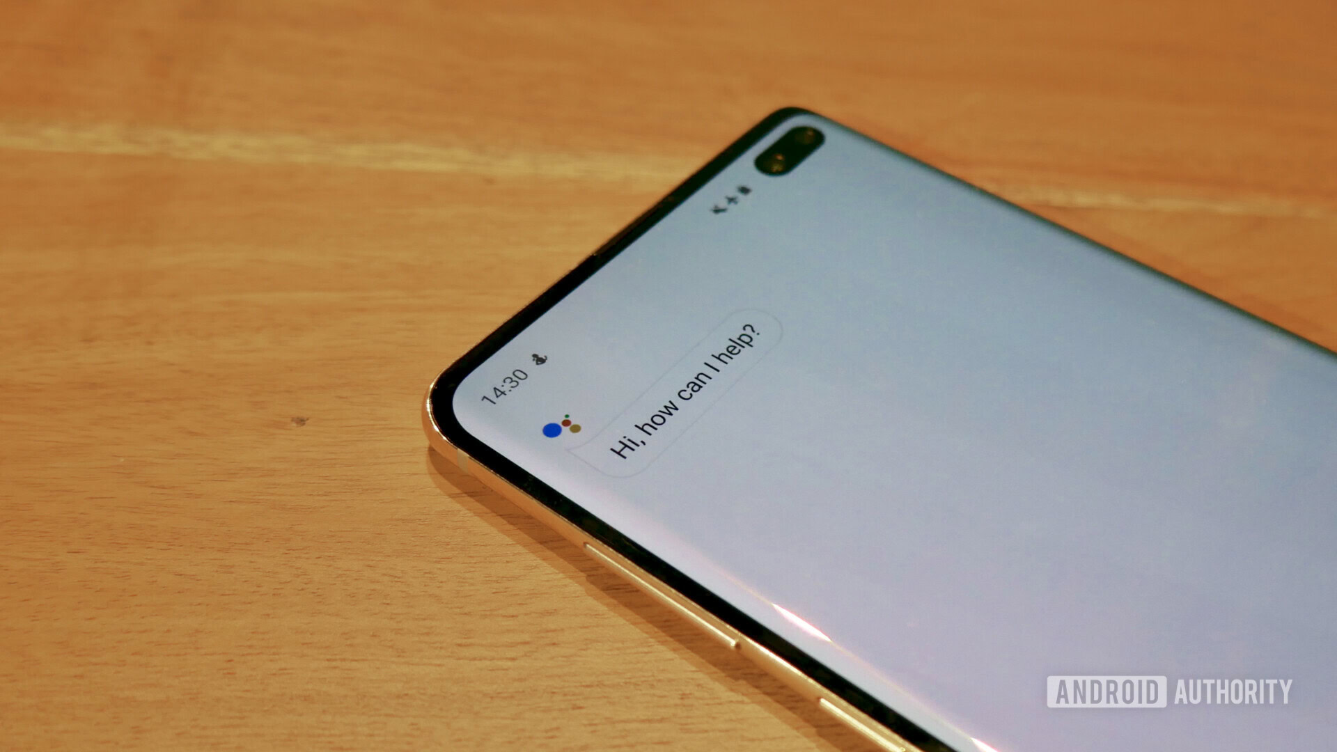
Underneath the fancy new interface is Android 9 Pie. You can read up on all the features in Pie right here, and I’d suggest you do so — it’s going to be awhile until the Galaxy S10 line gets Android Q, the next major version of Android. Samsung is one of the worst offenders when rolling out major software updates. It took 207 days for the company to roll out Oreo to last year’s smartphone line, and 140 days to roll out Android Pie — an improvement, but still not great.
Specs
Samsung Galaxy S10eSamsung Galaxy S10Samsung Galaxy S10 Plus
Display
Samsung Galaxy S10e
5.8-inch AMOLED panel
2,280 x 1,080 resolution
435ppi
19:9 aspect ratio
Samsung Galaxy S10
6.1-inch AMOLED panel
3,040 x 1,440 resolution
551ppi
19:9 aspect ratio
Samsung Galaxy S10 Plus
6.4-inch AMOLED panel
3,040 x 1,440 resolution
525ppi
19:9 aspect ratio
Processor
Samsung Galaxy S10e
8nm octa-core Exynos 9820 / 7nm octa-core Snapdragon 855
Samsung Galaxy S10
8nm octa-core Exynos 9820 / 7nm octa-core Snapdragon 855
Samsung Galaxy S10 Plus
8nm octa-core Exynos 9820 / 7nm octa-core Snapdragon 855
RAM
Samsung Galaxy S10e
6/8GB
Samsung Galaxy S10
8GB
Samsung Galaxy S10 Plus
8/12GB
Storage
Samsung Galaxy S10e
128/256GB
Samsung Galaxy S10
128/512GB
Samsung Galaxy S10 Plus
128/512GB / 1TB
MicroSD
Samsung Galaxy S10e
Yes, up to 512GB
Samsung Galaxy S10
Yes, up to 512GB
Samsung Galaxy S10 Plus
Yes, up to 512GB
Cameras
Samsung Galaxy S10e
Rear:
16MP f/2.2 ultrawide +
12MP f/1.5 and f/2.4 dual pixel with OIS
Front:
10MP f/1.9 dual pixel
Samsung Galaxy S10
Rear:
16MP f/2.2 ultrawide +
12MP f/1.5 and f/2.4 dual pixel with OIS +
12MP OIS telephoto f/2.4
Front:
10MP f/1.9 dual pixel
Samsung Galaxy S10 Plus
Rear:
16MP f/2.2 ultrawide +
12MP f/1.5 and f/2.4 dual pixel with OIS +
12MP OIS telephoto f/2.4
Front:
10MP f/1.9 dual pixel +
8MP depth sensor f/2.2
Battery
Samsung Galaxy S10e
3,100mAh
Non-removable
Samsung Galaxy S10
3,400mAh
Non-removable
Samsung Galaxy S10 Plus
4,100mAh
Non-removable
Wireless charging
Samsung Galaxy S10e
Fast Wireless Charging 2.0
Wireless PowerShare
Samsung Galaxy S10
Fast Wireless Charging 2.0
Wireless PowerShare
Samsung Galaxy S10 Plus
Fast Wireless Charging 2.0
Wireless PowerShare
Water resistance
Samsung Galaxy S10e
IP68
Samsung Galaxy S10
IP68
Samsung Galaxy S10 Plus
IP68
Security
Samsung Galaxy S10e
Capacitive fingerprint scanner. 2D face unlock.
Samsung Galaxy S10
Embedded Ultrasonic fingerprint scanner. 2D face unlock.
Samsung Galaxy S10 Plus
Embedded Ultrasonic fingerprint scanner. 2D face unlock.
Connectivity
Samsung Galaxy S10e
Wi-Fi 6
Bluetooth 5
Cat20 LTE, 7CA, 4×4 MIMO
Samsung Galaxy S10
Wi-Fi 6
Bluetooth 5
Cat20 LTE, 7CA, 4×4 MIMO
Samsung Galaxy S10 Plus
Wi-Fi 6
Bluetooth 5
Cat20 LTE, 7CA, 4×4 MIMO
SIM
Samsung Galaxy S10e
Nano SIM
Samsung Galaxy S10
Nano SIM
Samsung Galaxy S10 Plus
Nano SIM
Software
Samsung Galaxy S10e
Android 9 Pie
Samsung Galaxy S10
Android 9 Pie
Samsung Galaxy S10 Plus
Android 9 Pie
Dimensions and weight
Samsung Galaxy S10e
142.2 x 69.9 x 7.9mm
150g
Samsung Galaxy S10
149.9 x 70.4 x 7.8mm
157g
Samsung Galaxy S10 Plus
157.6 x 74.1 x 7.8mm
175g
Colors
Samsung Galaxy S10e
blue, yellow, black, white, pink
Samsung Galaxy S10
blue, green, black, white, pink
Samsung Galaxy S10 Plus
blue, green, black, white, pink, black (ceramic), white (ceramic)
Galaxy S10e price and availability
- Samsung Galaxy S10e: $599.99 (128GB), $699.99 (256GB)
- Samsung Galaxy S10: $749.99 (128GB), $999.99 (512GB)
- Samsung Galaxy S10 Plus: $849.99 (128GB), $1,099.99 (512GB), $1,449.99 (1TB)
If you want, you can spend as little as $600 on the Galaxy S10e as long as you opt for the version with 6GB of RAM and 128GB of storage. The device costs $100 more if you go for the model with 8GB of RAM and 256GB of storage.
The Galaxy S10e is available now from Samsung.com, Amazon, B&H, Best Buy, and other retailers. You can see the full list right here. Depending on where you purchase the device, you’ll be able to pick it up in Prism White, Prism Black, Prism Blue, Prism Green, Flamingo Pink, or Canary Yellow color options.
Update, July 11: Since the Galaxy S10e debuted in March, dozens of new phones have entered the market. The most direct competitor to the S10e is the OnePlus 7, a commendable update to the company’s 6T and an Editor’s Choice recipient. It’s a bargain. Another top contender is the ASUS Zenfone 6, a $500 wonder.
Moreover, Amazon now sells the Galaxy S10e for $599. That’s quite a deal, and makes a great value even better.
Samsung Galaxy S10e review: The verdict
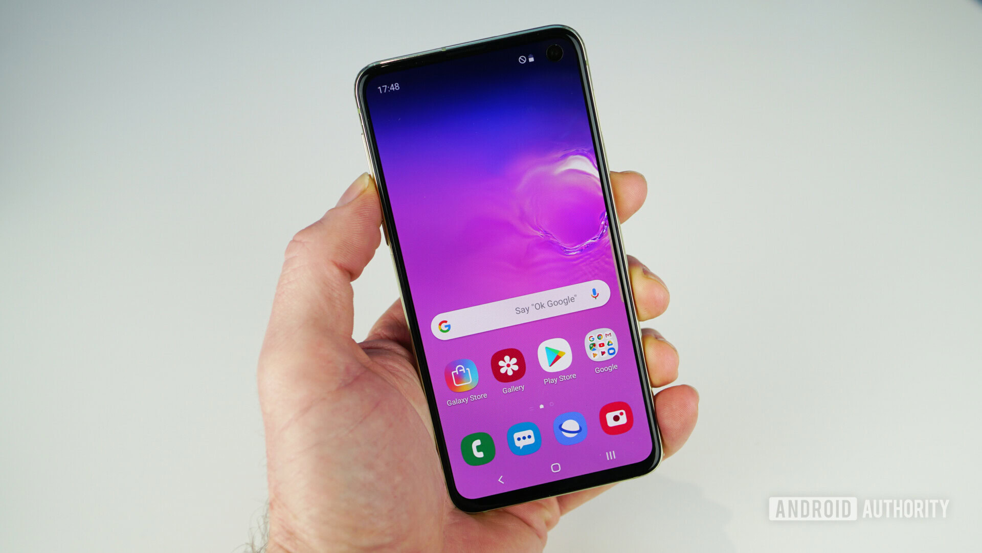
The Samsung Galaxy S10e is the best value Galaxy S model this year. It’s the one most people should buy. I’d have no problem recommending this phone to my parents, friends, or basically anyone who needs a really good Android phone that doesn’t cost $1,000.
The Samsung Galaxy S10e is the model most people should buy.
Despite what some people might say, you don’t need a gigantic display or three cameras on your smartphone. You might want them, but they’re not a necessity. We live in a world of excess, and the top two Galaxy S10 models deliver in spades. The Galaxy S10e is the most normal phone of the bunch, offering a great overall experience without making any detrimental sacrifices.
You’ll be hard-pressed to find a better phone at this price point. Samsung’s improved software coupled with its extraordinary hardware makes for an overall great smartphone, and one I’m not going to put down for a long time.


