Top 11 Digital Agency Websites – Our Choice | W3 Lab
In the previous post, there was a word about how to choose the right digital agency. Today, we bring you the list of the 10 best looking and most unique digital agencies’ websites:
Mục lục bài viết
Mabbly
Mabbly offers a ton of services related to business strategy and branding, web design, web development, marketing, and communications. The fact they design beautiful websites is evident from their own website:

 Mabbly digital agency
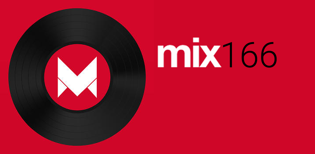
The front page is simple and striking: the warm red paired up with the white font is unique and not heavy on the eyes. The headline and description are short, have emotion and tells us everything we need to know. As you scroll down, the page turns white with black text and accents in the same shade of red as before. Notice how they used only three colors but didn’t make their website look boring?

 Three colors on their website but it still isn`t boring
Inside of the M, there is a black and white video playing featuring the employees in work and relaxing environments, maintaining the minimalist look while also adding something interesting. The fact they were featured on these notable websites gives them legibility and convinces us of the quality of their work and service.
3 Media Web
This digital agency has been building websites for almost 20 years and can make you a website and maintain it. They can help you with things such as lead generation, ad design, SEO and paid advertising, social media marketing, and many more.

 Very interesting digital agency website, isn`t it?
Their front page features a creative and adorable photo, and as you scroll down, you will see images and buttons in a variety of colors, but it is never overdone. This website is a good example of how you can break the rules sometimes yet still maintain a professional and good image.

 Professional and interesting digital agency website
Just like Mabbly’s part of the page about the websites that featured them, 3 Media Web has a showcase of their success, as well.
Absolute Web Services
Based in 1999, this digital agency provides a number of services. Whether you need website optimization, website development, mobile app development, or any kind of marketing services, they have got you covered. Now, let’s take a look at their website:

 Absolute Web Services Website
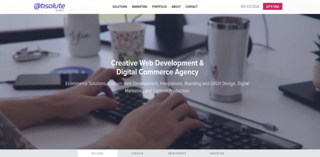
While their front page features a large video, the website still runs and loads smoothly and super fast, which is a great show of how good they are at optimizing websites. The buttons both on top and bottom are easy to spot and the video doesn’t take anything away. If you choose to watch it in its entirety, you can, if you don’t, you can easily locate whatever you want to learn about them. However, the most interesting part for me was their ‘Marketing’ page.

 Marketing Page
The blue is a bold choice but
paired up with the grid, it has the look of a blueprint which makes it very
interesting and unique. The partner list on the bottom shows us whom they
collaborate with and when you hover over their logos, they go from grey to full
color.
Scrolling further down, you can read their clients’ testimonials, brands they work with, the results of their work and an Instagram link to their profile, where they post updates, photos, and short videos.
1o8
1o8 specializes in e-commerce, social content, performance marketing, and helping brands with their Amazon sales.
 108 Digital Agency Website
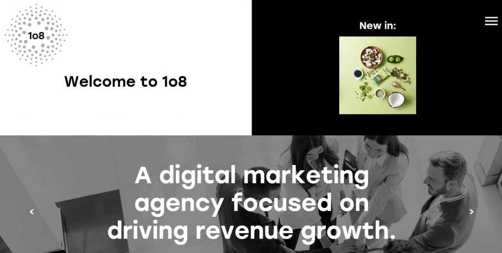
I personally love black and white pages with splashes of bright unconventional color, so their website easily caught my eye. The use of whitespace and black text with green accents is pretty and easy on the eyes. Look at their ‘Capabilities’ page:

 Capabilities Page
The way everything is divided and presented in a similar way but with a twist is very aesthetically pleasing, and the little graphics are a nice touch.
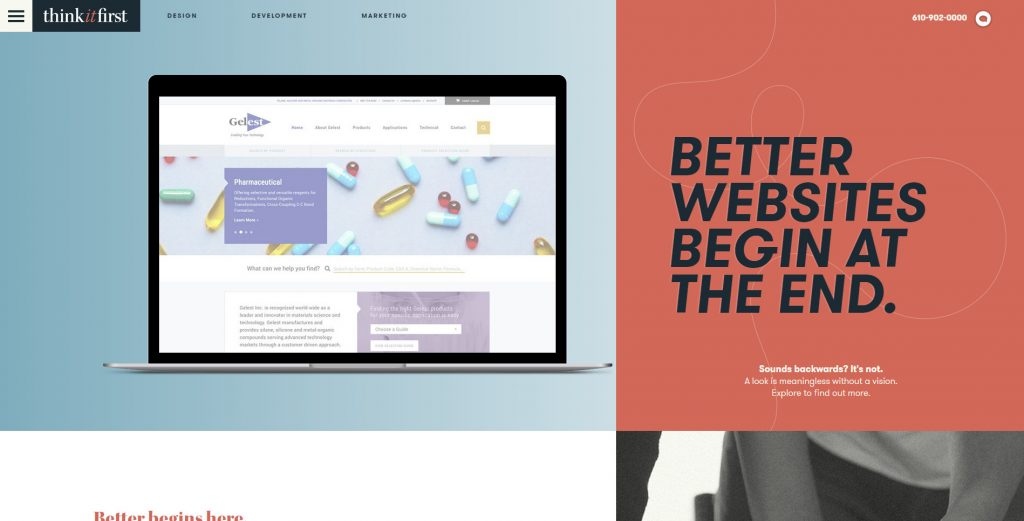
Think it First
Think it First offers dozens of services related to brand building, website development, web applications, content management, e-commerce, maintenance, and hosting. They also have one of the most interesting websites I’ve seen, so let’s get to it:

 Think It First
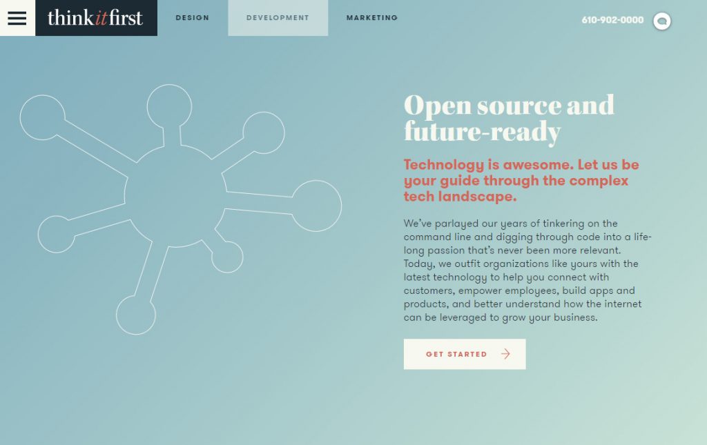
Their front page features the websites of the brands they have worked with on different screens, showing how beautiful the websites they build are but also the fact they’re responsive and work on all screen sizes, a very unique and smart way of showcasing one’s work. What I also love is their use of a number of colors: they used different shades of blue, red and green, which should look mismatched and chaotic, but it doesn’t because it’s done so tastefully.

 Clean And Modern Digital Agency Website
Their three main pages ‘design’, ‘development’, and ‘marketing’ each have one of these three colors as their theme and a cool and stylistic graphic.
Be Heard Partnership
Be Heard is a team of 330 specialists from tech, media, data & creative. Their front page is unique and features funny and smiling photos of their employees, giving many faces to their company:

 Be Heard
The rest of their website is just as image-heavy, but this is not a bad thing. It is a theme they chose to follow and it looks really nice. Look at their ‘work’ page, for example:
The brands they worked with each get a large space and a beautiful image and by hovering over them, you can see the name of the brand and in which way they collaborated.
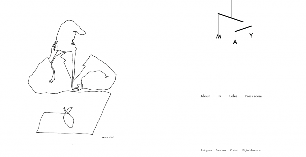
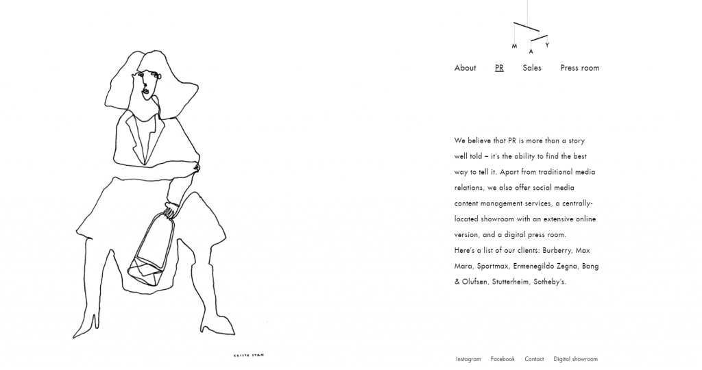
MAY
Not a conventional digital agency, MAY is a boutique and PR agency with the aim of bringing growth to fashion and lifestyle brands. They have perhaps one of the most minimalist websites I’ve ever seen, with large amounts of whitespace, simple black font, and simple drawings.

 Unconventional digital agency website
Their website consists of only
one long page, with each of the clickable pages featured on the main one, each
with a different drawing.
 May digital agency website
97th Floor
97th floor is experienced in SEO (keyword research, link building, technical SEO), paid media (different kinds of ads), creative (graphic design, copywriting, content marketing, video), and automation (email marketing, analytics, lead nurturing). Their front page is as unique as their name:

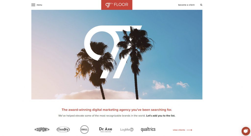 97th floor website
The minimalist approach with the large stunning image works perfectly. The colorful sky and dark palm tree complement the white logo and make it stand out. When you scroll down, you can immediately see their work:
As you can see, they not only featured their clients, but also the results of their work: a 450% increase in organic blog traffic is definitely something to brag about so why not put it on your front page?
WebMechanix
WebMechanix is a full-service digital agency that specializes in SEO, PPC, and marketing automation. I chose their website because their front page looks simple and minimalist, but as you click through their website, you get to see colorful pages, photos, and graphics. Here’s their front page:

 Front Page
Now let’s take a look at their marketing services:
They have still maintained the blue from the front page but added other colors like orange and yellow to spice things up a little.
My personal favorite part of their site is this part, where they symmetrically separated their case studies and their portfolio:

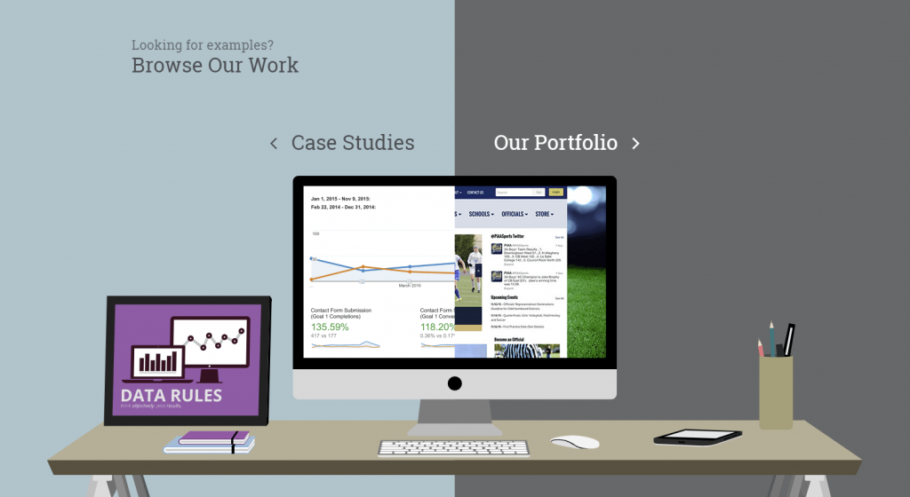 Beautiful portfolio example
This is a super unique idea that
looks really good.
WEBITMD
This agency is specialized in SEO, editorial outreach, multi-channel paid media, social media, strategic content marketing, analytics, email marketing, marketing automation, and many more areas. I chose their website because of the stunning front page:

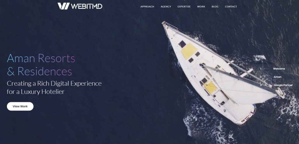 Digital Agency Specialized in SEO for website
It features three short videos: one of their employees, one of their clients, and one related to their partnership with Google. The videos are beautifully shot and you can click and choose which one you want to see. Another nice thing about their website is the color palette they used. Look how pretty their ‘approach’ page is:
The combination and gradient of blue, pink, and purple look really good and stand out both on the white and dark background.
ArtScience
Last but not least, ArtScience offers a variety of services, including brand, marketing, communications and engagement strategies, web and app design and build, design, illustration, web and social analytics, and many more.
Their website is quite unique: the neutral shades are contrasted by a very stark highlighter yellow:
 ArtScience Website
In a small space, they managed to
fit in two case studies, a short paragraph about themselves and a link to their
Twitter, yet it still looks minimalist and tasteful.
Wrapping up
As you can see, the possibilities are endless when it comes to having stunning and minimalist websites. These digital agencies experiment with color, shapes, images, and video and it works perfectly.
Hopefully, you’ve enjoyed looking at these websites as much as we did, and if you have any other contenders for this list, drop their websites in the comments!